Scarves Love it then leave it ,how do you curate your scarf collection?

TPF may earn a commission from merchant affiliate
links, including eBay, Amazon, and others

Thanks ... I am always looking for something new in an HS - CW or design. I have gotten uber fussy about new scarves, I stare at the photos endlessly and critique them, at some point, I start seeing trends

I have always thought that H has some sort of quota system for the 10 (or so) NEW designs in each collection. Something along the lines of - there has to be 1 floral/granny style, 2 geometrics, 4 that are on topic ie correspond to the (ever more vague) theme of the year, 2 that harken back to the Hermes collection, only 1 design per season is allowed with a large screen count, at least 5 designs must be 15 screens or lower etc
It is a little harder nowadays to discern the trends - they get lost in the double sided, tattoos, wash, dip dyes, bandanas, modern renderings. Some of those variants correspond to manufacturing technology breakthroughs eg there are special printing machines for the double sided ones, new chemical acid washes, new dyes. Other - modern, tattoo & bandana - are simply design simplifications - fewer colors - scarves that can be manufactured cheaper.

It is also very telling to cultivate an interest in the fakers eg they also print double sided and acid washed, jacquard. They dont necessarily try to replicate the collection anymore, they are far more creative. They take a 90 and do it in 140cm because the bigger size is popular now, in some they recognize lost opportunities by H (H should have done this one in 140, but didnt) or H should have done more with a certain CW (eg the mango/puce CW was the big hit of the season, super HTF, that is what the fakers go for)
The fakers seem to ignore some designs (rarely), those are probably the designs least worth having, eg the fakers are not big on bandana renderings
Re: fakers- Oh, my yes! I wonder if faking in the larger formats are also easier to slip under radar... eg: I don’t have knowledge of when other formats are released, so usually do search to compare cw’s details, *and ask in authentication thread* before purchasing. The first time I saw a fake jacquard I almost fainted as I thought they were “safe”... nope.
I’m in the opposite camp of desirability of notoriously faked designs; I usually resist those to avoid tainting my collex with the whiff of suspicion -ridiculous- lol!

Thank You for articulating about noticing the number of screens & other intricacies! I now realize that I unconsciously consider those factors when shopping & definitely lean towards more screens & detailed designs... knowing that preference is a valuable epiphany for me!
You are a true gem!
 
I really do like both CWs!
Thank you, I wear a lot scrunched up at the neck of my coat, not a lot shows, so I throw caution to the wind and go for colors that pop

Reminds me of today's photos of Pss Charlene - Monaco - she wore navy head to toe yesterday, but the lining of the coat - which barely shows is hot pink , awesome
 
Last edited:
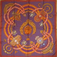
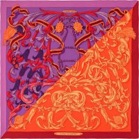
Actually I owned a purple orange cw of AUBE, and always felt I must be the old person on the planet to like combo
Actually ca 2002 H did quite a few purple orange scarves, it was sold but I still have my purple - pink - turquoise one , love it

View attachment 4908032

View attachment 4908033
You are not the only person to love purple and orange combined. There are at least two of us. In fact, combined with purple is about the only way I like orange. I have been in a multi year hunt for a cyclamen & orange vibrato picotin. I guess it was not popular because they seem to be crazy rare.

We are twins on the second Aube.
I like brown and purple (and brown and pink) and I love orange and purple, so psychedelic. My Artisans is pink and orange (and soft turquoise) I've had it since May. I can't wear that scarf, it's just too, too beautiful.
90 Kosmima square.jpg140 CS Mors a la Connetable.jpg

Hurray for orange/purple (or mango/puce!)
I do like these two, one first one more muted, the CSGM louder, both make me smile and scarves that make me smile can stay in the collection.

found the old post I wrote when I got the second one, more of this color combination to be found there:

 
Thanks ... I am always looking for something new in an HS - CW or design. I have gotten uber fussy about new scarves, I stare at the photos endlessly and critique them, at some point, I start seeing trends

I have always thought that H has some sort of quota system for the 10 (or so) NEW designs in each collection. Something along the lines of - there has to be 1 floral/granny style, 2 geometrics, 4 that are on topic ie correspond to the (ever more vague) theme of the year, 2 that harken back to the Hermes collection, only 1 design per season is allowed with a large screen count, at least 5 designs must be 15 screens or lower etc
It is a little harder nowadays to discern the trends - they get lost in the double sided, tattoos, wash, dip dyes, bandanas, modern renderings. Some of those variants correspond to manufacturing technology breakthroughs eg there are special printing machines for the double sided ones, new chemical acid washes, new dyes. Other - modern, tattoo & bandana - are simply design simplifications - fewer colors - scarves that can be manufactured cheaper.

It is also very telling to cultivate an interest in the fakers eg they also print double sided and acid washed, jacquard. They dont necessarily try to replicate the collection anymore, they are far more creative. They take a 90 and do it in 140cm because the bigger size is popular now, in some they recognize lost opportunities by H (H should have done this one in 140, but didnt) or H should have done more with a certain CW (eg the mango/puce CW was the big hit of the season, super HTF, that is what the fakers go for)
The fakers seem to ignore some designs (rarely), those are probably the designs least worth having, eg the fakers are not big on bandana renderings
So Interesting about the screens. Could you give an example of a design that has more than 15 screens that has been popular, new or old? And/or which one this a/w 2020 has the most screens, “the one“ as you say?
I oddly avoid all monochromatic I think because subconsciously I just respect the work less. Silly I know. But I guess for me, my Hermès scarves must encompass all the aspects that make them the best, and mono color doesn’t meet my criteria.I also can’t do a bandanna For some bias I have about them. I’ll get one for a lot less if I want that style, can’t pay Hermès price.
 
I'm lucky to have lots of room to store my collex, so I feel less pressure to cull. For me I would say my strategy for curating is to focus on only buying one of a type of design/artist if their scarfs IMHO "read" the same way when tied. For Alice Shirley, for example, I feel that Dans un Jardin Anglais, Mountain Zebra, Wild Singapore and Into the Canadian Wild all look too similar when tied. I do own Into the Canadian Wild, because as a Canuck I couldn't possibly forego a Canada 150, but don't feel the need to buy any of the others even though they are beautiful designs in & of themselves. Same comments with respect to Jan Bajtlik & Ugo Gattoni designs.
Like @turfnsurf, I feel the older designs hold more appeal, especially the ones linked to countries/themes - e.g. Year of Africa, India, the Himalayas, Asia, etc. DH & I love to travel and have travelled extensively, and scarf designs linked to places we have been remind me fondly of those trips whenever I choose them to wear. I am always checking the reseller market to acquire those types of designs.

Edited to note: I do have Under the Waves as a reminder of diving the Australian Great Barrier Reef.....
I too curate based on scarves reading the same way when tied. my next cull (I can feel it coming) will be along those lines. And there will be a lot of blues let go.....
 
Agree about Shirley, I would add a note. She has about 3 different riffs on animal designs, each group is similar when tied, but I think there are 3 diff Shirley looks , from left to right in illustrations, photos from h.com

1. FINE GRAIN designs - detailed panorama with tiny details eg CANADIAN, WAVES, ANGLAIS.
2. TEXTURAL designs with scales, feathers or fur eg PEGASUS, QUETZAL, ARGHHH, AWOOO
3. PATTERNED DETAIL/ZOOM designs eg APPALOOSA, TYGER, ESPRIT DE LA FORET with big fat blobs of colors
View attachment 4906950View attachment 4906954View attachment 4906953
I gave up trying to edit him out in his textured ARGHH, so, he is still here, the better comparison is with the three folded the same

View attachment 4906951
Well said. Yes, I see these three categories. And when the fat blobs of colors also have cheap looking printing (that butterfly wing!) I just can’t.
 
Surprisingly with all the zoom talks I have been wearing my 90 carres more, with tee shirts and leggings! I love reaching for a silk for a session. I do remove it after a few hours and when eating a meal. My purchases were limited to 2 Les Artisans, Plumes et Fete and Cite Cavaliere shawls. And two SE silks for worthy causes. I’m done for the year and possibly next!

I think I have a good balance of classic H designs along with modern graphic to appeal to my edgier tastes in form and color.
You are a serious stylist with a good eye and a calm head (for letting go when it’s time). Always inspired by you! And I have learned not to attempt to replicate anything you do, because it’s impossible!

I’m zooming the same way. Lipstick, 90, t shirt, yoga pants, slippers, LOL.
 
Actually I owned a purple orange cw of AUBE, and always felt I must be the old person on the planet to like combo
Actually ca 2002 H did quite a few purple orange scarves, it was sold but I still have my purple - pink - turquoise one , love it

View attachment 4908032

View attachment 4908033
That first one scares me, but I could definitely get that second one around my neck (Color wise).
 
So Interesting about the screens. Could you give an example of a design that has more than 15 screens that has been popular, new or old? And/or which one this a/w 2020 has the most screens, “the one“ as you say?
I oddly avoid all monochromatic I think because subconsciously I just respect the work less. Silly I know. But I guess for me, my Hermès scarves must encompass all the aspects that make them the best, and mono color doesn’t meet my criteria.I also can’t do a bandanna For some bias I have about them. I’ll get one for a lot less if I want that style, can’t pay Hermès price.
Same here re: bandanas and other designs that look like a machine designed them. One can get them anywhere. Although I love geometrics!
 
I too curate based on scarves reading the same way when tied. my next cull (I can feel it coming) will be along those lines. And there will be a lot of blues let go.....
Culling is soooo hard for me. I tend to find ways to tie that highlight a favorite design detail, so don’t think about similar looks. I have flat photos of everything, but now I think I may need to do mod shots and compare?

Sad for your soon-to-be blue orphans, but I’m sure they’ll find loving homes;)
 
Well said. Yes, I see these three categories. And when the fat blobs of colors also have cheap looking printing (that butterfly wing!) I just can’t.
Yes! So I remember reading somewhere that Hermès was not doing the traditional ink screening on all scarves and had started computer inkjet printing (or something) en masse. So is the zoom wing one of those? and what are some other ones?? I find this all fascinating. And will Hermès never admit it label online when they use a different process for printing?
 
I too curate based on scarves reading the same way when tied. my next cull (I can feel it coming) will be along those lines. And there will be a lot of blues let go.....

I go through very strong shorter or longterm phases so I daren't cull. One minute I thinking "why did I ever buy this?" and the next it's my favourite scarf.

I haven't worn my ol' default black/gold classics for. a long time (remember those anyone?). They are so much off the radar, I'm thinking there could be a Papertiger does blk/gld revival soo.

I am also aware that I look better with the mottled (not the ultra feminine ditzy 'Liberty' print though) but sometimes it's matching what's on the inside that counts.
 
Yes! So I remember reading somewhere that Hermès was not doing the traditional ink screening on all scarves and had started computer inkjet printing (or something) en masse. So is the zoom wing one of those? and what are some other ones?? I find this all fascinating. And will Hermès never admit it label online when they use a different process for printing?

Hard to tell but when there's very detailed shaded printing and hardly any saturation on the underside it kind of points to laser IMO
 
Top