You are using an out of date browser. It may not display this or other websites correctly.
You should upgrade or use an alternative browser.
You should upgrade or use an alternative browser.
Longchamp Le Pliage comparisons - Color and Sizes
- Thread starter seton
- Start date
TPF may earn a commission from merchant affiliate
links, including eBay, Amazon, and others
More options
Who Replied?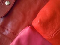
Here are comparison shots of Vermillion Red 2014, Paprika 2013, Poppy 2014
Observation:
Vermillion is definitely red, just looks orangey beside the red-orange shades
Poppy is slightly darker (maybe just a shade darker) than Paprika. Both are red-orange. So hard to tell when they are not together, and also on photos. You can only see the difference when they are side by side, in person or when photographed with flash.
these are great, thx!
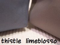
Mint? can someone define that one for me... see when i think mint i think a light green but it doesn't look that way when i google it nor the photo of the one i just bought... so perhaps i am just thinking the wrong shade?
Green is perhaps the lighter shade? either way both great colors just a wee bit confused lol enlighten me oh wise ones...
Mint is a dark teal
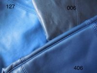
Some blue LP cuirs
blue 127
indigo 406
marine (?) 006
Oh, I didnt know 406 was Indigo too. I thought 506 was Indigo?
these are great, thx!
Oh, I didnt know 406 was Indigo too. I thought 506 was Indigo?
Yes, I think it's from spring 2014 but the years are blending together for me I specifically remember deliberating so long over buying it because I wanted something more navy, and the color name indigo made me worried that it might have a touch of purple
Mint is a dark teal
Thank you! That makes it very clear now. They honestly name their colors a bit oddly at times.
these are great, thx!
Mint is a dark teal
Oh, I didnt know 406 was Indigo too. I thought 506 was Indigo?
556 navy, 006 marine, 406 indigo, 127 blue
Thank you! That makes it very clear now. They honestly name their colors a bit oddly at times.
Couldn't agree more. Like the ones deciding on the names are colorblind. Lol
556 navy, 006 marine, 406 indigo, 127 blue
and this season's indigo for the le pliage is 683
Here.
Some more red/
Awesome comparison shots! Thank you
red 545
is red 545 the same as Dark Red? Will you happen to know whether Dark Red is darker than Cherry Red? I know Cherry Red is a blue-based red. I'm slightly confused between these two reds. Thank you in advance for sharing.
is red 545 the same as Dark Red? Will you happen to know whether Dark Red is darker than Cherry Red? I know Cherry Red is a blue-based red. I'm slightly confused between these two reds. Thank you in advance for sharing.
545 is rouge red for the cuir and I would consider it dark red. Cherry is brighter, closer to vermillion (but cherry is more blue).
545 is rouge red for the cuir and I would consider it dark red. Cherry is brighter, closer to vermillion (but cherry is more blue).
Thank you! That is a great help!

Couldn't agree more. Like the ones deciding on the names are colorblind. Lol
+1

Register on TPF! This sidebar then disappears and there are less ads!