These threads are archived as part of our reference library, therefore please only post scarves on this thread from the season in the title. If you are not sure, please do a search or ask in the ID this scarf thread before you post. 
TPF may earn a commission from merchant affiliate
links, including eBay, Amazon, and others
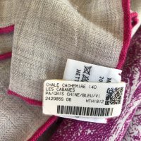
As promised! CW #6 - gris chine/bleu/violetDear Scarfies, if somebody has Les Cabanes, pls share photos with me
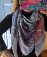
Beautifully shown...I would never guess that it is the same scarf!! I think it looks wonderful on you but you have to feel that way to wear it!!! Thanks for taking the time to share!Dearest ladies and gents, here is La Foret in CW13 vert/fuschia/jaune. I don't think it's been shown on this thread yet. It is BRIGHT as all get out! And the variety of colors gives very different looks. It's wonderfully stimulating to look at but doesn't suit my coloring or wardrobe, I'm afraid. However it might be just the thing for lovers of tropical brights!
View attachment 4322221
Oh my. These are my colors! I was complaining about the use of repetitive color families early this season, but I'm drawn to this particular colorway like a moth to flames. Every single scarf I see in the Paradise color family is so beautiful to me and different enough that I keep telling myself it's worth adding yet another! So far, my list includes: SaP, dragons et zouaves, and l'Art do bojagi.Dearest ladies and gents, here is La Foret in CW13 vert/fuschia/jaune. I don't think it's been shown on this thread yet. It is BRIGHT as all get out! And the variety of colors gives very different looks. It's wonderfully stimulating to look at but doesn't suit my coloring or wardrobe, I'm afraid. However it might be just the thing for lovers of tropical brights!
View attachment 4322221
Ahhh yessss, that’s my dream too, Caducée in purple would be absolutely perfect! So fitting for the design IMO. Sadly I don’t think we should get our hopes up for a purple one, don’t believe any of the other men’s scarves are in that colour.Below reposting the CW families for the men. It seems we’ve seen the one for Orange (the orange/marine) and the one for Gris/Rouge (the gris/noir). The other two I’m not quite sure about: based on the pic the cobalt/marine could fall either in Ciel or Marine, based on the name the last one (but the h.com pic seems off from the below pic?). The greenish one I would place under the Kaki, but it could also be Acide. So maybe we are missing the Ciel and Acide ones? But can see them do it in red too, to not have two blues. As a purple one is off the table (unless H surprises us), I’m keeping all my fingers crossed for a yellow Caducée, (just like the second one from the top, in the Acide family).
View attachment 4322145
(Excuse my rambling, as you can tell I’m a bit obsessed.Hope to hear from my SA tomorrow.)
")
I agree with Bunny that the lime green is striking. The grayish/black design overlay tones it down. Blue you can get anytime, more or less, but not lime. Lime is supposed to be a big color this year, too.I wonder which caducee rock I should get. I have this one currently. I’d like one where the pattern shows up more, but I don’t think the bright ones will match enough in my wardrobe. Perhaps CW 04?
View attachment 4321458
I am very new to Hermes scarves, so the only season I can comment upon is SS19. I cannot wait for Sweet Dreams to appear on the US website, as I love the artwork of Jan Bajtlik, even though it is considered a scarf for men. I have Animapolis in cw 01 with the black hem and it is so much fun! I also have Jungle Love in the blue noir and rose vif. I am also patiently awaiting the new Maori scarf, Kawa Ora, and I might spring for A L'Ombre Des Pivoines in pink if it ever reappears online. Well, that's my take on this season's offerings, anyway.
 You speak just like a seasoned tpfer!
I am similar Fugutive Rouge! i adore vivid bright high contrast colors and scarves. It’s truly a gorgeous scarf tied, and people are drawn to it when I’m out and about. It sold out fast on H.com US first round, of course it’s worth adding another, just because it is in the same color family doesn’t mean it’s the SAME!Oh my. These are my colors! I was complaining about the use of repetitive color families early this season, but I'm drawn to this particular colorway like a moth to flames. Every single scarf I see in the Paradise color family is so beautiful to me and different enough that I keep telling myself it's worth adding yet another! So far, my list includes: SaP, dragons et zouaves, and l'Art do bojagi.

They're stonewashed, no? ThSo they just threw em in the washer for a few cycles and and told their costumers how it's a new vintage worn feeling
What's next, color bleed and pre-stained?
I do think they did a better job with the "color families" this season compared with previous, but the "families" are still too similar to each other and there's not much color variety in many designs. Animapolis was such a breath of fresh air in that regard. I get the impression H is "going all out" on color and detail in just a couple of designs each season, to keep connoisseurs interested, and leveraging the "color families" and "less detailed / fewer colors" scarves to fill out the line in an economical manner. Perhaps I'm feeling overly cynical today. I do own and love some of the "simplified" scarves. But I did find this season that although my initial wish list was huge, much of it was repetitive in some way, so it wasn't as hard as I thought to get my list down to the very few I would actually purchase. ETA: I do like the re-issuing of "un-messed-up" vintage designs (Perspectives, Equateur....) and hope that will continue.I’m curious overall what everyone thinks of SS19 for scarves? Im having mixed feelings.
They're stonewashed, no? Th
ey threw them in the washer for a few cycles with some gravel and told their customers it's a new vintage feeling.
(If anybody wants a reason not to buy stonewashed, they use up more energy than non-stonewashed).
I wonder what would happen if anyone threw a silk twill scarf in the washer with some gravel. Would the fabric get the sueded feel?
My first washed scarf is on its way to me. Muted/soft is great for me so I have high hopes, we shall see! I'm hoping this format will be great for casual wear.I can only wear crisp colors and clear tones. Anything even slightly muted or faded makes me look rumpled and washed out. I admire those who look so chic in the washed scarves. It’s been a real bummer for me this season & last to see all the gorgeous reissues that I would love to have in same colors - but NOT washed. At least it has seriously curbed my spending [emoji3]