Hermes in print

TPF may earn a commission from merchant affiliate
links, including eBay, Amazon, and others

Nadège Vanhée on Her First 10 Years at Hermès: “I Never Look Back”​

By Nicole Phelps
June 6, 2024

Nadège VanheeCybulski for Vogue by OK McCausland in New York NY on June 5th 2024.

Nadège Vanhee, in NYC. Photographed by OK McCausland

Nadège Vanhée left New York for Paris 10 years ago. She was a design director at The Row when Hermès called with the kind of offer you don’t say no to: the artistic director of women's ready-to-wear. A decade later, though, the city still has its hooks in the French designer—once a New Yorker, always a New Yorker, as they say.
This week Vanhée is back in town to present a new collection—not resort, to be clear, but a sort of part-two of the fall collection she showed in February. “I have a special connection with New York,” Vanhée said at a makeshift studio on the west side, and “when I did this second chapter I felt it was relevant to show it here because it’s the perfect blend between a French and an American girl.”
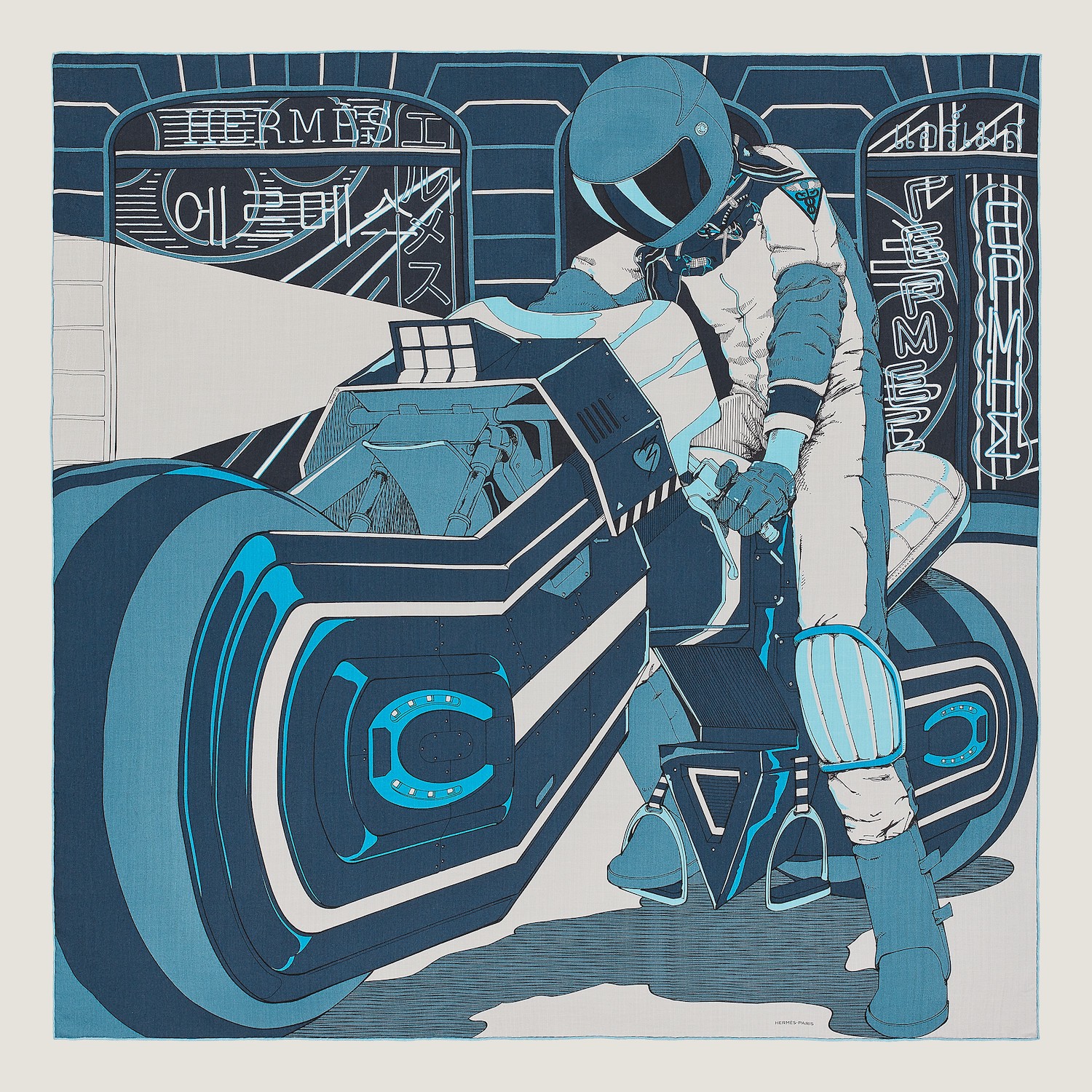
The fall show—part one—was dedicated to horses and motorbikes, and it was the sexiest show of her Hermès tenure: lots of fitted leather and flashes of race car red. Tonight’s show isn’t an anniversary collection; still, her New York visit was cause for reflection. “I remember when I met Axel [Dumas, the executive chairman of Hermès], I said I really want to make the coat as relevant as the Birkin bag, and I think today we have customers who really discover the brand through the ready-to-wear, and that’s something which is quite exciting.” She took a break from fitting that ready-to-wear to talk mentors, the women role models who’ve led Hermès in the past, and how she maintains the house’s “attractive aura.”

On the allure of the Hermès creative director role:
I wanted to go to a house with really strong roots, which had strong stability. It was important for me; working for The Row, working for Celine, we were really at the beginning of something. I had to give a lot, because they were really starting their DNA. There was a strange feeling of going back to something familiar but at the same time super distant to me, because I hadn’t been there in years.

On what she learned at her jobs pre-Hermès:
Mary-Kate and Ashley? The sky’s the limit, the studio was very young and they showed me that if you want to do it, you do it. Especially coming from France where everything is ‘not possible’, it was nice to have the freedom of trying. Celine: the quest of working on a very strong assertive woman. I think what I learned from Martin, I remember one of our first meetings and he was like, [scoffs], ‘those archives.’ And I was like, ‘come on, Martin…’ and he said: ‘I don’t want to see anything from previous collections.’ And I think this has been imprinted on me: you look ahead, but you don’t ignore what you did and you also don’t give up your ideas.

On the designers who preceded her at Hermès:
Jean Paul Gaultier had a lot of freedom at the house. He was really experimental, he tried to expand the scope of the silhouette while still playing with ideas like fetishism. Martin Margiela before Gaultier was a sort of chiropractor or osteopath. The house had gone in every direction and he really helped to consolidate the fundamentals. And with Christophe Lemaire [her immediate predecessor], I didn’t want to look too much. Lemaire, Gaultier, and Margiela—they really brought their brand to the house and I really wanted to be more like a searcher. For me it was easier to go back to the first silhouettes that were designed in the ’20s and ’30s, and the work of Lola Prusac and Catherine de Karolyi. I naturally looked more toward the women who designed for Hermès. When you flick through the archives, lots of women have given a strong imprint to the house, even though the first clothes designed for women were men’s adaptations.

On being a woman designer:
Gender is tricky. When you’re a writer, you can write a female character if you’re male. I always get annoyed when we have to justify. It was Rebecca Solnit [the author of Men Explain Things to Me] who said that too: why do we have to justify anything? Yes, equality is great, but it doesn’t make me a better designer because I’m female. I do see this conversation about women designers happening. But women voting was like what 80 years ago [in France]. I mean, women having bank accounts in France only happened in the ’70s. What I see in fashion is just a reflection of that. There is a lot more to do.

On function over form:
The house is really about transmission. You acquire something and know you’re going to wear it and know you’re going to transmit to your children. There’s also this idea of anchor. People feel this is a stable object. I see lots of models, and they walk in with a vintage shirt from Hermès, and they say, ‘oh, I bought it in a vintage store,’ or ‘I got that scarf from my mom’ and they recontextualize it. There’s this Hermès motto: designing objects that really help the user everyday, this concept of being functional. And I think when you think about functionality, you’re always relevant.

On never looking back:
I don’t look back. I like to look ahead. There’s always things that we haven’t resolved and you push them further. Over these 10 years, you can definitely see an evolution in the silhouette. It has sharpened, but it’s playful and quite empathic. There’s a lot of different women who are quite fond of the collection and you put them in a room and they don’t look alike.

On what today’s show resolves:
It’s really the styling, the connection with the different metiers of the house: the jewelers, the accessoires, the hat, the scarf. We have different creative directors: Clémande [Burgevin Blachma, Fashion Accessories], and of course Pierre Hardy [Artistic Director of the shoe and jewelry collections]. There’s this great synergy. It’s not just the ready-to-wear. It’s a very interesting moment for Hermès, I think we have the right people at the right place.


Pierre Hardy, Creative Director Of Hermès Jewelery On The New High Jewelery Collection​

Pierre Hardy explores the complexities and intricacies of color in the new Hermès high jewelry collection.

image_provider

Photo: Hermès

Hermès needs no introduction — synonymous with luxury and heritage, the brand has cultivated a cult-like following since the 1830s, when it was founded. Since then, the French Maison has become known for its luxe leather goods and bags, along with those vibrant scarves that have become a signature of the brand.

Most recently, Hermès celebrated a new launch in Paris, revealing a brand new high jewelry collection yesterday. Designed by French visionary Pierre Hardy, the line is described as one that reflects “the stages of an eclectic and radiant odyssey”, encompassing varying geometric shapes in radiant colors and precious stones including diamonds, sapphires, rubies, and many more.

Speaking about the collection, creative director of Hermès Jewelry, Pierre Hardy shared the intricacies behind the pieces in the chapters of the new Hermès haute bijouterie collection. “I wanted to find a way to express this fundamental phenomenon — of color, at Hermès — and build a strong, autonomous and independent identity,” he explained.

image_provider

Photo: Hermès

Below, excerpts from his conversation.

What is the theme of this collection?
Color! This collection asserts the goal of inventing a vocabulary that moves away from the house’s recognizable shapes. A vocabulary of emancipation that embraces a certain sense of freedom, and involves jumping over obstacles, to use an equestrian image. This collection expresses color in shapes. I wanted to find a way to express this fundamental phenomenon – of color, at Hermès – and build a strong, autonomous and independent identity.

Can you identify the origin of this experimentation with color?
I learned about the theories of color during my art degree, and I re-immersed myself in them with passion and method to develop this collection. This theoretical study develops a hierarchy of color (primary, secondary, tertiary), envisaging their relationships, their complementarities, their temperature, etc. Some pieces are based on these theories and lead to more narrative explorations. I like to start with something that is quite strict, defined and rigorous in structure, and then organize the diffraction from it. The combination of a color and a shape sets the mind thinking: if red is square, what is that square saying? If yellow is triangular, the mind could fleetingly visualize the symbol on a superhero’s outfit, for example, or it could be linked to other memories, such as of a work of art, an album cover, a piece of architecture, or a feeling.

image_provider

Photo: Hermès

How does this complexity relate to the world of Hermès?
The house can create a whole variety of symbols, revisit its original shapes – the ring and bar clasp. the Chaîne d’ancre, the Kelly and Birkin bags – and open up other avenues. It’s precisely this eclecticism that defines the identity of the collection, in which the aim has been to consider the way in which color is applied to the body, a little like make-up, to explore the images of color ingrained in my mind, or to focus on the history of jewelry. I wanted to combine all this, to make it contemporary and “Hermes”, by seeking out as much of the wonder generated by color as possible – the kind of wonder tinged with astonishment we might feel, for example, when a black and white film is colorized.

Color at Hermès is not an isolated notion…

Color is very much in evidence at Hermès: there is even a color library for silk that contains almost 75,000 references. Paradoxically, this is the first time in the houses history that such a wide variety of stones has been used in haute bijouterie: we have emeralds, rubies, sapphires and diamonds, ie. green, red, blue and white. Color is a natural resource on which we can draw infinitely, and I wanted to explore the whole spectrum! In addition to precious stones, we have also used semi-precious stones to give us a broader, more precise palette. High-quality jeweling and stone-setting then produced subtle color gradients. The work of the jeweler is an almost supernatural, magical transformation from one substance to another that involves organizing a series of shifts from one universe to another: from sketches on paper to objects in stone and metal, from the theoretical to the ornamental, from a two-dimensional representation to a three-dimensional piece.


image_provider

Photo: Hermès

There’s an abundance of joyous pieces in this collection
I wanted to express a lot of ideas at the same time. It’s possible to want some quite different things all at once. However, I wasn’t trying to use color to unite a range of heterogeneous objects. Quite the opposite, in fact. The exploration of color has produced extremely rich and extraordinarily diverse results. Rather than stifling this diversity I wanted to pay tribute to it and give it every opportunity to resonate and flourish. I have not sought to restrict, but rather to allow.


Kendall Jenner and Gigi Hadid Rode Across the Place Vendôme in Hermès for Vogue World: Paris​


Image may contain Helmet Clothing Glove Person Teen Adult Footwear Shoe Animal Horse and Horseback Riding

Pascal Le Segretain/Getty Images

On Sunday night, two of Vogue’s very favorite horse girls, Kendall Jenner and Gigi Hadid, made a thunderous appearance at Vogue World: Paris, flying the flag for equestrian sports.
During the portion of the evening inspired by 1950s fashion, models streamed down the catwalk in riffs on Dior’s iconic Bar jacket—a piece reminiscent of the jackets worn by riders in show-jumping competitions (dressage, too, though theirs are longer)—as well as other equestrian-inspired looks by Balmain, Thom Browne, Jean Paul Gaultier, Maison Margiela, and more. Close on their heels were Jenner and Hadid—both riders and horse lovers since childhood—who crossed the iconic Place Vendôme on horseback, dressed in jackets, pants, and boots from Hermès’s fall 2024 collection.


Their Andalusian steeds, seven-year-old Django (the dark one) and nine-year-old Napo (the gray one), were also outfitted by the French fashion house; just take a look at their bright orange saddle pads, matching wraps, and blankets made of scarves. (Of course, dressing horses and riders is very much in Hermès’s wheelhouse; its original business, established by Thierry Hermès in 1837, produced bridles and carriage harnesses, introducing saddlery in the 1880s. Other leather goods—and clothes—would come a bit later.)


At a rehearsal for Vogue World: Paris on Saturday, Jenner and Hadid had the chance to meet their mounts before the big show and learn a little about their backgrounds. Both horses come from Évreux, a picturesque commune in Normandy, where they live in a barn near a cabaret called Le Manège de Tilly. Its creator and manager, Frederic Mouquet, has raised and trained both horses since they were three and uses them in performances once or twice a month. That regular experience with noise and big crowds made them a good fit for the fashion circus of Vogue World: Paris—not to mention the fact that Valérie Chavanon, a longtime trainer and animal coordinator who served as a consultant for Sunday’s event, had previously worked with Napo on a Dior commercial. (Mouquet has called Napo “brave,” while Django is more “cheeky.”) Parfait.

Image may contain People Person Adult Clothing Glove Accessories Bag Handbag Helmet Footwear Shoe Hat and Animal


High Jewelry Shines During Paris Couture Week​

Hermès embraced color, Piaget went for texture and Boucheron used technology to capture ocean waves.

A collar of black beads and clear beads; in the center is a triangular diamond from which extends five rows of colored beads.

The Hermès Supracolor necklace, featuring a triangular centerpiece with a cascading, rainbow-like fringe of beads, bears a striking resemblance to the cover artwork of Pink Floyd’s 1973 album “The Dark Side of the Moon.”Credit...Guido Mocafico

The fall couture shows in Paris, which ended Thursday, were held earlier than the usual July dates to avoid clashing with preparations for the Olympic Games, but the season still offered some Parisian high jewelry houses a chance to shine brightly.

Their presentations capped a series of glamorous events around Europe, as several houses continued the trend of taking high jewelry debuts on the road: Bulgari showed in Rome; Cartier in Vienna; Chanel in Monaco; Dior in Florence, Italy; and Louis Vuitton in St.-Tropez, France.

In Paris, the 67-piece Hermès collection, Les Formes de la Couleur (the Shapes of Color), was the largest the house had produced — and arguably its most playful. A freestyle brushstroke, for example, was rendered as a mono-earring called Fresh Paint, with green tsavorite garnets simulating pigment.

And while the house has nearly 75,000 shades in its silk color library, the collection was the first time it had used so many primary colors and rainbow palettes for jewelry.

A long curving earring of green gems edged in yellow gold.

The Hermès collection included a freestyle brushstroke rendered as a mono-earring with green tsavorite garnets.Credit...Guido Mocafico

“It took us a long time to do a lot of diamonds and colored gemstones,” said Pierre Hardy, the creative director of Hermès jewelry since 2001 and of high jewelry since its introduction in 2010. “With leather, silk and makeup, one sees how color informs the world of Hermès, but for jewelry we’d never experimented with that kind of mix before.”

The designer described his creative process as “liberating color from minerality, cuts and facets to let it be more supple, almost liquid or diffuse, like makeup on the body.”

Cultural touchstones provided an unexpected source of inspiration, too. In the Supracolor necklace, for example, five strands of black and gray spinel beads were anchored by a triangular centerpiece featuring a 1.1-carat diamond set in rutilated quartz and surrounded by baguette diamonds, with a cascading, rainbow-like fringe of beads in white, orange and gray moonstone, chalcedony, chrysoprase, rose quartz and pink tourmaline. Mr. Hardy acknowledged that it bore a striking resemblance to the cover artwork of Pink Floyd’s 1973 album “The Dark Side of the Moon.”

“It’s a real exercise to look at pop culture on the one hand, and something scientific on the other, and turn it into something ultra-precious,” said Mr. Hardy, who also used color to revisit signatures such as its Kelly bracelet, offered in a white-gold version fully pavéd with gemstones.

A bag that is white gold at the top; the rest, including the strap, is fully covered in purple, blue, yellow and orange gems.
The Hermès Birkin bag was replicated in white gold, diamonds, spessartites, aquamarines, amethysts and pink, blue and yellow sapphires.Credit...Guido Mocafico

Even the house’s celebrated Birkin bag was rendered as a small but fully functional jeweled bag in white or yellow gold that had been worked to mimic crocodile leather and then encrusted with nearly 3,000 diamonds, spessartites, aquamarines, amethysts and pink, blue and yellow sapphires.


Mysterious Rider

A pocket watch with a contemporary steel horse (motorbike) and rider by Dutch graphic designer Viktor Hachmang interpreted in champlevé enamel.

Slim-Hermes-Pocket-Mysterious-Rider-1.jpg


Hermès has a talent for infusing a light-hearted and contemporary touch into its beautifully crafted luxury products. As a brand that started life as a purveyor of the finest quality saddles and harnesses in Paris in the mid-19th century, equestrian motifs abound at Hermès. The latest Slim d'Hermès Pocket Mysterious Rider watch features a champlevé enamel cover depicting the figure of the Mysterious Rider created by Dutch illustrator and comic book artist Viktor Hachmang for an Hermès scarf. While the equestrian motif might not be as evident as in other editions, motorbikes are sometimes called steel horses. The pocket watch shares the elegant lines of Philippe Delhotal’s Slim d'Hermès case and is powered by an ultra-slim micro-rotor movement.


Once again, Hermès borrows a design initially destined for one of its famous Carré Hermès silk scarves and translates it into the miniature realm of watchmaking employing different métiers d’art. We’ve seen several examples of this crossover from scarf to dial with the Arceau Mon Premier Galop, the delightfully festive dials of the Arceau Costume de Fête, and the contemporary comic book heroine on horseback dial taken from Ugo Bienvenu's Wow scarf.

Last year, Hermès released a Slim d’Hermès pocket watch decorated with horsehair marquetry inspired by Thai designer Terawat Teankaprasith’s Masan & Masan silk scarf. The new Slim d’Hermès Pocket Mysterious Rider adopts Viktor Hachmang’s unique graphics that combine Japanese art with comic-book pop culture.


The cover is brought to life with champlevé enamel. This demanding métier d’art involves carving small cells into the metal, filling them with coloured glass powders mixed with natural oils and firing them several times in a kiln at over 800ºC to fix the pigments. Using a palette of red, white, and blue enamel, a helmet hides the biker’s face and head as he holds the handlebars of a futuristic motorbike. Naturally, he is wearing an Hermès scarf with touches of red to match his riding gear and helmet. Geometric patterns in a steel grey colour are used for the motorbike and the stone façade in the background, which is the storefront of Hermès’ flagship boutique in Paris on 24 Faubourg Saint-Honoré.


Opening the protective cover reveals the refined white enamel dial with hand-painted red numerals and hour markers. French graphic designer Philippe Apeloig created the typeface used for the numerals and inscriptions on the dial, giving this pocket watch a unique, contemporary and highly refined look.
Hermès creative director Philippe Delhotal’s design for the Slim d'Hermès watch is now considered a contemporary classic. The sleek lines of the Slim d’Hermès are expanded to accommodate the 45mm pocket watch, which has a thickness of 11.6mm and the crown at noon. Crafted in 18k white gold, the case features stirrup-shaped lugs over the crown to attach the Hermès Rouge H (red) alligator cord.

Slim d’Hermès Email Grand FeuThe calibre H1950, here in a wrist-sized Slim d’Hermès

Powered by the ultra-thin automatic calibre H1950, designed and manufactured by Vaucher, the movement has a thickness of just 2.6mm and relies on a micro-rotor. Beating at 21,600vph, the calibre can store 42 hours of power reserve. The bridges and rotor are decorated with an Hermès “H” pattern, and the movement can be seen through the sapphire crystal caseback
The Slim d’Hermès Pocket Mysterious Rider is a limited edition of three pieces and comes in a matte Rouge H alligator pouch. Price is upon request. For more information, please consult hermes.com.

 
Top