Scarves …..Hermès Fall/Winter 2024 Scarves…..

TPF may earn a commission from merchant affiliate
links, including eBay, Amazon, and others

AW24 Scarves So far...

Silk twill 90

18-3-7 (Geoff McFetridge) 004164S cw 02,04,05,07,08,09,10
Bagage à main (Rosa Maria Unda Souki) 004119S cw 01,02,03,04,05,06
Complication Equestre (Octave Marsal) 004148S cw 01,02,05,08,09,10,12
Èmile et une Nuit (Virginie Jamin) 004162S cw 02,03,04,06,07,08,11
Hermès Parade (Jonathan Burton) 004150S cw 01,03,05,06,08,12
Les Folies du Faubourg (Elias Kafouros) 004147S cw 01,03,04,05,06,07,08
Nous Sommes Inséparables (Florence Manlik) 004149S cw 02,03,04,06,07,08,09
Stately Wheels (Stuart Patience) 004163S cw 01,02,04,05,06,07,10,11

Double Face
Caracteristick (Carine Brancowitz) 904165S cw 01,02,03,04,05
Guepards Bandana (Robert Dallet) 904166S cw 01,02,03,04,05
Mille Feuilles de Soie (Natsuno Hidaka) 904126S cw 01,02,03,04,05


Forever Collection
Eperon d’Or (Henri d’Origny)

140 Silk
Jeu des Omnibus au Tampon (Giancarlo Pagni)
Animapolis (Jan Bajtlik)


45cm Gavroche in cashmere/silk
Harnais de Coeur (Daiske Nomura) 744173S cw 02,07,08,12

CSGM
Effet Kaléidoscope (Gianpaolo Pagni) 243800S cw 01,02,04,05,06,07,08
Les Roues de Phaéton Bandana (Pierre Marie) 244170S cw 01,05,06,07,08,10
Lettres Equestres (Internal Creation) 244039S cw 01,03,04,07,08,10,12
Montura de Gaucho (Antonio Carrau) 244185S cw 01,02,04,06,07,08,09
Orto Botanico di Palermo (François Houtin) 244121S cw 01,02,05,06,08,09
Sous le Charme d'Orphée (Alice Shirley) 244177S cw 01,03,04,06,08,09,11

CSGT
Coup de Fouet Chemise (Florence Manlik) 364172S cw 01,02,03,04,05,06
Jungle Love (Robert Dalett) 361876S cw 01,03,04,05,07,08,09
Tulipomanie (Aline Honore) 363964S cw 02,03,04,06,08,11,12

Men’s
100 cashmere/silk

Cheval au Carré (Pierre Charpin) 104131T cw 02,03,04,06,10
Hermès metallique (Viktor Hachmang) 104145T 11 cw 11,13,17,18,19
Roaaaaar! (Alice Shirley) 103957T cw 01,03,05,06,09
Ronds de Marche (Hubert De Watrigant) 102730T cw 01,08,09,14,15

Twilly
In the Pocket (Leigh Cooke)
Guepards
Grand Apparat
Cavalier en Formes
Hermes en Parade
Nous sommes inséparables (Florence Manlik)
Guepard Bandana Franges Cuir

45cm Gavroche
Precious Paradise (Katie Scott)
Becanes
La Berline Bayadère (Wlodek Kaminski) 743864S cw 01,03,04,06,07,08

55cm Bandana

70cm Vintage Silk

Candy Libris (Daiske Nomura) 984151S cw 01,02,04,05,06,09
Faubourg City (Baptiste Virot) 984125S cw 01,02,03,04,06,07,08
I Like Flowers (Leigh Cooke) 984167S cw 01,02,03,04,06,07,11
Palonniers (Hugo Grygkar) 981071S cw 01,05,07,09,10,11,12
Pêle-Mêle Sellier (Thibaut Huchard) 984123S cw 01,04,07,09,11


Men’s (random format)
Roaaaar (Alice Shirley)
Promenade au Faubourg
 
Thank you all for your thoughtful comments and insights 😍🙏 You are all so wonderfully kind and I appreciate your thoughts and remarks a lot!

I will take some more time to decide if this shawl is the one for me, and your considerations are really helpful!


Thank you @Hanton, the black and white is indeed softened considerably by the grey shading in the flowers! It is not as stark as a pure white and black cw.

You are welcome @BagsRGreat and thank you for your kind comments. There is a lot of ivory in this design for sure. I will try it out with an ivory jumper to see ( I have no anthracite).


Thank you @Ashanti_Rose! On me it certainly wears less easily then the navy cw. I did try the red and it was very beautiful, but as you said, way to similar to my 90 silk and a red Bal de soie triangle with almost the same colours 🫣


thank you @Redbirdhermes. Interesting what you say about the scarf covering up the coloured sweater. I hope you find a cw you love. I think the vermillion might be beautiful on you…


Thank you @JulieKat! I see what you mean with the stronger lip. Another scarfie suggested the same! I never wear bold lipstick because I am reapplying lip balm all day but I could search for stronger lip balm colors perhaps…. I do tend to balance things out with stronger eye makeup though.


Thank you @Smae-ze! Yes, the grey is not easy on me… irl it is better because my eyes are greyish green, so it balances out more…


Thank you @SilkCouture, you are so nice. I really love the black and white shawls too. I think you have more contrast than me so it might be easier for you? The Tulipomanie has a lot of grey shading in the tulips, which I like, but judging the photos @EtsyBoss shared earlier, I think the Sous le charme d’orphee has the most crisp black and white contrast. Also, the hem on the Tulipomanie is a dark blue (stunning imo), not black. So it is technically not completely black and white I guess…

View attachment 6065158


Thank you @Marie-the-Mary 😊 good luck with your wallet 😂
I think the triangle is gorgeous! I so love the shading grays in it (over too much black). So glad they did the grays. I think because it has all the grays then it works more on you than stark b/w.

I think we have a scale of 1-10 of what looks good on us. Not 1-10 from bad to good. But a 1-10 on what looks good. Those 9 ,10’s are where people see you and say wow you look amazing. Your face glows. You light up. All those adjectives. And all of our scarves can’t all be 10’s can they. Or can they on the orange slope :thinking: .
Sometimes we just love a design in a certain colorway. Or even love a color in a silk, and it’s not a 10 color on us. And we all can still make it look best on us with color tops and lippie and styling. And maybe it’s only a 1 or 2 looking good on us. That is ok if we love the scarf and makes us happy. The scarf is gorgeous. I don’t think it looks bad at all on you.
I will also add, I am not sure you would get a low cost per wear. A winter season who wears a lot of black, white, gray, white and clear bright colors would get a very low cost per wear. Business woman with this elegant add on, chefs kiss. Dark hair, white/gray hair too.
But as someone said, if you arent 100% sure from when opened it and didn’t gasp with love then I say return.
Sorry so long! :blush:
 
Hello dear all,

I received a third cashmere triangle from this season ( I already purchased the green and black jungle love and the chocolate Coup de fouet Chemise). I love the format 😍

I really love Tulipomanie, but struggle with the cws. I returned the navy because it was very very similar to my La Selle Imaginaire, and I am not very keen on the white hem…

I found the black and white version very modern and decided to give it a try. I think this cw is stunning, but it is very different from what I usually wear and I wonder if I can pull it off with my haircolor…. It does fill a real gap for me in the cashmere department though…

I would love to hear your honest opinions 😊 (I already concerted with a very lovely scarfie who gave me some much appreciated advice 😍).

Thank you !!!

View attachment 6064409View attachment 6064410View attachment 6064411View attachment 6064412
I love the colourway but would personally only wear it with a black, white or charcoal grey outfit. If you need more flexibility I’d skip it. If you would wear it with that palette I think it’s beautiful.
 
I think the triangle is gorgeous! I so love the shading grays in it (over too much black). So glad they did the grays. I think because it has all the grays then it works more on you than stark b/w.

I think we have a scale of 1-10 of what looks good on us. Not 1-10 from bad to good. But a 1-10 on what looks good. Those 9 ,10’s are where people see you and say wow you look amazing. Your face glows. You light up. All those adjectives. And all of our scarves can’t all be 10’s can they. Or can they on the orange slope :thinking: .
Sometimes we just love a design in a certain colorway. Or even love a color in a silk, and it’s not a 10 color on us. And we all can still make it look best on us with color tops and lippie and styling. And maybe it’s only a 1 or 2 looking good on us. That is ok if we love the scarf and makes us happy. The scarf is gorgeous. I don’t think it looks bad at all on you.
I will also add, I am not sure you would get a low cost per wear. A winter season who wears a lot of black, white, gray, white and clear bright colors would get a very low cost per wear. Business woman with this elegant add on, chefs kiss. Dark hair, white/gray hair too.
But as someone said, if you arent 100% sure from when opened it and didn’t gasp with love then I say return.
Sorry so long! :blush:
+1 to all of this. Very well articulated, @Nomad!

@redheaddem I’ll add to the confusion by saying that I personally like it best on you with the red, with the very soft grey a close second. Both are wonderful winter (season, not the colour theme!) looks and I can just imagine you walking through snow covered pines, or decorating a tree for Christmas in either of these outfits and looking divine. It would be stunning with a simple black, or neutral business dress, or a soft and cosy sweater dress in grey, camel or any soft neutral. It’s a very elegant and refined shawl on you and there’s something very peaceful about it. Of course, the only thing that matters is how much YOU love it.
If lip colour is an issue with frequent lip balm applications, you could try a lip stain? I have the same challenge and adore my peripera ink velvet stains. Start with a lip balm first, and they don’t dry the lips out anywhere near the way ‘long wear’ lipsticks tend to.
 
Hello dear all,

I received a third cashmere triangle from this season ( I already purchased the green and black jungle love and the chocolate Coup de fouet Chemise). I love the format 😍

I really love Tulipomanie, but struggle with the cws. I returned the navy because it was very very similar to my La Selle Imaginaire, and I am not very keen on the white hem…

I found the black and white version very modern and decided to give it a try. I think this cw is stunning, but it is very different from what I usually wear and I wonder if I can pull it off with my haircolor…. It does fill a real gap for me in the cashmere department though…

I would love to hear your honest opinions 😊 (I already concerted with a very lovely scarfie who gave me some much appreciated advice 😍).

Thank you !!!

View attachment 6064409View attachment 6064410View attachment 6064411View attachment 6064412
This cw doesn’t support your glowy radiance, it’s too cool and icy and a bit dull. The design deserves more color IMO. I have one Gris chine, dark blue CSGM when I thought I needed a neutral shawl and despite my love for the design, don’t wear it often.
 
... still traveling, so excuse the not quite flattering photos. Though wished to finally share sth. and contribute, too:
- DH's and the lovely SA's choice: Lettres Equestres cw 08 blanc / vert / rouge H244039S 08

(IMO these parts with "quite a bit hard /cool toned" and bright shades of yellow, green, red and this shade of blue are rather not what I would choose primarily - though) my beloved Darling-DH looked so happy and so proud and he really liked the design:
It will always be a very dear to me and a very happy shared memory :love:
and I really do like the black beige colour parts on the (wool)white background ...

(Tried the enchanting Roaaar in chartreuse - unfortunately much too much darker and medium browns when tied for my taste/complexion
and the Colours of the beautiful Carré 90 18-3-7 - vert anthracite / kaki / orange - looked so lovely IRL when flat
that I got very excited - and then - around my neck - this design did nothing, really absolutely nothing on me.)
 

Attachments

  • IMG_3718.JPG
    IMG_3718.JPG
    147.4 KB · Views: 83
  • IMG_3717.JPG
    IMG_3717.JPG
    177.4 KB · Views: 83
  • IMG_3714.JPG
    IMG_3714.JPG
    161.3 KB · Views: 83
Lettres Equestres cw 08 blanc / vert / rouge H244039S 08

here photos of the IMO "rather a bit hard /cool toned" and bright shades of yellow, green, red and this shade of blue parts...
 

Attachments

  • IMG_3720.JPG
    IMG_3720.JPG
    150.7 KB · Views: 58
  • IMG_3716.JPG
    IMG_3716.JPG
    157.8 KB · Views: 56
  • IMG_3715.JPG
    IMG_3715.JPG
    195.7 KB · Views: 57
  • IMG_3719.JPG
    IMG_3719.JPG
    150.9 KB · Views: 58
  • IMG_3714.JPG
    IMG_3714.JPG
    161.3 KB · Views: 56
I think the triangle is gorgeous! I so love the shading grays in it (over too much black). So glad they did the grays. I think because it has all the grays then it works more on you than stark b/w.

I think we have a scale of 1-10 of what looks good on us. Not 1-10 from bad to good. But a 1-10 on what looks good. Those 9 ,10’s are where people see you and say wow you look amazing. Your face glows. You light up. All those adjectives. And all of our scarves can’t all be 10’s can they. Or can they on the orange slope :thinking: .
Sometimes we just love a design in a certain colorway. Or even love a color in a silk, and it’s not a 10 color on us. And we all can still make it look best on us with color tops and lippie and styling. And maybe it’s only a 1 or 2 looking good on us. That is ok if we love the scarf and makes us happy. The scarf is gorgeous. I don’t think it looks bad at all on you.
I will also add, I am not sure you would get a low cost per wear. A winter season who wears a lot of black, white, gray, white and clear bright colors would get a very low cost per wear. Business woman with this elegant add on, chefs kiss. Dark hair, white/gray hair too.
But as someone said, if you arent 100% sure from when opened it and didn’t gasp with love then I say return.
Sorry so long! :blush:
@Nomad I absolutely agree with you. Also, when "we" comment on the forum whether this or that looks good or not, we do not have the full picture to consider. Frequently, we "cut" off the eyes from out mod shots, which are a big part of how one or the other scarf will look. Makeup, clothing, occasion - also plays a huge part in what we will end up wearing of not. So as you rightfully pointed out - everything should be taken in the context. I love your "cost per wear" mention - I frequently think of my shawls/scarf just the same!
 
Hello dear all,

I received a third cashmere triangle from this season ( I already purchased the green and black jungle love and the chocolate Coup de fouet Chemise). I love the format 😍

I really love Tulipomanie, but struggle with the cws. I returned the navy because it was very very similar to my La Selle Imaginaire, and I am not very keen on the white hem…

I found the black and white version very modern and decided to give it a try. I think this cw is stunning, but it is very different from what I usually wear and I wonder if I can pull it off with my haircolor…. It does fill a real gap for me in the cashmere department though…

I would love to hear your honest opinions 😊 (I already concerted with a very lovely scarfie who gave me some much appreciated advice 😍).

Thank you !!!

View attachment 6064409View attachment 6064410View attachment 6064411View attachment 6064412
I LOVE it on you! I think if you wear it with all black outfit - i will look especially elegant!
 
I think the triangle is gorgeous! I so love the shading grays in it (over too much black). So glad they did the grays. I think because it has all the grays then it works more on you than stark b/w.

I think we have a scale of 1-10 of what looks good on us. Not 1-10 from bad to good. But a 1-10 on what looks good. Those 9 ,10’s are where people see you and say wow you look amazing. Your face glows. You light up. All those adjectives. And all of our scarves can’t all be 10’s can they. Or can they on the orange slope :thinking: .
Sometimes we just love a design in a certain colorway. Or even love a color in a silk, and it’s not a 10 color on us. And we all can still make it look best on us with color tops and lippie and styling. And maybe it’s only a 1 or 2 looking good on us. That is ok if we love the scarf and makes us happy. The scarf is gorgeous. I don’t think it looks bad at all on you.
I will also add, I am not sure you would get a low cost per wear. A winter season who wears a lot of black, white, gray, white and clear bright colors would get a very low cost per wear. Business woman with this elegant add on, chefs kiss. Dark hair, white/gray hair too.
But as someone said, if you arent 100% sure from when opened it and didn’t gasp with love then I say return.
Sorry so long! :blush:

Thank you @Nomad, this makes perfect sense to me. I do agree that the scarf itself is gorgeous. I have a few scarves that are a 10 on me… and I have a few that don’t, but I still love them and usually find a way to make them work… but the love needs to really be there. But it is not always instant love with me. Sometimes I need some time to decide. Some of my most beloved pieces, like my vermillion Tulipomanie, I actually returned, only to regret it later and repurchase again 🫣
I love the colourway but would personally only wear it with a black, white or charcoal grey outfit. If you need more flexibility I’d skip it. If you would wear it with that palette I think it’s beautiful.
Thank you @GabrielleS. I will definitely try it out with white too!
+1 to all of this. Very well articulated, @Nomad!

@redheaddem I’ll add to the confusion by saying that I personally like it best on you with the red, with the very soft grey a close second. Both are wonderful winter (season, not the colour theme!) looks and I can just imagine you walking through snow covered pines, or decorating a tree for Christmas in either of these outfits and looking divine. It would be stunning with a simple black, or neutral business dress, or a soft and cosy sweater dress in grey, camel or any soft neutral. It’s a very elegant and refined shawl on you and there’s something very peaceful about it. Of course, the only thing that matters is how much YOU love it.
If lip colour is an issue with frequent lip balm applications, you could try a lip stain? I have the same challenge and adore my peripera ink velvet stains. Start with a lip balm first, and they don’t dry the lips out anywhere near the way ‘long wear’ lipsticks tend to.

Lol, it is funny how divergent everyone’s opinions are 😋 I am happy you are adding your two cents @Lellabelle and that you love it with the red jumper, I do to. I had to giggle when I read about me walking through snow covered pines since it hardly ever snows here anymore. But I get the picture and thank you for the nice compliment! I would definitely wear this to decorate my tree 🌲. I will look into those lip inks, I have not tried those since college be honest, but I bet they chanced a lot since then 👍
This cw doesn’t support your glowy radiance, it’s too cool and icy and a bit dull. The design deserves more color IMO. I have one Gris chine, dark blue CSGM when I thought I needed a neutral shawl and despite my love for the design, don’t wear it often.

thank you @Maedi, I appreciate your thoughts. Interesting what you say about not wearing the gris chine shawl often… I will consider this.

I LOVE it on you! I think if you wear it with all black outfit - i will look especially elegant!

Thank you @luckystar07. So nice of you!
 
Hello dear all,

I received a third cashmere triangle from this season ( I already purchased the green and black jungle love and the chocolate Coup de fouet Chemise). I love the format 😍

I really love Tulipomanie, but struggle with the cws. I returned the navy because it was very very similar to my La Selle Imaginaire, and I am not very keen on the white hem…

I found the black and white version very modern and decided to give it a try. I think this cw is stunning, but it is very different from what I usually wear and I wonder if I can pull it off with my haircolor…. It does fill a real gap for me in the cashmere department though…

I would love to hear your honest opinions 😊 (I already concerted with a very lovely scarfie who gave me some much appreciated advice 😍).

Thank you !!!

View attachment 6064409View attachment 6064410View attachment 6064411View attachment 6064412
Even though I think this greyscale is well done, I also feel this scarf design deserves some color. The other colorway I had really hoped to try was the grey and lavender one. You might try that. I think it gives the best of both worlds in that you get the some sense of a flexible neutral with the grey chine' background, but also some colors too in the flowers. My plan had been to get that one and sell my Cavalcadour Fleuri in the Grey Chine', but as soon as I realized I wasn't going to get rid of that anyway no matter if I got the grey and lavender triangle, I decided to look at the blue that I got instead. Bonus is that the grey chine' triangle will look great with black, grey, cream, and blues and still have some sense of "neutral" while also giving the flowers their due with some color.
 
... still traveling, so excuse the not quite flattering photos. Though wished to finally share sth. and contribute, too:
- DH's and the lovely SA's choice: Lettres Equestres cw 08 blanc / vert / rouge H244039S 08

(IMO these parts with "quite a bit hard /cool toned" and bright shades of yellow, green, red and this shade of blue are rather not what I would choose primarily - though) my beloved Darling-DH looked so happy and so proud and he really liked the design:
It will always be a very dear to me and a very happy shared memory :love:
and I really do like the black beige colour parts on the (wool)white background ...

(Tried the enchanting Roaaar in chartreuse - unfortunately much too much darker and medium browns when tied for my taste/complexion
and the Colours of the beautiful Carré 90 18-3-7 - vert anthracite / kaki / orange - looked so lovely IRL when flat
that I got very excited - and then - around my neck - this design did nothing, really absolutely nothing on me.)

Congratulations @Pivoine66 on your beautiful shawl. I find the cooler and brighter shades perfectly balanced with the more neutral tones of the shawl. Very elegant cw! And with a pleasant memory attached to it, what is not to love?
 
Even though I think this greyscale is well done, I also feel this scarf design deserves some color. The other colorway I had really hoped to try was the grey and lavender one. You might try that. I think it gives the best of both worlds in that you get the some sense of a flexible neutral with the grey chine' background, but also some colors too in the flowers. My plan had been to get that one and sell my Cavalcadour Fleuri in the Grey Chine', but as soon as I realized I wasn't going to get rid of that anyway no matter if I got the grey and lavender triangle, I decided to look at the blue that I got instead. Bonus is that the grey chine' triangle will look great with black, grey, cream, and blues and still have some sense of "neutral" while also giving the flowers their due with some color.
I do want to try that cw @bunnycat, if I get the chance! I think your navy is just stunning on you though!
 
I do want to try that cw @bunnycat, if I get the chance! I think your navy is just stunning on you though!
Thanks! I didn't have a navy cashmere, so it fit a spot. And once once I felt through my thoughts on the grey triangle versus my grey Cav Fleuri, well, there wasn't any need to have 2 in that sort of colorway, though it is a beauty.
 
Hello dear all,

I received a third cashmere triangle from this season ( I already purchased the green and black jungle love and the chocolate Coup de fouet Chemise). I love the format 😍

I really love Tulipomanie, but struggle with the cws. I returned the navy because it was very very similar to my La Selle Imaginaire, and I am not very keen on the white hem…

I found the black and white version very modern and decided to give it a try. I think this cw is stunning, but it is very different from what I usually wear and I wonder if I can pull it off with my haircolor…. It does fill a real gap for me in the cashmere department though…

I would love to hear your honest opinions 😊 (I already concerted with a very lovely scarfie who gave me some much appreciated advice 😍).

Thank you !!!

View attachment 6064409View attachment 6064410View attachment 6064411View attachment 6064412
I am coming in late to the chorus here @redheaddem but I think I come down with @GabrielleS and @luckystar and the other members in their opinion that the piece itself is stunning as a grey scale version and looks beautiful and elegant on black, charcoal grey etc. To me the design in and of itself is inherently elegant and painterly and not really casual in the same way the bright 90 versions are. This neutral does work with the colors, too of course, but for casual looks, I think you can find much better neutral options. I would love to see the caramel monochrome cw on you and the other colorful one (lilac) that was mentioned. I would also factor in cost per wear as @Nomad mentioned.
@Nomad I absolutely agree with you. Also, when "we" comment on the forum whether this or that looks good or not, we do not have the full picture to consider. Frequently, we "cut" off the eyes from out mod shots, which are a big part of how one or the other scarf will look. Makeup, clothing, occasion - also plays a huge part in what we will end up wearing of not. So as you rightfully pointed out - everything should be taken in the context. I love your "cost per wear" mention - I frequently think of my shawls/scarf just the same!
Even though I think this greyscale is well done, I also feel this scarf design deserves some color. The other colorway I had really hoped to try was the grey and lavender one. You might try that. I think it gives the best of both worlds in that you get the some sense of a flexible neutral with the grey chine' background, but also some colors too in the flowers. My plan had been to get that one and sell my Cavalcadour Fleuri in the Grey Chine', but as soon as I realized I wasn't going to get rid of that anyway no matter if I got the grey and lavender triangle, I decided to look at the blue that I got instead. Bonus is that the grey chine' triangle will look great with black, grey, cream, and blues and still have some sense of "neutral" while also giving the flowers their due with some color.
Dear @Ashanti_Rose , @Nomad and @bunnycat thank you for your very thoughtful and interesting remarks. I do think that "context" is a major factor and as you point out, we often just see a sliver of it, or limited options. I loved the conceptualization that not everything in our closets is a drop dead wowza item and that you can still have a range of beautiful things. An army needs not only a colonel but some soldiers too, after all! The scarf community here always makes me think more carefully about the process, so thank you all....
... still traveling, so excuse the not quite flattering photos. Though wished to finally share sth. and contribute, too:
- DH's and the lovely SA's choice: Lettres Equestres cw 08 blanc / vert / rouge H244039S 08

(IMO these parts with "quite a bit hard /cool toned" and bright shades of yellow, green, red and this shade of blue are rather not what I would choose primarily - though) my beloved Darling-DH looked so happy and so proud and he really liked the design:
It will always be a very dear to me and a very happy shared memory :love:
and I really do like the black beige colour parts on the (wool)white background ...

(Tried the enchanting Roaaar in chartreuse - unfortunately much too much darker and medium browns when tied for my taste/complexion
and the Colours of the beautiful Carré 90 18-3-7 - vert anthracite / kaki / orange - looked so lovely IRL when flat
that I got very excited - and then - around my neck - this design did nothing, really absolutely nothing on me.)
I love love love this Lettres Equestres 08 @Pivoine66 and add my congratulations to the rest! And what could be better than a piece your DH loves on you? I am always delighted when scarf delight is shared at my house :winkiss: 
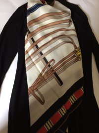
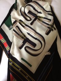
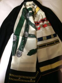
! I really love the balance of the tones on this cw and I think that despite those colors that are outside of your usual comfort zone, the overall effect is of a very elegant neutral. It was recently suggested to me, when I expressed reservations about one aspect of a shawl, that I add an accessory that honors that color. I did take that suggestion and bought a roulis bracelet in bright "jaune de naples" -- not something I would normally pick!!! and yet, it made all the difference when I wore it. It seemed to add a sense of intentionality to the outfit, if that makes sense... In any case, I love this shawl and have it on my list to look at as well now!
 
Top