F/W 2012 - Bal Intel

TPF may earn a commission from merchant affiliate
links, including eBay, Amazon, and others

Yeah, I agree, I don't like the contrast/darker stitching and zipper track. The colour looks a bit dull, but maybe prettier IRL

Crocus sure looks faded with contrast stitching & matching darker zipper track. Not sure I like it! I am so curious about cassis, looks like dark cherry in some & purple red in others.

oh yay~ finally a picture of Crocus! I don't mind a mute purple :smile1: but ya, I agree, I cannot stand a darker zipper track! Kinda disappointed..
 
Missmoimoi, would you describe the color of Cassis for me? I have had my eye on this one since seeing the swatch, thank you so much!!!!!

Hullo! I thought I would whip back to Holts before reporting back to you but it's foul out...not sure I'll venture out today. I'll rely on my short-term memory :D

When I saw photos of Cassis bags here on TPF, it looked a bit too "ash" and dull for me but I'm wrong. It's not a heavily saturated deep, dark, dramatic wine tone...but it's not pale or pastel either.

The soft smooshy leather is pigmented enough (but I suppose that could depend on bag to bag; each one might be a little different depending on how batches turned out). The leather also had enough of a sheen on it! So it's not dry or ashy.

I suppose I could say, it reminds me of Cassis wine: if you were looking through the wine glass...it's coloured with a light hand but not a water colour or a pastel. When I think of darker, sinister & dramatic wine or burgundy shades, I instantly visualize YSL Opium ads, kwim? So it's not dramatic like that. The Cassis is not muddy but it is subdued...not bright, vibrant or sharp in colour, kwim?

Personally, I will again purse rggh or perhaps the regular antique brass hardware...just don't know. For once, I could possibly pick my first silver hardware as the mini-GSH is more subtle (the larger GSH is too bright white for me personally although it's beautiful).

I think most handbag lovers are very colour sensitive, so I hope my description helps!
 
dear fionarcat is right MissMoiMoi, this description is lovely and your short term memory is perfect. Thank you so very much, I really appreciate these details and really got a good visual based on your description! You rock!


Hullo! I thought I would whip back to Holts before reporting back to you but it's foul out...not sure I'll venture out today. I'll rely on my short-term memory :D

When I saw photos of Cassis bags here on TPF, it looked a bit too "ash" and dull for me but I'm wrong. It's not a heavily saturated deep, dark, dramatic wine tone...but it's not pale or pastel either.

The soft smooshy leather is pigmented enough (but I suppose that could depend on bag to bag; each one might be a little different depending on how batches turned out). The leather also had enough of a sheen on it! So it's not dry or ashy.

I suppose I could say, it reminds me of Cassis wine: if you were looking through the wine glass...it's coloured with a light hand but not a water colour or a pastel. When I think of darker, sinister & dramatic wine or burgundy shades, I instantly visualize YSL Opium ads, kwim? So it's not dramatic like that. The Cassis is not muddy but it is subdued...not bright, vibrant or sharp in colour, kwim?

Personally, I will again purse rggh or perhaps the regular antique brass hardware...just don't know. For once, I could possibly pick my first silver hardware as the mini-GSH is more subtle (the larger GSH is too bright white for me personally although it's beautiful).

I think most handbag lovers are very colour sensitive, so I hope my description helps!
 
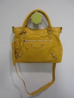
Just got this photo of Mangue Town from one of my SA's. I was hoping it would be a little deeper in color with a bit more orange undertones so it looked richer than Moutarde.
 

Attachments

  • MangueG12SHTownDetails.jpg
    MangueG12SHTownDetails.jpg
    26 KB · Views: 1,164
TMitch6542 said:
Just got this photo of Mangue Town from one of my SA's. I was hoping it would be a little deeper in color with a bit more orange undertones so it looked richer than Moutarde.

Hmmm, yea...was hoping same thing...like duck egg yolk...if it's really close to moutarde, then I'm ok to pass on it. This paves the way for Cassis :)

Am getting nervous about Rose Thulian though...it might be prettier irl.
 
Just got this photo of Mangue Town from one of my SA's. I was hoping it would be a little deeper in color with a bit more orange undertones so it looked richer than Moutarde.

Thanks very much for the photo! I too was hoping for a more intense yellow. It looks kinda sickly in this photo doesn't it?! Phew! I'm safe this season!
 
TMitch6542 said:
Just got this photo of Mangue Town from one of my SA's. I was hoping it would be a little deeper in color with a bit more orange undertones so it looked richer than Moutarde.

Eh - NUTS!!! Need to see it IRL!!!
 
Just got this photo of Mangue Town from one of my SA's. I was hoping it would be a little deeper in color with a bit more orange undertones so it looked richer than Moutarde.

Thanks for the shot, TMitch. It looks like one of Bal's early yellows! Hopefully it will withstand staining better, being agneau this time around.
 
Finally I received a picture of Crocus!!! I was waiting to see a nice photo of this colour! Here's the crocus city with mrgh and the cassis PT with mrggh ENJOY!!

I was excited for the crocus but I have to say it is looking a little grey-ish to me, a little bit muted. I hope to see it IRL soon!

Oh my, just when I thought I was Bal content!!!

I suspect I am in the minority, as I really adore the Crocus looking slightly faded against the zipper. It makes it look "old already"... and that Cassis leather is so divine!!! Question floating in my head now: "Does having Bordeaux preclude me from splurging on the Cassis, especially when it is as divinely wrinkly as this shot shows it to be??":graucho: ... oh dear me, also loving the murky oddness of Cumin (looks like some of my curries), which is the yellow version of the enigmatic Green from a couple of seasons ago (can't for the life of me recall it's name even though I have it - but it looks like the mouldy, oxidised green part of copper domes).
 
Last edited:
Top