Scarves ............... The Spring 2014 scarves ................

TPF may earn a commission from merchant affiliate
links, including eBay, Amazon, and others

Hmm, not sure if H will reissue the same cw again in the same format. There was a white/sepia colorway of Au Coeur de la Vie in the previous issue:
http://piwigo.hermesscarf.com/picture?/4945

http://forum.purseblog.com/hermes/the-heart-of-life-scarf-pics-112932-3.html#post2265641


They won't. It's the one I was referring to earlier in the thread that I was hoping they'd have a similar one to. There will be two Coeurs this season that are close, but not quite the same. Both with white backgrounds and muted colors. One has blueish tones, the other has red highlights.
 
They won't. It's the one I was referring to earlier in the thread that I was hoping they'd have a similar one to. There will be two Coeurs this season that are close, but not quite the same. Both with white backgrounds and muted colors. One has blueish tones, the other has red highlights.

Thank you for this info
I'm one of the few here who isn't crazy about this pattern
However in the muted tones (like the sepia on the bolide in the window of FSH) somehow I love that - maybe the pale blue or red will have the same sort of overall effect ?
 
TT, they're somewhat different. I was mad about the one on the bolide in the window, but most of the offerings are going to be colorful and the two whites are more "airy" whereas the sepia on the bolide has an earthy/neutral quality IYKWIM? Don't know if it makes sense, hope it does...
 
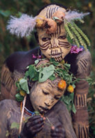
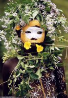
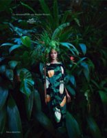
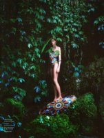
A few more shots from the spring campaign.
The campaign was shot by the brilliant Hans Silvester
The images are reminiscent of Silvester's portraits of the Omo Valley People of Ethiopia
ImageUploadedByPurseForum1391005999.474290.jpg
ImageUploadedByPurseForum1391006011.125316.jpg

I love that H takes such care in choosing collaborators!

ImageUploadedByPurseForum1391006074.431314.jpg
ImageUploadedByPurseForum1391006085.979271.jpg
ImageUploadedByPurseForum1391006096.963781.jpg
 
The metamorphoses of the wallet joke hit the nail on the head. I'm grateful there is so much to choose from this season.

A couple more visuals - some coral beauties to start the day:

3uXv0i9.jpg

Les Facéties de Pégase
Ref. H002798S 07

and another De la Mer au Ciel, in CW 10 (H002795S 10)
3DlatUe.jpg

Ohhhh
These are my colors... Thank you- looking forward to seeing how these tie
Anyone seen these IRL yet??
 
TT, they're somewhat different. I was mad about the one on the bolide in the window, but most of the offerings are going to be colorful and the two whites are more "airy" whereas the sepia on the bolide has an earthy/neutral quality IYKWIM? Don't know if it makes sense, hope it does...

Totally get that and we are on the same page
It's that earthiness that is so attractive in that pattern (to me)
Your description is so helpful
Thx💛
 
A few more shots from the spring campaign.
The campaign was shot by the brilliant Hans Silvester
The images are reminiscent of Silvester's portraits of the Omo Valley People of Ethiopia
View attachment 2482234
View attachment 2482235

I love that H takes such care in choosing collaborators!

View attachment 2482239
View attachment 2482240
View attachment 2482241
Fabulous
Have seen some of these but did not know the artistic link
Hermes is so interesting and have said it before
International artistic and intellectual
Thank you for the background
 
Totally get that and we are on the same page

It's that earthiness that is so attractive in that pattern (to me)

Your description is so helpful

Thx💛


I am totally with you on this. The pattern doesn't do much for me, but it does have incredible details when folded. I used to have this in pm mousseline. Wish they were doing the sepia version, too!
 
A few more shots from the spring campaign.
The campaign was shot by the brilliant Hans Silvester
The images are reminiscent of Silvester's portraits of the Omo Valley People of Ethiopia

I have that book of Silvester's photos (gorgeous), but had no idea he was the one behind the campaign. Thanks for the info and photos!


The metamorphoses of the wallet joke hit the nail on the head. I'm grateful there is so much to choose from this season.

A couple more visuals - some coral beauties to start the day:

myam myam (as the French say)
 
TT, they're somewhat different. I was mad about the one on the bolide in the window, but most of the offerings are going to be colorful and the two whites are more "airy" whereas the sepia on the bolide has an earthy/neutral quality IYKWIM? Don't know if it makes sense, hope it does...
I agree, I am so disappointed it won't be issued in this cw, I heard no 17 and 22 are the closest. From what you say they are not really comparable though...
 
Top