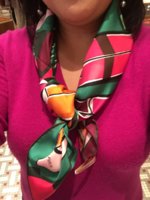
Amazing, birkinmary....please, post more of your fabulous combinations.Utterly amazing birkinmary!!! I miss your posts!
You are using an out of date browser. It may not display this or other websites correctly.
You should upgrade or use an alternative browser.
You should upgrade or use an alternative browser.
Scarves The Hermès Spring Summer 2018 Scarves
- Thread starter litchi
- Start date
TPF may earn a commission from merchant affiliate
links, including eBay, Amazon, and others
More options
Who Replied?Dear birkinmary, I love to see that you are posting here on tPF now and then and share with us things from your beautiful Hermès collection.PdS CSGM color 07 with SO Kelly 28 Sellier Jaune d’Or/Gris Mouette/GHW
View attachment 3943736 View attachment 3943737 View attachment 3943738
You know so well how to compose and use different colours. This yellow together with the rich red tones is exquisite and joyful.
Your pictures are always eye candy!
Pictures of the Robe du Soir! (cw 18, menthe/marine/encre/blanc )
In my bedroom, directly under the light fixture, box corner left in for color calibration:
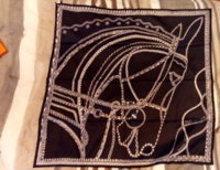
See? Closeup:
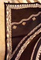
The section that includes the circles is "navy". Reminder, here is the photo on h.com:
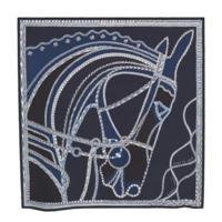
Ok, here is where it gets interesting. I took it to the window (grey day but natural light) and to my eyes it looked the same, maybe a little more contrast, but here is what the camera saw:
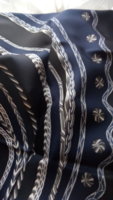
Look, I don't think I'm color-blind, but I swear that is not what it looks like in real life, even in natural light.
I'm contemplating if I need a black/black-to-the-visible-eye scarf. I am dubious.
ETA: I must admit, the lighting in my bedroom is apparently way off natural light, as you can see from the whites. I will think about my light bulbs.
In my bedroom, directly under the light fixture, box corner left in for color calibration:

See? Closeup:

The section that includes the circles is "navy". Reminder, here is the photo on h.com:

Ok, here is where it gets interesting. I took it to the window (grey day but natural light) and to my eyes it looked the same, maybe a little more contrast, but here is what the camera saw:

Look, I don't think I'm color-blind, but I swear that is not what it looks like in real life, even in natural light.
I'm contemplating if I need a black/black-to-the-visible-eye scarf. I am dubious.
ETA: I must admit, the lighting in my bedroom is apparently way off natural light, as you can see from the whites. I will think about my light bulbs.
Interesting to hear your thoughts. I am also struggling with a CW of this design. I am surprised that anything can wash you out! I think you always wear vibrant colors successfully.You look radiant in this cw, pautinka! Just gorgeous. I love this design but all the cws seem to wash me out. The exception is the dark burgundy with green and orange. But in that I feel the colors are too intense for the delicate design. It totally overpowers it. I wish they offered a few more options...
If anyone can give an explanation of this new tag fiasco, I would love to hear it. My SA just rolled her eyes.This looks beautiful on you! I agree that this was made for you!!! (With this season's scarves, I have carefully clipped all of the tags off as well. It's too hard to hide the care tag and prevents the use of that one corner. That is the extent of surgery that I can do, and thankfully, no hems have been harmed in the process.)
Interesting to hear your thoughts. I am also struggling with a CW of this design. I am surprised that anything can wash you out! I think you always wear vibrant colors successfully.
You are too kind, Moma! Next time I’m at a store I will try on some “wash-me-out!” cws and take some pics just for you. [emoji12]
Is there a particular cw of Favolosa you’re considering? This is the one I was talking about - the colors are gorgeous but it’s too bold - you can’t see practically any elements of the design.

ETA: At second glance, maybe that’s just because of the way I tied it... will have to look at it again.
BUT - this is the same cw as the Sea Surf and Fun one.
View attachment 3944406
And although Im chomping at the bit to see it, Modernisme Tropical 140 comes in a similar cw too.
Agree with BBC and others about why H would make all the cws so homogenized. This season’s designs are almost all hits, but color is equally important. Whoever made that decision should be flogged with a wet noodle. Or made to wear all the similar cws and forced to guess which is which while hooked up to a machine that gives ‘em a slight shock every time they get an answer wrong. Heh heh.
Last edited:
Pictures of the Robe du Soir! (cw 18, menthe/marine/encre/blanc )
In my bedroom, directly under the light fixture, box corner left in for color calibration:
View attachment 3944326
See? Closeup:
View attachment 3944327
The section that includes the circles is "navy". Reminder, here is the photo on h.com:
View attachment 3944329
Ok, here is where it gets interesting. I took it to the window (grey day but natural light) and to my eyes it looked the same, maybe a little more contrast, but here is what the camera saw:
View attachment 3944330
Look, I don't think I'm color-blind, but I swear that is not what it looks like in real life, even in natural light.
I'm contemplating if I need a black/black-to-the-visible-eye scarf. I am dubious.
ETA: I must admit, the lighting in my bedroom is apparently way off natural light, as you can see from the whites. I will think about my light bulbs.
Those are some cool moody blues! How does it tie?
Another beautiful jacket that pairs stunningly with JQ! And in velvet! Ooh, this is such a delicious combo, @croisette !
Thank you so much, dear Joannadyne!Another beautiful jacket that pairs stunningly with JQ! And in velvet! Ooh, this is such a delicious combo, @croisette !
And thank you for sharing the modpics!
Sea, Surf, and Fun!Oops, I gues I can’t add a photo when editing a post. Here’s the Sea Surf sand one:
View attachment 3944412
Dagnabit. I still can’t remember the name of this scarf correctly. I have no idea why I keep having such a hard time with it!

Go to the sea to surf and have fun!

Love that sellier, beautiful combination! The match with the scarf is so pretty!!
The more I see this CW, the more I like it. Looks great with your Kelly.
Amazing, birkinmary....please, post more of your fabulous combinations.
Dear birkinmary, I love to see that you are posting here on tPF now and then and share with us things from your beautiful Hermès collection.
You know so well how to compose and use different colours. This yellow together with the rich red tones is exquisite and joyful.
Your pictures are always eye candy!
Thank you all for your nice comments, I will try to keep posting

Scarf mail today! I managed to order this from h.com during the few hours it was available.
The Savana Dance mousseline stole, CW 3 quetsche/ rose bonbon/ turquoise/ciel.
Yes, it has same giant label as the 90s.
Despite all the pastels this season, this has deeper colors. It has a bit more orange( but dark) than I expected. One pleasant surprise was that the leopard is beautiful blues, the monkey a charcoal black. The h.com pix do not show that part of the design! A very happy, summery CW. The pink is a very pretty deep pink.
Goes with turquoise, cornflower Blue, navy, black, cream, white.
Hopefully, I will enable someone, LOL!View attachment 3943762 View attachment 3943763
Shown with a few bangles- the blue clic is “azur”View attachment 3943764 View attachment 3943765 View attachment 3943766
View attachment 3943768
View attachment 3943769
Just gorgeous! I think you will enable alot of people (myself included!)

Just love, stunning shawl and stunning Kelly. Glad to have you back!PdS CSGM color 07 with SO Kelly 28 Sellier Jaune d’Or/Gris Mouette/GHW
View attachment 3943736 View attachment 3943737 View attachment 3943738

Register on TPF! This sidebar then disappears and there are less ads!

