Scarves ........The Fall 2016 Scarves........

TPF may earn a commission from merchant affiliate
links, including eBay, Amazon, and others

I don't have H Electrique (yet) to post here (and try as I might to keep it off, it's now it's on my "list"....hope hubby doesn't see!) But slide a scarf ring (or any ring shape that will fit on a triangle folded gavroche) and then tie it around your neck cowboy style. This tames the pouf that a lot of people dislike in the small formats... :biggrin:
Thank you for the suggestion! Hm, is it kind of like how you do it with the twillies?? I think my issue is more that it feels too small, but there's a gavroche I'm watching on ebay - maybe I'll go for it and play with it. Worst case, it will likely look lovely tied on my bag. :)
 
Hi scarf1, yes the blue one of course. [emoji170]

We have yet to see 01 which is light blue and grey. That was my only hesitation. I might like that too. As well as the red and purple. But that design seems to be one of the only designs that is appealing to me this season so I don't mind getting more than one. And this one has Colvert. [emoji170]

Etoile, I think the colors are representative but they look more dull online. They are a bit more striking in person. I'll post photos later

Sounds beautiful! Look forward to seeing your pics!
 
  • Like
Reactions: CathBB
Hi scarf1, yes the blue one of course. [emoji170]

We have yet to see 01 which is light blue and grey. That was my only hesitation. I might like that too. As well as the red and purple. But that design seems to be one of the only designs that is appealing to me this season so I don't mind getting more than one. And this one has Colvert. [emoji170]

Etoile, I think the colors are representative but they look more dull online. They are a bit more striking in person. I'll post photos later
Thanks! That CW 05 is quite elegant! I worry it may be too dark for me, and definitely want to see the one with the lighter blue/grey. Also, once you get home, can you do comparison shot with the similar dark blue CSGM from last season? :angel:
 
Thanks! That CW 05 is quite elegant! I worry it may be too dark for me, and definitely want to see the one with the lighter blue/grey. Also, once you get home, can you do comparison shot with the similar dark blue CSGM from last season? :angel:

Yes of course. I think you will like the one item that I purchased from the spring collection too. [emoji170]
 
I have a slight dilemma- I bought 2 CWs of the CSGM C'est la Fete and I think I might be leaning toward returning one (the khaki/noir/noir CW). I do like the muted and subtle way they applied the design, and I'm definitely keeping the blue one as blue is a staple in my wardrobe. But the poor khaki one has sat inside its box since I got it home and took photos of it, and I'm not sure it'll get into my regular rotation in the fall due to the color. So hard to tell because it's too warm to even think about wearing a CSGM right now!

Question for the fellow scarf-obsessed: am I crazy if I return it? It seems like it would be likely to sell out so if I change my mind and want it later I wouldn't be able to get it.
Dilemma. Well, you could crank up the AC and take some modellng shots for us and let us decide! Would that help? LOL We've all been there...
 
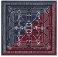
Grand Manège Cut - silk twill bandana 55"

01
2ihb8gj.jpg


02
1s0395.jpg


03
bese34.jpg


04
sb6137.jpg


About screened vs ink jet printing, many of the reissues are no longer screened the way they used to be. Hermes has always been quiet about that, to point of letting everyone be blissfully thinking the printing process has not changed. I doubt an SA would know for certain how a design is made.
An obvious difference is the addition of colors in the backgrounds, all that remix stuff, color blocks. That hides the fact that the design itself printed quite differently - fewer screens/colors.
One possibility: new issues have less shades of gold (for ex) in the gold hardware. The result is more comic book / graphic looking than the original printing due to lack of color nuances.
Another possibility is the use of a finesse style - pen & ink line drawing designs which are testament to the fewer screen trend. The tattoo series , the bandanna, this seasons legendes de l arbre are examples, C est la Fete CS scarf.
Ink jet printing is yet another possibility. I think all (most) of the 70s, maxi twillies etc are done that way. Maybe not the twill 90s. Could not say about the 140s. My silk 140s certainly look to have been inkjet printed.
How can you tell? An experienced eye can tell the difference. The easiest way is to put two scarves (new & old) alongside one another and compare some detailed sections. Are they identical ? Does the new designs look blurry ? less crisp ? Those are signs of ink jet printing. Count the colors - fewer means elimination of screens.
The comic book effect you mention is definitely a look I dislike. Gimme my vintage scarves!
 
Just stopped by Boston store. No c'est la fete in any format. Dallet doesn't look good in me, nor does Zenobie. I bought the mors cashmere in 05 that's online. I can post photos later. And a pays gavroche. It's going to be a slow season for me. They had a few 90s but none that interested me. And literally two 140 slks.
Ugh! Thanks for the update dear. SO glad that I didn't go yesterday as I would not have been pleased. I always feel as if my SA may have forgot to call me and I'll luck out but you confirmed I would not have haha.
Did you see the Colvert notebook upstairs though? :angel:

Grand Manège Cut - silk twill bandana 55"

04
sb6137.jpg


Umm, I just might need this. It's kind of fabulous. I just need to get "black and yellow" out of my head. {who would've thought I could quote Wiz Khalifa on an H thread! HAHA}
Thanks for the updates HNN!!:heart:
 
Top