You are using an out of date browser. It may not display this or other websites correctly.
You should upgrade or use an alternative browser.
You should upgrade or use an alternative browser.
Scarves Spring/summer 2021 scarves
- Thread starter hermeshound
- Start date
TPF may earn a commission from merchant affiliate
links, including eBay, Amazon, and others
More options
Who Replied?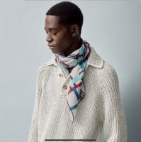
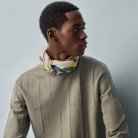

Thanks. It's also on the US website and I'm thinking of ordering one. I was wondering if we had any action shots yet?
Oh Sammy, this is the CW I want!!! I love it on you. Thanks for the pix. I have had it in my cart so many times, and when I go to pay I get a SORRY WE DON"T ACTUALLY HAVE THIS message. Sooooo frustrating. That last knot (with the awesome ring) is just fabulous!!!Swinging Saint-Germain arrived today!
View attachment 4963640View attachment 4963641View attachment 4963642

I have been stalking the site for Swinging Saint Germain. I can only say that it's a mess! Every few days they show the CW I want (@Sammy Royal's) only to refuse payment.(Speaking of H.com, why do the website still not have the actual flat photo of the Swinging Saint Germain CW 10 up so only photo is a mod shot
https://www.hermes.com/us/en/product/swinging-saint-germain-scarf-70-H982411Sv10/ ...)
Does anyone seriously wear these gigantic bows?Thanks for posting. Here are other colors:
View attachment 4964401
View attachment 4964402
View attachment 4964403
View attachment 4964404
View attachment 4964405
View attachment 4964406
View attachment 4964407
View attachment 4964408

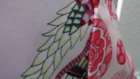
On the other end of the brightness spectrum, here are more shots of my MdZ wash scarf. The wash texture is indeed scrumptious! So wearable, this has hardly left my neck since it showed up. The rose pale color is hard to capture in a photo, it definitely appears lilac-leaning pink IRL, not creme or gray. The first photo is the most color-accurate. Studying the scarf further, the "dip-dye-like" effect seems to originate from the base fabric itself. I think the entire fabric of the scarf is rose pale (including hem), then the rest of the design was printed on top of that, so every color is suffused with the rose pale, making for a very soft and low-contrast effect. For sure not as low contrast as a true dip dye, but you can tell that the scarf is not a bunch of colors separately printed on a white/plain silk. Thoughts? The first picture is most color-accurate in my opinion.
View attachment 4961046
View attachment 4961047View attachment 4961049View attachment 4961050
There seems to be a lot of chatter that buying the twill version and hand washing it would result in the look of the washed silks.
I completely disagree that this is the case. I agree with your assessment @Langsam, the wash silk is a lovely more muted rendition of the same colors. I have been collecting and caring for my silks for many years. Hand washing my twills even ten times would not result in the same feel of the washed silk imo. And for me, for this specific design, I prefer the muted more natural organic colors and printing rather than the bright pops. Just my two cents and to each their own.
The vintage silks are just different in quality and and feel. I for one, appreciate a washed silk in my collection and can’t wait to receive mine.
Love your choice!
I have the Hermes Galaxy in the same format from last season and love it. Find it much easier to wear than silk twill, and the extra 10cm compared to the women's 90 also allows for better looking knots IMOCurrently loving the men’s 100 cashmere silks and looking into these two. Anyone has experience with this format or modshots?
ALice Shirley’s Awoooo and Ugo Gattoni’s Les Bains are both men’s silks and I love this size format. More wearable and easier to wash than the silk twill, less precious. Go for it! Both are modelled in the Clubhouse Ode to Alice Shirley or Unite for Ugo threads.Currently loving the men’s 100 cashmere silks and looking into these two. Anyone has experience with this format or modshots?
I have the Hermes Galaxy in the same format from last season and love it. Find it much easier to wear than silk twill, and the extra 10cm compared to the women's 90 also allows for better looking knots IMO
ALice Shirley’s Awoooo and Ugo Gattoni’s Les Bains are both men’s silks and I love this size format. More wearable and easier to wash than the silk twill, less precious. Go for it! Both are modelled in the Clubhouse Ode to Alice Shirley or Unite for Ugo threads.
Ah, thanks, this is what I hoped [not
 ] to hear!
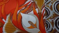
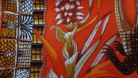
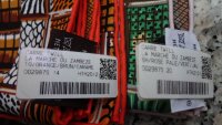
Hello ladies, after missing out on the first edition of "La Marche du Zambèze" I ordered two colourways of that joyful scarf in silk twill straight away: No 14 (orange/brun/caramel) and No. 20 (rose pâle/vert/jaune). As Living-la-Vida-FiFi says all quite well, No. 20 is a no-brainer, but No. 14 ( my favourite  ) imo is a real surprise: A very vibrant orange base paired with very warm yellows, browns, beiges and even pale rose and cream - this colour composition turns the scarf into perfect harmony (see detailed pics). I also added two pics allowing to compare the "pale rose" and "orange" to the same colourways of two older scarves ("Pois de Soie" and "Bolduc") to show the difference, maybe some of you might be interested in.
) imo is a real surprise: A very vibrant orange base paired with very warm yellows, browns, beiges and even pale rose and cream - this colour composition turns the scarf into perfect harmony (see detailed pics). I also added two pics allowing to compare the "pale rose" and "orange" to the same colourways of two older scarves ("Pois de Soie" and "Bolduc") to show the difference, maybe some of you might be interested in.Attachments
-
 DSC02171.JPG158.3 KB · Views: 169
 -
 DSC02172.JPG142.7 KB · Views: 166
 -
 DSC02173.JPG138.9 KB · Views: 164
 -
 DSC02179.JPG165.1 KB · Views: 165
 -
 DSC02180.JPG189.7 KB · Views: 159
 -
 DSC02182.JPG184.5 KB · Views: 154
 -
 DSC02183.JPG176 KB · Views: 148
 -
 DSC02184.JPG169.7 KB · Views: 138
 -
 DSC02185.JPG216.4 KB · Views: 132
 -
 DSC02186.JPG268.1 KB · Views: 126
 -
 DSC02175.JPG161.6 KB · Views: 129
 -
 DSC02170.JPG190.6 KB · Views: 127
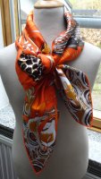
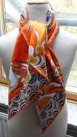
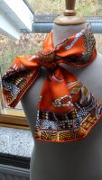
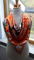
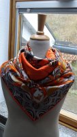
Here is a quick mod shot of my first scarf of the new season: La Marche du Zambeze CW 14 orange/brun/caramel Such a breathtaking design and the colors are so so gorgeous Did you ever buy a lipstick just because of the name? I did yesterday, the name of the lipstick is "Orange Danger". And this is exactly where I always am. I will take more pics of the scarf tomorrow.

More CWs of this (IMO rather ugly, that pink flower clashes so badly with the red hems) design:
CW 2
View attachment 4964310
View attachment 4964311
View attachment 4964312
CW 3
View attachment 4964313
View attachment 4964314
View attachment 4964317
Aww- I actually rather like both of them.
oh! I’ve been waiting for this to be modeled. I’ve had my eye on this colorway. It looks amazing.
I've got it on today!

Looks fab on you and perfect with every outfit
Thank you fifi!

Thanks for posting. Here are other colors:
View attachment 4964401
View attachment 4964402
View attachment 4964403
View attachment 4964404
View attachment 4964405
View attachment 4964406
View attachment 4964407
View attachment 4964408
The pink one is delicious- reminds me a little in overall look to this one I have (Azulejos):

Last edited:
Hello ladies, after missing out on the first edition of "La Marche du Zambèze" I ordered two colourways of that joyful scarf in silk twill straight away: No 14 (orange/brun/caramel) and No. 20 (rose pâle/vert/jaune). As Living-la-Vida-FiFi says all quite well, No. 20 is a no-brainer, but No. 14 ( my favourite
Gorgeous choices!
Here is a quick mod shot of my first scarf of the new season: La Marche du Zambeze CW 14 orange/brun/caramel Such a breathtaking design and the colors are so so gorgeous Did you ever buy a lipstick just because of the name? I did yesterday, the name of the lipstick is "Orange Danger". And this is exactly where I always am. I will take more pics of the scarf tomorrow.
View attachment 4964893
Beautiful on you sonnet!
Thank you for clarifying that the orange scarf (or similar desirables) appear sporadically. I'm surprised that H doesn't bring a boatload of select designs for the web and dole them out one by one. It seems that's what they used to do for decades. So the web offerings were pretty static and predictable.There were 4 CWs earlier in the week, and so just keep checking. If it goes anything like last season, they kept mostly getting in the same CWs that sold out so I'd just check in again. If I see it, I'll PM you. (I mean...if I HAPPEN to be looking on H dot com....
Scarf1, this is absolutely gorgeous.Scarf mail! Marche au Zambezi CW 21 in silk twill. I missed this during its original release. Like @bunnycat , I always wash scarves and decided to save $50 and buy the twill rather than the wash version.
@momasaurus - hope these help!
my first thought when I opened the box was that the colors were more saturated than I expected. The darker blue looks like blue ink.It is close in color to my bleu royal bangle. I will most likely wear with either pink or navy. I also included a shot of the back side - you can still see the image, but it is much more pastel. ( I know some of you care about this). I can see myself possibly wearing this backwards if I want a much more pastel scarf.
View attachment 4963122View attachment 4963123View attachment 4963124View attachment 4963125View attachment 4963126
The sweater in the pic below is actually navy.
View attachment 4963127
View attachment 4963142
I wonder if Marche du Zambeze was done by the same artist(s) who did Flowers of South Africa? I never got Marche so I never looked closely at it. But now I see that the artistic styles are similar IMO.
Thanks! Yes , both designs are by Ardmore artists. So is Savana Dance.Thank you for clarifying that the orange scarf (or similar desirables) appear sporadically. I'm surprised that H doesn't bring a boatload of select designs for the web and dole them out one by one. It seems that's what they used to do for decades. So the web offerings were pretty static and predictable.
Scarf1, this is absolutely gorgeous.
I wonder if Marche du Zambeze was done by the same artist(s) who did Flowers of South Africa? I never got Marche so I never looked closely at it. But now I see that the artistic styles are similar IMO.
Register on TPF! This sidebar then disappears and there are less ads!