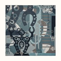
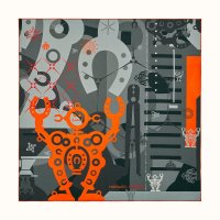
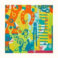
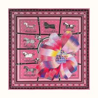
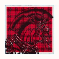
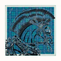
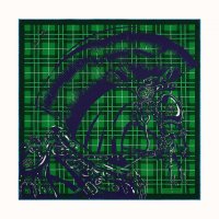
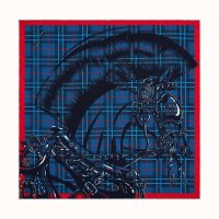
I love how the second colorway brings out the star background the best but I'm not a fan of the white borders (it seems like many of the scarves lately have contrasting edge borders?). Reattaching images for easy viewing.
I have a weakness for the CW that is closest to the real life / original work colors and this is probably the one for this scarf to me (because of the sky color with the stars). Yeah, we've had a couple members mention the edge / border situation we've been seeing with the new stuff. I also agree, I much prefer a "fuller" scarf, and am curious why they opted for this (there are now so many designs with these borders that I'm beginning to feel that it's a conscious choice). One member wondered if it's to leave open the possibilities of personalisation, which is a fun idea, although I don't think that service is widely available right now.


