Scarves …..Hermès Spring/Summer 2024 Scarves…..

TPF may earn a commission from merchant affiliate
links, including eBay, Amazon, and others

I’m just copying and pasting @redheaddem’s wonderfully kind listing of this season’s scarves, so the list can be carried forward and we don’t have to hunt for so long for it.
I don’t think anyone else has added to it……

Silk twill 90
Hermès Flagship (Dimitri Rybaltchenko)
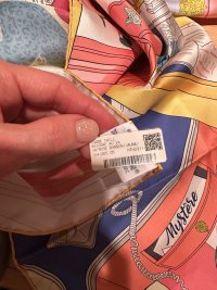
Mystère au 24 (Jonathan Burton)
Harnais de Coeur (Daiske Nomura)
Precious Paradise (Katie Scott)
Beauté Composée (Nick Doyle)
Silla de Gaucho (Antonio Carrau)
Figures libres (Geoff McFetridge)
Le cavalier à la trompette (Jan Bajtlik)
Haute Parure
Twilly au Bloc

Forever Collection
Jungle love (Robert Dallet)
Eperon d’Or (Henri d’Origny)
Brides de Gala (Hugo Grygkar)
Couvertures et tenues de jour (Jacques Eudel)
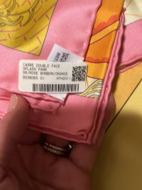
Double Face
Splash park (Jacqueline Colley)
Della Cavalleria Favolosa ( (Virginie Jamin)
A la lumière du Flambeau (Pierre Marie)

140 Silk
Robe légère (Théo de Gueltzl)
Animapolis (Jan Bajtlik)
Jeu des Omnibus (Gianpaolo Pagni?)

CSGM
Cavalier en formes (Gianpaolo Pagni)
Chevaux dechainés (Octave Marsal)
Coaching Deja-Vu (Julie Abadie)
Pique Sellier (Cyrille Diatkine)
Tatouages Marins Bandana (Sophie Koechlin)
Hermès Locomotion (Ugo Bienvenu)
Fantaisie d'Etriers

CSGT
Arcs-en-Ciel (Julie Abadie)
Flamingo Party Coloriage (Laurence Bourthoumieux)
Bouclerie Moderne en casaques (Françoise de la Perrière)

Twilly
Precious Paradise Katie Scott
Funny Ice Cream Elias Kafouros

45cm Gavroche
La Danse du Printemps
Just Married
Robe Legere

55cm Bandana
Animaux Bandana
Paris Qui Roule Bandana

70cm Vintage Silk
Les Voitures Nouvelles to the 70 cms
Choreographie Equestre to the 70cms
Acte III, Scene 1, La Clairiere Decoupage to the 70 cms
Funny Ice Cream to the 70 cms
Ay Royaume de Helios to the 70cms

Men's
100cm Cashmere silk
Cocoricoooo! Alice Shirley
Neo Brandeborgs Daiske Nomura based on Cathy Latham
Permis de Construire Jin Kwon
First and Chic
Horse Reality
 
Thé shipment arrived and I’m loving the Mystère in this cw. The other cw’s looked pale on me. Plus, i had to get Jungle Love Forever. The colors are stunning. I noticed the colors of Mystère are similar to the other double side scarf ( Splash Park ) I got few weeks ago. Here are the pics. Plus, I’m so glad I got the Vallée 😻😻😻😻😻 and the Animapolis in pink and blue. P
 

Attachments

  • EBD626DC-F45E-4E14-89D0-96A872E3C0ED.jpeg
    EBD626DC-F45E-4E14-89D0-96A872E3C0ED.jpeg
    294.4 KB · Views: 163
  • 93FC0D63-3186-413B-93E5-B517903EB882.jpeg
    93FC0D63-3186-413B-93E5-B517903EB882.jpeg
    260 KB · Views: 172
  • 58D3E6AA-88C1-4FFE-8A77-A73E29CBEC1E.jpeg
    58D3E6AA-88C1-4FFE-8A77-A73E29CBEC1E.jpeg
    403.4 KB · Views: 166
  • E9FAD5AF-FE4B-4732-BA21-76629873E858.jpeg
    E9FAD5AF-FE4B-4732-BA21-76629873E858.jpeg
    427.8 KB · Views: 164
  • 558DB3FA-9082-412B-BD6D-2FF4AEF05822.jpeg
    558DB3FA-9082-412B-BD6D-2FF4AEF05822.jpeg
    322.6 KB · Views: 168
  • 9E30D749-906E-4E98-BF71-902946068ACD.jpeg
    9E30D749-906E-4E98-BF71-902946068ACD.jpeg
    163.1 KB · Views: 159
  • D8EE7C1A-0ED5-4545-BEAE-1295D76DA421.jpeg
    D8EE7C1A-0ED5-4545-BEAE-1295D76DA421.jpeg
    257.8 KB · Views: 154
  • 14DE1492-AF16-4E40-8E6F-49D58A97A04D.jpeg
    14DE1492-AF16-4E40-8E6F-49D58A97A04D.jpeg
    405.8 KB · Views: 162
Thé shipment arrived and I’m loving the Mystère in this cw. The other cw’s looked pale on me. Plus, i had to get Jungle Love Forever. The colors are stunning. I noticed the colors of Mystère are similar to the other double side scarf ( Splash Park ) I got few weeks ago. Here are the pics. Plus, I’m so glad I got the Vallée 😻😻😻😻😻 and the Animapolis in pink and blue. P

Stunning haul😍 congratulations! I am actually thinking about the splash park, do you have any mod shots maybe? And did you end up getting the yellow Robe Légère?
 
Hi friends, so here we have Splash Park double face cw02 Marine/ Vert / Multicolore.

I tried it with a turquoise top and a black top. I was expecting to like the colourful side with the turquoise top but I really did not. The colours are muted and they did not pop against a colourful top, whereas I liked that face more against black. On the other hand, I was surprised by how nice the navy face looked against the turquoise top.

There is a lot of silver on the coloured side and the shades are not the vivid ones I’m used to choosing so I’m in two minds about it. However it’s a bit different than what I currently have in my collection. At the cost of the double faces, should I keep or return?

IMG_0382.jpeg
IMG_0385.jpeg
IMG_0388.jpeg
IMG_0389.jpeg
 
View attachment 5933782
Ya’ll I am literally obsessed!! I had been eyeing this one online. Went into my store for a different purchase and they had ONE! Was meant to be.
  • Faubourg of Dreams Scarf 100 - Gris/Jaune/Anthracit
YES YES YES
I NEED IT
...... my only concern is whether it's too similar to my all-grey except fuschia hem Hermes Galaxy, what with the rockets and the stars... but that yellow, oh my <3
 
Hi friends, so here we have Splash Park double face cw02 Marine/ Vert / Multicolore.

I tried it with a turquoise top and a black top. I was expecting to like the colourful side with the turquoise top but I really did not. The colours are muted and they did not pop against a colourful top, whereas I liked that face more against black. On the other hand, I was surprised by how nice the navy face looked against the turquoise top.

There is a lot of silver on the coloured side and the shades are not the vivid ones I’m used to choosing so I’m in two minds about it. However it’s a bit different than what I currently have in my collection. At the cost of the double faces, should I keep or return?

View attachment 5935476
View attachment 5935477
View attachment 5935478
View attachment 5935479
Thank you for these modshots! This was one of the ones I was considering but you're right, the colors on the bright side do look way more muted than I'd like. If you're not in love with it, I would return. Perhaps you can try one of the brighter CWs?
 
Hi friends, so here we have Splash Park double face cw02 Marine/ Vert / Multicolore.

I tried it with a turquoise top and a black top. I was expecting to like the colourful side with the turquoise top but I really did not. The colours are muted and they did not pop against a colourful top, whereas I liked that face more against black. On the other hand, I was surprised by how nice the navy face looked against the turquoise top.

There is a lot of silver on the coloured side and the shades are not the vivid ones I’m used to choosing so I’m in two minds about it. However it’s a bit different than what I currently have in my collection. At the cost of the double faces, should I keep or return?

View attachment 5935476
View attachment 5935477
View attachment 5935478
View attachment 5935479

Trickyyyyyyy. On the one hand my first reaction was ‘oh wow that’s gorgeous and I might need it.’ The colors are wonderfully soothing and tonal. I think the green of your sweater picks up the green in the scarf perfectly but maybe that’s just the way the colors came out in the photo.

Staring at the pics more, I am seeing what you mean about the silver. It’s sort of like… I like the silver, but I think they missed an opportunity here, and they overdid it maybe?

For example, I really like this side here:
IMG_9230.jpeg

in the sense of the balance and mix of colors and blank space. But then the other side isn’t as consistent.

It is CERTAINLY lovely on you. Maybe sit with it for a few days and see if the love grows harder or dies off.
 
Trickyyyyyyy. On the one hand my first reaction was ‘oh wow that’s gorgeous and I might need it.’ The colors are wonderfully soothing and tonal. I think the green of your sweater picks up the green in the scarf perfectly but maybe that’s just the way the colors came out in the photo.

Staring at the pics more, I am seeing what you mean about the silver. It’s sort of like… I like the silver, but I think they missed an opportunity here, and they overdid it maybe?

For example, I really like this side here:
View attachment 5935491

in the sense of the balance and mix of colors and blank space. But then the other side isn’t as consistent.

It is CERTAINLY lovely on you. Maybe sit with it for a few days and see if the love grows harder or dies off.
Thanks, appreciate your thoughtful and detailed feedback. I agree with everything you said! Will sleep on it. I’ll also try it with a pinky-coral top and see what that yields.
 
Thank you for these modshots! This was one of the ones I was considering but you're right, the colors on the bright side do look way more muted than I'd like. If you're not in love with it, I would return. Perhaps you can try one of the brighter CWs?
Hi @ajaxbreaker, nice to see you here. I have the colourful CSGM below and the only double face that doesn’t look too warm-toned on me is the white, colourful one which seems to be a bit too similar to the CSGM…

CSGM
IMG_0391.jpeg
IMG_0390.jpeg
vs Double Face
IMG_0392.jpeg
 
Hi friends, so here we have Splash Park double face cw02 Marine/ Vert / Multicolore.

I tried it with a turquoise top and a black top. I was expecting to like the colourful side with the turquoise top but I really did not. The colours are muted and they did not pop against a colourful top, whereas I liked that face more against black. On the other hand, I was surprised by how nice the navy face looked against the turquoise top.

There is a lot of silver on the coloured side and the shades are not the vivid ones I’m used to choosing so I’m in two minds about it. However it’s a bit different than what I currently have in my collection. At the cost of the double faces, should I keep or return?

View attachment 5935476
View attachment 5935477
View attachment 5935478
View attachment 5935479

It certainly looks different to the photos on H.com. Much more muted. Or is it just the winter light at your place?

The silvery side is particularly muted and cool toned... Maybe a bit too much?

It looks nice enough but I am not (yet) convinced... I would also love to see it on other colored tops, good idea!
 
Hi friends, so here we have Splash Park double face cw02 Marine/ Vert / Multicolore.

I tried it with a turquoise top and a black top. I was expecting to like the colourful side with the turquoise top but I really did not. The colours are muted and they did not pop against a colourful top, whereas I liked that face more against black. On the other hand, I was surprised by how nice the navy face looked against the turquoise top.

There is a lot of silver on the coloured side and the shades are not the vivid ones I’m used to choosing so I’m in two minds about it. However it’s a bit different than what I currently have in my collection. At the cost of the double faces, should I keep or return?

View attachment 5935476
View attachment 5935477
View attachment 5935478
View attachment 5935479
Wow. I think this is one of the best double face scarves ever. Both sides work and are totally different. Very tempting!
 
Hi friends, so here we have Splash Park double face cw02 Marine/ Vert / Multicolore.

I tried it with a turquoise top and a black top. I was expecting to like the colourful side with the turquoise top but I really did not. The colours are muted and they did not pop against a colourful top, whereas I liked that face more against black. On the other hand, I was surprised by how nice the navy face looked against the turquoise top.

There is a lot of silver on the coloured side and the shades are not the vivid ones I’m used to choosing so I’m in two minds about it. However it’s a bit different than what I currently have in my collection. At the cost of the double faces, should I keep or return?

View attachment 5935476
View attachment 5935477
View attachment 5935478
View attachment 5935479
As someone who is obsessed with the cuteness of the Splash Park design, I was overjoyed when they re-released it in silk. However none of the colour ways appeal to me, I feel like they are too “serious” and don’t play along with the 90’s retro feel of the design. I know some will say that’s the point, to keep it somewhat elegant!

The white one is more vivid (on the website at least), but being a soft summer/ autumn, white drains me too much. So hoping more color ways are coming 🤞🏼🤞🏼

That said the navy makes your skin pop, if you like the colour then I think you should enjoy it! It really is a fun design. I don’t love the reverse side (on any of the available cw’s) as much, which makes me also wish it was just single sided and that much less pricey!)
 
Hi! I'm with @redheaddem on this – the color seems a bit understated for your vibrant style. You always shine so brightly in those cheerfully colored scarves! 😊🧣
Hi friends, so here we have Splash Park double face cw02 Marine/ Vert / Multicolore.

I tried it with a turquoise top and a black top. I was expecting to like the colourful side with the turquoise top but I really did not. The colours are muted and they did not pop against a colourful top, whereas I liked that face more against black. On the other hand, I was surprised by how nice the navy face looked against the turquoise top.

There is a lot of silver on the coloured side and the shades are not the vivid ones I’m used to choosing so I’m in two minds about it. However it’s a bit different than what I currently have in my collection. At the cost of the double faces, should I keep or return?

View attachment 5935476
View attachment 5935477
View attachment 5935478
View attachment 5935479

It certainly looks different to the photos on H.com. Much more muted. Or is it just the winter light at your place?

The silvery side is particularly muted and cool toned... Maybe a bit too much?

It looks nice enough but I am not (yet) convinced... I would also love to see it on other colored tops, good idea!
 
Top