These threads are archived as part of our reference library, therefore please only post scarves on this thread from the season in the title. If you are not sure, please do a search or ask in the ID this scarf thread before you post. 
TPF may earn a commission from merchant affiliate
links, including eBay, Amazon, and others
I had a similar feeling about the 140 Sieste, which seemed somehow less detailed than the original issue to me-- but honestly, that could be just my dislike of the shininess of the recent-issue 140 silks. Maybe the detail is there and I'm distracted by the sheen, but for whatever reason, that, too, fell flat for me.
Thank you so much! And I do agree that the black hem is one of its best featuresWow it looks great on you! Love that eye catching black border on this cw
Thank you ever so much! It is a super versatile design and soooo fun!The cw with this pink hem is adorable! I'm trying to avoid white hems, so thank you @weN84 for showing how cute is this scarf!
Loving your Jungle Tattoo CSGM and your pretty, regal cat! She's very photogenic, @CanuckBagLover!
Oh, my, @Living.la.vida.fifi, Animapolis wasn't on my list at all and now your gorgeous photos show the versatility of this scarf and cw... hmm.. That coffee pot is cute, I agree!")
Happy to be your twin! Don’t you just love its versatility? I keep discovering new design elements every time I tie it!Scarf twins!
Oh, what a lovely thing to say! Thank you so very much!it was made for you! and the joy in your face warms my heart. so lovely!
Thank you so very much!Beautiful fifi, this one suits you so well, fabulous as ever
Oh my goodness! What an excruciating wait! Wishing that you receive it very soon!Fifi, it still hasn't reached me. It has now gone further south to London. If I don't get it tomorrow (which FedEx have promised me today) it will be returned to Paris then sent to my place in France. What a joke!!!! Hermès have been excellent though with their service, getting on to FedEx to back me up.
Hahaha! Oh I love that penguin corner as well! And it’s so versatile! Thank you so much!This scarf just screams "Fifi"! It is just fun,fun, fun! I especially love the yellow corner with the penguins. It looks like a different scarf in every pic. I think this is one of my favourites on you.
The blues make me happy too and these are gorgeous!I gots the blues, and it makes me happy.
View attachment 4284641
Gorgeous!Scarfmail! Animapolis CW 05 blue lavande / vert / corail H003275S 05. It's magnificent! WAY out my comfort zone on colorful-ness, so glad I took a chance. I was concerned about the orange (my skin is cool-toned and orange is one of my worst colors) but the corail has a strong pinky undertone to it, and is balanced out by all those lovely greens and blues, that makes it work. Cool-toned scarfies needn't avoid this one. I think it will look amazing with denim.
View attachment 4284682
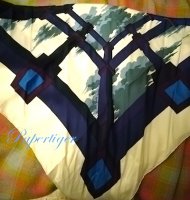
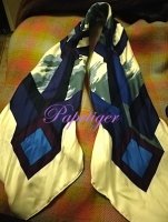
Oh, I love it!View attachment 4284818 My tree of song twilly came today. Honestly, and not sure why but I thought the pale blue was more teal/aqua... I still like it. I Think it will be beautiful on a blue nuit Kelly that I don’t have yet
It is gorgeous! Seriously, I don’t think there is a bad CW of this design!Posted below. The camera is making the colors look a bit brighter than they are. IRL I find the overall effect harmonious. What are your thoughts?
The pinks and lavenders in this are really nice. I ordered as soon as I could, figuring I could return or exchange if needed. No need
You are most welcome. Let us know how you like it!
View attachment 4284840
Thanks for the heads up @Angelian!
Losange GM Chevaux En Camouflage in cashmere/silk H433396T
02
View attachment 4284732 View attachment 4284733
05
View attachment 4284734 View attachment 4284735
09
View attachment 4284736 View attachment 4284737
11
View attachment 4284738 View attachment 4284739
You know I'm not usually so excited for reissues but I've had the hardest time finding the right vintage cw for me in suitable condition so this could go in the HG thread as well.
For those interested in Perspectives generally and/or cw 29 Creme/Bleu/Prune
The 'Creme' is ivory NOT white and NOT cream
The 'Bleu' is many various shades of bright, ink and sea. Those suares are brighter than pics suggest.
The 'Prune' is not prune as we know it (from leather) it's a cross between violet and aubergine
The clouds are soft green with a Bleu Glacier shadow
Also there is dark green and purple
Love the points, bias fold, triangle but the cowboy knot does't quite work with this.
Mod shots truer to real life colour, please excuse the 'warm' (yellow) light in other shots.


This is stunning... Congrats! I love this reissue and it’s one of the silks that’s Im considering for this season. The clouds are amazing. Can’t wait to see it and try it IRL!You know I'm not usually so excited for reissues but I've had the hardest time finding the right vintage cw for me in suitable condition so this could go in the HG thread as well.
For those interested in Perspectives generally and/or cw 29 Creme/Bleu/Prune
The 'Creme' is ivory NOT white and NOT cream
The 'Bleu' is many various shades of bright, ink and sea. Those suares are brighter than pics suggest.
The 'Prune' is not prune as we know it (from leather) it's a cross between violet and aubergine
The clouds are soft green with a Bleu Glacier shadow
Also there is dark green and purple
Love the points, bias fold, triangle but the cowboy knot does't quite work with this.
Mod shots truer to real life colour, please excuse the 'warm' (yellow) light in other shots.
I can NEVER be sick of this design. What a stunning CW this is! There are waaaay too many gorgeous ones to be able to decide! Congrats!I hope you're not all sick of the Paradis shawl already. I popped in today and they had exactly what I was looking for.
View attachment 4284985
View attachment 4284986
View attachment 4284987
View attachment 4284988
REALLY works with my coloring...forgive the PJ photos!!
View attachment 4284989
View attachment 4284990
".....that I don't have yet."View attachment 4284818 My tree of song twilly came today. Honestly, and not sure why but I thought the pale blue was more teal/aqua... I still like it. I Think it will be beautiful on a blue nuit Kelly that I don’t have yet
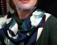
 That made me smile. This twilly is a very good start!
Yes, the F/W 140 silks are sooooo nice.I think that has more to do with the season/type of 140 silk. Last week I bought On A Summer Day and today I bought Sieste and while they are both 140s, the silk for each is different for the different seasons. F/W 140 silks (I think they are called “twill lave”) are thicker and heavier and S/S 140 silks (“summer silk” or “plume” - depends on the year, but I think they signify the same thing) are lighter and thinner...maybe shinier too. My Summers Day does not have a sheen to it.
By the way, I really decided straight off that I did not like Animopolis at it is far too busy and too weird for me...except I saw it IRL. That CW5 is reaaaallllly amazing for me and CW1 is beautiful too!!!
Thanks for these pix. Seems like a wonderful CW for you!You know I'm not usually so excited for reissues but I've had the hardest time finding the right vintage cw for me in suitable condition so this could go in the HG thread as well.
For those interested in Perspectives generally and/or cw 29 Creme/Bleu/Prune
The 'Creme' is ivory NOT white and NOT cream
The 'Bleu' is many various shades of bright, ink and sea. Those suares are brighter than pics suggest.
The 'Prune' is not prune as we know it (from leather) it's a cross between violet and aubergine
The clouds are soft green with a Bleu Glacier shadow
Also there is dark green and purple
Love the points, bias fold, triangle but the cowboy knot does't quite work with this.
Mod shots truer to real life colour, please excuse the 'warm' (yellow) light in other shots.
I was thinking the same thing. I like this CW for you, PT.Beautiful! I like that last pic the best on you. In my mind (and I could be remembering wrong) but this seems a bit different from what you usually go for scarf-wise, but I know of quite a lot in your closet this will go well with!
Thank you dear... Its certainly a wish of mine... I want to be ready for her".....that I don't have yet."

Yes, the F/W 140 silks are sooooo nice.
Haha - did you get an Animopolis then?
Absolutely made for you!!! Gorgeous, PT!You know I'm not usually so excited for reissues but I've had the hardest time finding the right vintage cw for me in suitable condition so this could go in the HG thread as well.
For those interested in Perspectives generally and/or cw 29 Creme/Bleu/Prune
The 'Creme' is ivory NOT white and NOT cream
The 'Bleu' is many various shades of bright, ink and sea. Those suares are brighter than pics suggest.
The 'Prune' is not prune as we know it (from leather) it's a cross between violet and aubergine
The clouds are soft green with a Bleu Glacier shadow
Also there is dark green and purple
Love the points, bias fold, triangle but the cowboy knot does't quite work with this.
Mod shots truer to real life colour, please excuse the 'warm' (yellow) light in other shots.