These threads are archived as part of our reference library, therefore please only post scarves on this thread from the season in the title. If you are not sure, please do a search or ask in the ID this scarf thread before you post. 
TPF may earn a commission from merchant affiliate
links, including eBay, Amazon, and others
Thank you for alerting us to this!
I like that the colors are now becoming a bit more universal as I've noticed for the FW18 season and now SS19 season. There's colors that can be worn year round regardless of seasons, which makes it better, in my opinion. I tend to only buy silks in Spring/Summer season as those colors tend to suit me better than the darker colors for Fall/Winter but with the new coloration, it means I can probably find one or two cw that will likely suit me regardless of seasons!

140cm Plume Silk Robe du Soir Pop H433244 S
13View attachment 4238545 View attachment 4238546
14View attachment 4238547 View attachment 4238548
15View attachment 4238549 View attachment 4238550
16View attachment 4238551 View attachment 4238552
17View attachment 4238553 View attachment 4238554
The purple/blue CW 14 speaks to me, but I would have preferred the ropes to be more than blank space. And I am afraid how the white will hold up next to the dark colors when being hand washed.Thank you Wen84 for posting these.
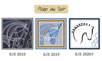
I’m sorry to be negative but the best thing about this design was the intricacy of the ropes. They dumbed it down. It could have been absolutely beautiful but it looks really dull and flat. So disappointing.
The purple/blue CW 14 speaks to me, but I would have preferred the ropes to be more than blank space. And I am afraid how the white will hold up next to the dark colors when being hand washed.
Maybe there will be more in these colors...
I am so disappointed, you're absolutely right. The purple one attracts me because of the colors, but as for this iteration of the design - I think it worked better in the gavroche size. I'm so sad, but I guess my wallet is safe.Thank you Wen84 for posting these.
I’m sorry to be negative but the best thing about this design was the intricacy of the ropes. They dumbed it down. It could have been absolutely beautiful but it looks really dull and flat. So disappointing.

With apologies to anyone who loves the newest iteration of this design, I see this trend toward oversimplification as a thinly veiled attempt to cut costs. Repeating designs season after season, reducing the number of screens and dyes, and increasing prices on various products results in the record-breaking profits that Hermès posts quarter after quarter. I know that many appreciate a “fresh take” on a classic design, but I personally have never found a silk re-mix that exceeded the beauty of the original. I sometimes wonder, what’s next?
With apologies to anyone who loves the newest iteration of this design, I see this trend toward oversimplification as a thinly veiled attempt to cut costs. Repeating designs season after season, reducing the number of screens and dyes, and increasing prices on various products results in the record-breaking profits that Hermès posts quarter after quarter. I know that many appreciate a “fresh take” on a classic design, but I personally have never found a silk re-mix that exceeded the beauty of the original. I sometimes wonder, what’s next?
I know not everyone's cup of tea, but a number of my favorite older scarves are simple graphics, with only two colors. My difficulty for a several scarf seasons has been the color palettes they've chosen. I've found them challenging, and hard for me to wear, so I've not bought any new scarves for quite a while!At no charge, I will take a request for customization!I may be in the minority, but I like the simplified, graphic quality of the 140. And I'd buy your stylized SS20 version if I loved the colors used!

With apologies to anyone who loves the newest iteration of this design, I see this trend toward oversimplification as a thinly veiled attempt to cut costs. Repeating designs season after season, reducing the number of screens and dyes, and increasing prices on various products results in the record-breaking profits that Hermès posts quarter after quarter. I know that many appreciate a “fresh take” on a classic design, but I personally have never found a silk re-mix that exceeded the beauty of the original. I sometimes wonder, what’s next?
Coup de fouet is a great example! I have a 90 and a 140 and all the detail is still there. Argh..Hermes what are you doing?
I may be in the minority, but I like the simplified, graphic quality of the 140. And I'd buy your stylized SS20 version if I loved the colors used!


 okay
okay