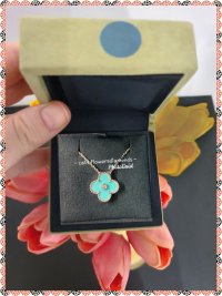
I personally like the lighter more muted shade of blue as well. It looks great on you! Congrats!!I ended up getting the lighter of the 2. I liked the pendant even more in person !
You are using an out of date browser. It may not display this or other websites correctly.
You should upgrade or use an alternative browser.
You should upgrade or use an alternative browser.
2022 Holiday Pendant
- Thread starter babygirl416
- Start date
TPF may earn a commission from merchant affiliate
links, including eBay, Amazon, and others
More options
Who Replied?My lovely SA came through for me!
The colour is very chameleon. Under the bright lights in the boutique it looked more blue, in the warmer lights of my dressing room more green and when worn in natural daylight somewhere in between. (Please excuse my neck; need to learn how to use filters so as not to scare you all! )
I absolutely love it and think being more muted than turquoise makes it more wearable.
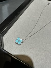
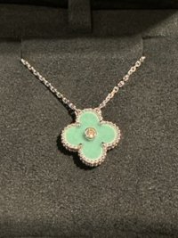
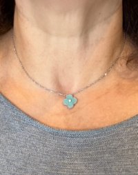


Definitely try it out in different types of lighting, it seems so different based on where it is and the colors that surround it because of the high gloss.Mine arrived yesterday, earlier than expected from overseas. It is smooth-ish and swimming pool blue, white edges a bit on the side. Photo taken with flash because of the grim weather. I.have put the protector back as I'm undecided. If I'm offered nicer one here I'll send it back.
View attachment 5623889
Never apologize for your neck!!! I can’t tell you how thrilled I am when I see an unedited picture. The jewelry accounts that blur them so they look like a hotdog wearing a necklace bother them heck out of me!!My lovely SA came through for me!
The colour is very chameleon. Under the bright lights in the boutique it looked more blue, in the warmer lights of my dressing room more green and when worn in natural daylight somewhere in between. (Please excuse my neck; need to learn how to use filters so as not to scare you all! )
I absolutely love it and think being more muted than turquoise makes it more wearable.
View attachment 5624549View attachment 5624550View attachment 5624551
It’s so refreshing to see an untouched photo. Why?? Because it looks like me. And I don’t look like a blurry hotdog.

Even the default beauty filters on most phone’s front facing cameras that bother me. Nothing looks real.
 I see photos of my niece and nephew and they look like images out of a magazine and I hate for them to compare themselves to those filtered photos that smooth skin and hide other flaws because it’s so unrealistic.
I think the color looks great on you! I can’t wait to send mine out to be lengthened! This is my first pendant but who the heck wears them out of the box at the standard length? I have a slim neck but on the longest jump ring I feel like it could choke me out.

Went to see the VCA HP 2022 Celadon Porcelain in person. I made sure to bring my Turquoise YG pendant and Hermes Lagon swift K32 for direct comparison. My particular turquoise pendant was definitely bluer and more saturated, the HP is greener in comparison. It was actually a closer match to my Lagon swift K32 than my turquoise pendant.
Love your turquoise. I wish I could get one, been looking for one on the resale market forever. Some day it will come ✨✨ enjoy yours in good health.These pics are as close to accurate as I could get in the harsh in-store lighting. Note that as others have mentioned, it photographs bluer than it is in real life because of the phone camera auto-adjust - next to turquoise especially, you can definitely appreciate the greener tones. Although it is a gorgeous color, I did pass on the HP as I felt it was too close to my turquoise to warrant a 4+k purchase, plus I'm not really a WG person, and I have way too many other pieces on my wishlist . If I did not own turquoise, I would have definitely snapped this up, because it's my favorite color family.View attachment 5624490View attachment 5624491View attachment 5624492
Thank you for the real unedited picturesMy lovely SA came through for me!
The colour is very chameleon. Under the bright lights in the boutique it looked more blue, in the warmer lights of my dressing room more green and when worn in natural daylight somewhere in between. (Please excuse my neck; need to learn how to use filters so as not to scare you all! )
I absolutely love it and think being more muted than turquoise makes it more wearable.
View attachment 5624549View attachment 5624550View attachment 5624551
Just collected my HP & took photo next to my turquoise buttery earrings in WG for comparison & stand-alone. I must say IPhone 13pro (I m using it) seems to give the closest to actual colour vs Samsung (SA using it) which gives more blue hue.
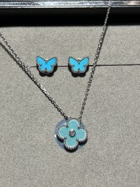
I also took another shot in the car with natural sunlight on my way home.
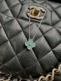
Another shot under my walk-in wardrobe lighting.
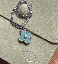

I also took another shot in the car with natural sunlight on my way home.

Another shot under my walk-in wardrobe lighting.

I am very disappointed as I waited a whole year and it came out to be blue.
I was hoping it will either be jade, pink, or a yellow mother of pearl.
Very sad about this.
I was hoping it will either be jade, pink, or a yellow mother of pearl.
Very sad about this.
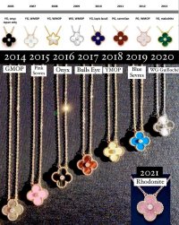
They did yellow MOP in 2018, so I don’t think we’d see that anytime soon. It also looks like they did gold MOP in 2014.I am very disappointed as I waited a whole year and it came out to be blue.
I was hoping it will either be jade, pink, or a yellow mother of pearl.
Very sad about this.
They did pink sevres in 2015 and 2021’s rhodonite would also be considered pink in my book so it will likely be a few years before they repeat a pink tone color.
Jade would be a possibility in the future. It looks like they’ve done some jade VA in the past but not in a holiday pendant.
Went to see the VCA HP 2022 Celadon Porcelain in person. I made sure to bring my Turquoise YG pendant and Hermes Lagon swift K32 for direct comparison. My particular turquoise pendant was definitely bluer and more saturated, the HP is greener in comparison. It was actually a closer match to my Lagon swift K32 than my turquoise pendant.
These pics are as close to accurate as I could get in the harsh in-store lighting. Note that as others have mentioned, it photographs bluer than it is in real life because of the phone camera auto-adjust - next to turquoise especially, you can definitely appreciate the greener tones. Although it is a gorgeous color, I did pass on the HP as I felt it was too close to my turquoise to warrant a 4+k purchase, plus I'm not really a WG person, and I have way too many other pieces on my wishlist . If I did not own turquoise, I would have definitely snapped this up, because it's my favorite color family.View attachment 5624490View attachment 5624491View attachment 5624492
Love that you did this, bc I own that same pendant and tend to love YG, especially on my neck/ears. I do love WG for bracelets, but it washes me out as necklaces and earrings, despite trying over and over, lol.
Saved me a bunch too lol!
I am very disappointed as I waited a whole year and it came out to be blue.
I was hoping it will either be jade, pink, or a yellow mother of pearl.
Very sad about this.
A jade pendant would be lovely. Here’s to hoping you’ll like next year’s!
They did yellow MOP in 2018, so I don’t think we’d see that anytime soon. It also looks like they did gold MOP in 2014.
They did pink sevres in 2015 and 2021’s rhodonite would also be considered pink in my book so it will likely be a few years before they repeat a pink tone color.
Jade would be a possibility in the future. It looks like they’ve done some jade VA in the past but not in a holiday pendant.
View attachment 5624766
I want purple!! Where is my purple?!

I know there has been discussion on color variation for the 2022 pendant, but I also wanted to chime in and contribute that mine has absolutely no "bumpiness" at any angle or uneven coloration. It is as smooth, even and perfect as my 2015 pink porcelain.
So it may be there is color variation and material variation this year.
So it may be there is color variation and material variation this year.
Register on TPF! This sidebar then disappears and there are less ads!

