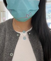
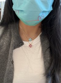
Noticed how this year’s HP in WG, with ‘plain‘ stone/porcelain makes the diamond centre appear bigger due to the white rims around it: ) Lovely
You are using an out of date browser. It may not display this or other websites correctly.
You should upgrade or use an alternative browser.
You should upgrade or use an alternative browser.
2022 Holiday Pendant
- Thread starter babygirl416
- Start date
TPF may earn a commission from merchant affiliate
links, including eBay, Amazon, and others
More options
Who Replied?Adding another reference photo of the 2022 HP.
It’s a lovely color. There are definitely more green hues IRL than what the picture depicts. Unfortunately, I do not have any WG but am happy that it’s going to be loved by a very good friend of mine. Because of this year’s new policy, she was not able to secure one and I was happy to offer her my pendant.
View attachment 5623994
Anyone would be so lucky to have a friend like you! Do you know, since the necklace is under your profile, would your friend be able to bring it in-store to get it engraved or serviced such as adding length or polishing?
It shouldn’t be a problem. It’s like if you were gifted a VCA piece by someone, the piece would be registered under the purchaser’s name but you, the receiver, would still enjoy all the “warranties” that come with the piece, since it’s an authentic VCA creation. At least that is what I hope (that VCA stands behind all of its creation regardless of who the piece is registered under).Anyone would be so lucky to have a friend like you! Do you know, since the necklace is under your profile, would your friend be able to bring it in-store to get it engraved or serviced such as adding length or polishing?
Ooh, good point. I will have to double check what my magic pendant came it, you’re probably right in that they would be the same.It depends on the SA- but your packaging I’ve received for my magic pendant prior, so it’s not new. My SA also knows I prefer the smaller boxes because it’s the only way for me to fit all my vca pieces in my safety deposit box
Yay! I should have it back in time for my next trip.They always say two weeks, but it has never taken that long.
I didn’t realize this since this is my first vintage alhambra pendant. I know I still want the 2” but I’ll measure it for science before I ship it out.On the extension, I found it interesting that the original length of the new HP is longer than the original length of previous year’s HP. I would usually extend mine by 2 inches but when measured vs my adjusted old HP, it needed to adjust it by 1 inch only.
Went to see the VCA HP 2022 Celadon Porcelain in person. I made sure to bring my Turquoise YG pendant and Hermes Lagon swift K32 for direct comparison. My particular turquoise pendant was definitely bluer and more saturated, the HP is greener in comparison. It was actually a closer match to my Lagon swift K32 than my turquoise pendant.
These pics are as close to accurate as I could get in the harsh in-store lighting. Note that as others have mentioned, it photographs bluer than it is in real life because of the phone camera auto-adjust - next to turquoise especially, you can definitely appreciate the greener tones. Although it is a gorgeous color, I did pass on the HP as I felt it was too close to my turquoise to warrant a 4+k purchase, plus I'm not really a WG person, and I have way too many other pieces on my wishlist . If I did not own turquoise, I would have definitely snapped this up, because it's my favorite color family.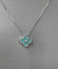

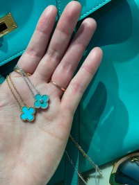
These pics are as close to accurate as I could get in the harsh in-store lighting. Note that as others have mentioned, it photographs bluer than it is in real life because of the phone camera auto-adjust - next to turquoise especially, you can definitely appreciate the greener tones. Although it is a gorgeous color, I did pass on the HP as I felt it was too close to my turquoise to warrant a 4+k purchase, plus I'm not really a WG person, and I have way too many other pieces on my wishlist . If I did not own turquoise, I would have definitely snapped this up, because it's my favorite color family.


Last edited:
Love this comparison pic. Turquoise is so beautiful but looking at the holiday pendant it definitely holds its weight as being very beautiful too.Went to see the VCA HP 2022 Celadon Porcelain in person. I made sure to bring my Turquoise YG pendant and Hermes Lagon swift K32 for direct comparison. My particular turquoise pendant was definitely bluer and more saturated, the HP is greener in comparison. It was actually a closer match to my Lagon swift K32 than my turquoise pendant.
These pics are as close to accurate as I could get in the harsh in-store lighting. Note that as others have mentioned, it photographs bluer than it is in real life because of the phone camera auto-adjust - next to turquoise especially, you can definitely appreciate the greener tones. Although it is a gorgeous color, I did pass on the HP as I felt it was too close to my turquoise to warrant a 4+k purchase, plus I'm not really a WG person, and I have way too many other pieces on my wishlist . If I did not own turquoise, I would have definitely snapped this up, because it's my favorite color family.View attachment 5624490View attachment 5624491View attachment 5624492
I think the diamond adds a touch of elegance and feminine softness to the hp color. Paired with your bag… it’s WOW.
Thank you for sharing these pictures… I was hoping it would look as close as possible to turquoise. It has similarities but is definitely not the same.
I don’t have turquoise (I wish I did!)
Wonderful comparison pics and post. Thank you.Went to see the VCA HP 2022 Celadon Porcelain in person. I made sure to bring my Turquoise YG pendant and Hermes Lagon swift K32 for direct comparison. My particular turquoise pendant was definitely bluer and more saturated, the HP is greener in comparison. It was actually a closer match to my Lagon swift K32 than my turquoise pendant.
These pics are as close to accurate as I could get in the harsh in-store lighting. Note that as others have mentioned, it photographs bluer than it is in real life because of the phone camera auto-adjust - next to turquoise especially, you can definitely appreciate the greener tones. Although it is a gorgeous color, I did pass on the HP as I felt it was too close to my turquoise to warrant a 4+k purchase, plus I'm not really a WG person, and I have way too many other pieces on my wishlist . If I did not own turquoise, I would have definitely snapped this up, because it's my favorite color family.View attachment 5624490View attachment 5624491View attachment 5624492
I ended up getting the lighter of the 2. I liked the pendant even more in person !
These are the most accurate pictures I've seen so far for showing what the color really looks like in person.
Now I am wondering how much the pendants vary in color. The one I saw in person did not look this vibrant at all!Went to see the VCA HP 2022 Celadon Porcelain in person. I made sure to bring my Turquoise YG pendant and Hermes Lagon swift K32 for direct comparison. My particular turquoise pendant was definitely bluer and more saturated, the HP is greener in comparison. It was actually a closer match to my Lagon swift K32 than my turquoise pendant.
These pics are as close to accurate as I could get in the harsh in-store lighting. Note that as others have mentioned, it photographs bluer than it is in real life because of the phone camera auto-adjust - next to turquoise especially, you can definitely appreciate the greener tones. Although it is a gorgeous color, I did pass on the HP as I felt it was too close to my turquoise to warrant a 4+k purchase, plus I'm not really a WG person, and I have way too many other pieces on my wishlist . If I did not own turquoise, I would have definitely snapped this up, because it's my favorite color family.View attachment 5624490View attachment 5624491View attachment 5624492
Another thing I don't love about the HP this year is the texture. When the light hits it a certain way, you can really see the texture and it looks bumpy in a very unappealing way. I'm pretty disappointed with the HP this year. I was really looking forward to it, but it just does not bring me any joy. In fact, I actually think I hate it.
It's not just that it is white gold, I don't mind white gold most of the time and in diamond pieces white gold is absolutely beautiful....but white gold is already cool toned, and combined with this very muted, green-blue-grey, cool toned porcelain, it just doesn't work for me. If it wasn't so limited and hard to get (which increases desire, demand, and a sense of urgency) I wonder how many people would actually like it & buy it.
Now I am wondering how much the pendants vary in color. The one I saw in person did not look this vibrant at all!
Another thing I don't love about the HP this year is the texture. When the light hits it a certain way, you can really see the texture and it looks bumpy in a very unappealing way. I'm pretty disappointed with the HP this year. I was really looking forward to it, but it just does not bring me any joy. In fact, I actually think I hate it.
It's not just that it is white gold, I don't mind white gold most of the time and in diamond pieces white gold is absolutely beautiful....but white gold is already cool toned, and combined with this very muted, green-blue-grey, cool toned porcelain, it just doesn't work for me. If it wasn't so limited and hard to get (which increases desire, demand, and a sense of urgency) I wonder how many people would actually like it & buy it.
I think a lot of people still like the color of the HP this year, given it is a closest color substitute for a turquoise alhambra pendant.
I do think VCA is smart though, they chose this color which is close to turquoise yet not as bright or saturated or even-tone like turquoise. This way VCA will still maintain the premier status of turquoise in the VCA jewelry collection as turquoise is used in high jewelry collections or as a special alhambra stone for VCA’s VIP clients.
Last edited:
It really doesn't look anything like turquoise in person though. It is so, so muted.I think a lot of people still like the color of the HP this year, given it is a closest color substitute for a turquoise alhambra pendant. I do think VCA is smart though, they chose this swatch which is close to turquoise yet not as bright or saturated or even tone like turquoise. This way VCA will still keep the premier status of turquoise in the VCA jewelry collection as turquoise is obviously used in high jewelry collections or as a special alhambra stone for VCA’s VIP clients.
It really doesn't look anything like turquoise in person though. It is so, so muted.
That's sad. But you already own the beautiful turquoise pave Alhambra 20 motifs, right? So, you don't need this year's HP.

I actually let the turquoise pave goThat's sad. But you already own the beautiful turquoise pave Alhambra 20 motifs, right? So, you don't need this year's HP.

but regardless, I was hoping for better for this year’s HP!
Register on TPF! This sidebar then disappears and there are less ads!

