The Worst Hermes Color EVER!?

TPF may earn a commission from merchant affiliate
links, including eBay, Amazon, and others

I am pleasantly surprised to see the wildly differing opinions about color. I found this thread after searching for "toundra", because I was on the fence. I didn't imagine to find any hate towards blue jean, pinks, and especially etoupe but there it was. It made me chuckle.

As for me, I dislike bright reds on myself, so rouge vif would be a no for me.
Too funny. I really like toundra especially with GHW. I can see why others find it boring though — but not me :)
 
It's really interesting to me how hardware color influences how I perceive the bag's color. I honestly feel that Hermes should refuse to make some colors with certain hardware. For example, one of our more controversial ones - crevette. I was googling and it looks SO BAD with palladium hardware. Like a washed out tangerine or something. But with gold hardware, the color warms and gets kind of peachy. It's not something that would work with my color palate but it is still pleasing for me to look at.
Glycine, another controversial one, is the opposite. When I see it with PHW, I think it's lovely and subtle and sophisticated and the PHW seems to bring out some mauve, lavender tones in the leather. With GHW, it looks awful and drab and well, fleshlike.
This last observation might belong in unpopular opinions thread, but I feel the same way about etoupe. Hermes should refuse to make it with gold hardware, it looks absolutely awful, lol. But with silver, it's a nice neutral. TO ME, lol.
 
This last observation might belong in unpopular opinions thread, but I feel the same way about etoupe. Hermes should refuse to make it with gold hardware, it looks absolutely awful, lol. But with silver, it's a nice neutral. TO ME, lol.
Too funny — I believe H should ONLY do Etoupe w/ GHW for the exact same reason. Lol.

Etoupe and/or Etain w/ PHW comes across as incredibly underwhelming/boring to me.

Love all the different opinions!
 
It's really interesting to me how hardware color influences how I perceive the bag's color. I honestly feel that Hermes should refuse to make some colors with certain hardware. For example, one of our more controversial ones - crevette. I was googling and it looks SO BAD with palladium hardware. Like a washed out tangerine or something. But with gold hardware, the color warms and gets kind of peachy. It's not something that would work with my color palate but it is still pleasing for me to look at.
Glycine, another controversial one, is the opposite. When I see it with PHW, I think it's lovely and subtle and sophisticated and the PHW seems to bring out some mauve, lavender tones in the leather. With GHW, it looks awful and drab and well, fleshlike.
This last observation might belong in unpopular opinions thread, but I feel the same way about etoupe. Hermes should refuse to make it with gold hardware, it looks absolutely awful, lol. But with silver, it's a nice neutral. TO ME, lol.

Totally agree. Especially delicate colours that can be overwhelmed by ghw like Bleu Brume or Glycine, very different that quite close light colours such as Ciel or Sakura which can just about compete. (especially in more reflective leathers).

I tried Glycine phw and it was very ice-princess like. It still did not 'like me' though. I'm what is supposedly termed 'neutral', on the right cool beauty it would have looked magical.
 
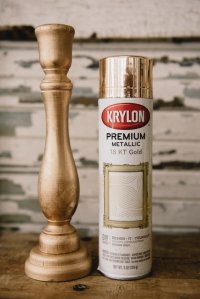
I don’t like doré.

It looks cheap to me and reminds me of metallic spray paint:

View attachment 6119122


Ewwww dear lord these pics need a nsfw filter!!

My worst H color is probably Kraft. Looks like cheese colored cat sick. Also the name sucks.


Too funny. I really like toundra especially with GHW. I can see why others find it boring though — but not me :smile:


I wonder if that's because these colours like Kraft, Tundra and Doré are too near classic H neutrals like Veau Naturel, Etoupe and Gold we are so familiar with. It almost looks the colours are 'off'. Etoupe gone off or Gold gone off. You can add Sesame, Curry, Biscuit, Quebracho etc too. In store, I remember literally looking at bags on shelves, particularly neutrals, and thinking "it looks wrong' and "why don't they just make more Gold or Etoupe?". I think mainly they were trying to replicate natural saddle leathers. Why don't Hermes just do some more Veau Naturel (we know the answer to that one :biggrin:).

Funny enough I don't feel the same about Etain which I love, the 'greish' I can wear. Beige de Weimar misses the too close for comfort feeling too because I think it's far enough from Etoupe and Gold, somewhere in the middle, true dark beige.
 
Ewwww dear lord these pics need a nsfw filter!!

My worst H color is probably Kraft. Looks like cheese colored cat sick. Also the name sucks.
I was looking up bronze dore, my previous winner for Worst Color, and compared it to Kraft. I think you're right and Kraft is slightly worse. It's got more yellowy green in it. They're both definitely living in sick 💩 territory for me, though.

And yeah, wow crevette is foul. As are those "dessert" pictures, omg 🤮

Adding to this, I recently saw a matte alligator bicolor combo that I desperately disliked... it was like, "vanille" (like the off-white drab color of walls inside a smoker's home) and some kind of pastel yellow. Really increased the smoker's teeth feeling. 😅 So sorry if that's your SO and you love it, I just... do not.
 
This thread does make me laugh! I've just read that Ebene reminds someone of an old sofa, so now whenever I look at my Birkin I'm going to think of that! Thank you :lol:

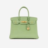
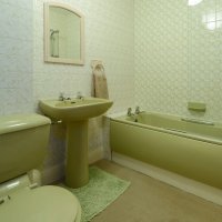
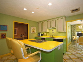
By way of revenge, having already posted Crevette coloured custard I'm adding Vert Criquet. I think I've mentioned it before and it may have just been a UK thing, but whenever I see it I think 1970's bathroom suite. :biggrin:

Image 1.jpegImage.jpeg
 
This thread does make me laugh! I've just read that Ebene reminds someone of an old sofa, so now whenever I look at my Birkin I'm going to think of that! Thank you :lol:

By way of revenge, having already posted Crevette coloured custard I'm adding Vert Criquet. I think I've mentioned it before and it may have just been a UK thing, but whenever I see it I think 1970's bathroom suite. :biggrin:

View attachment 6119591View attachment 6119592
We have the same in the US and I also feel the same for this green.

1737396431472.png

And the name really put a nail in that coffin.
 
Top