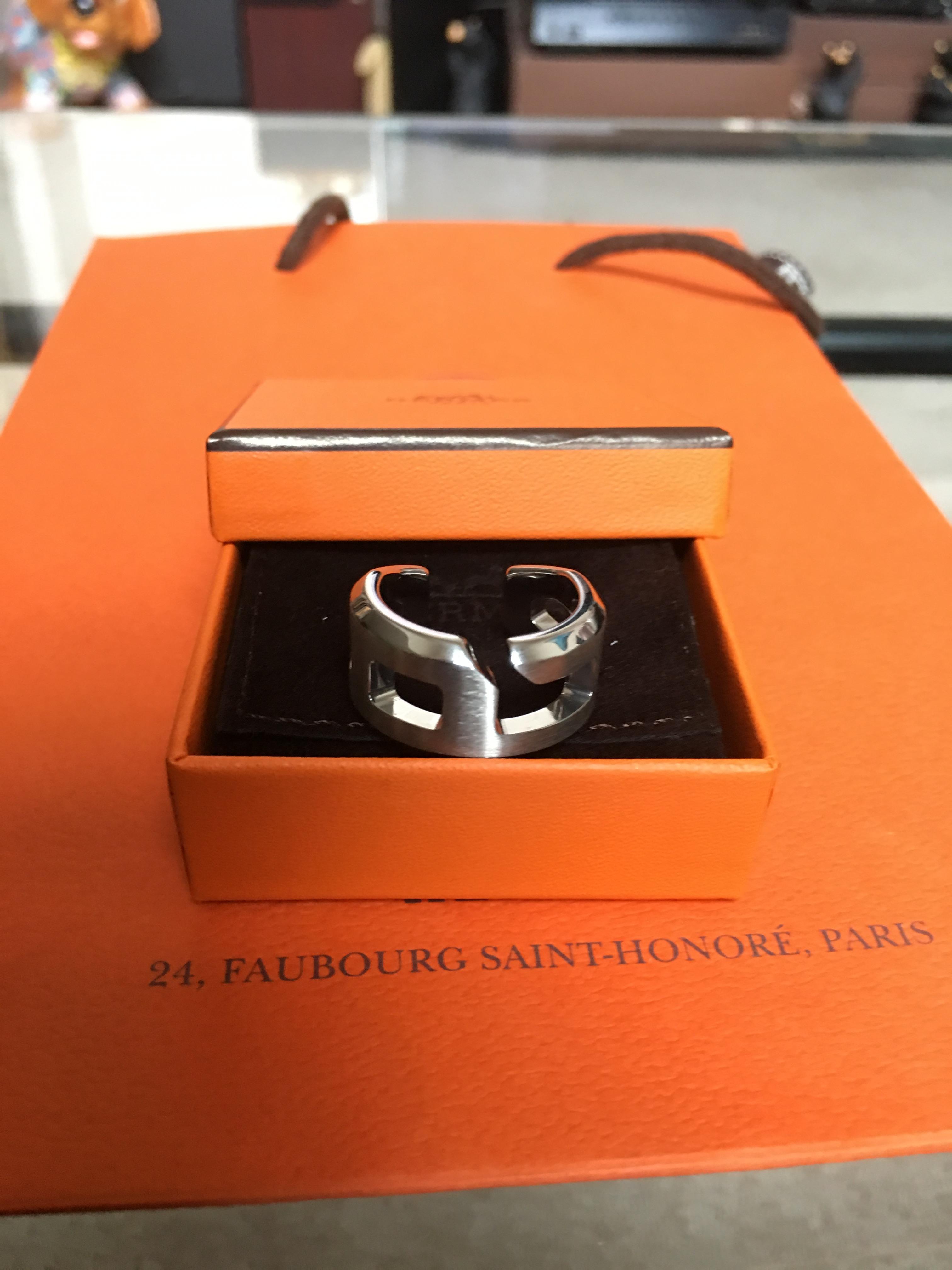
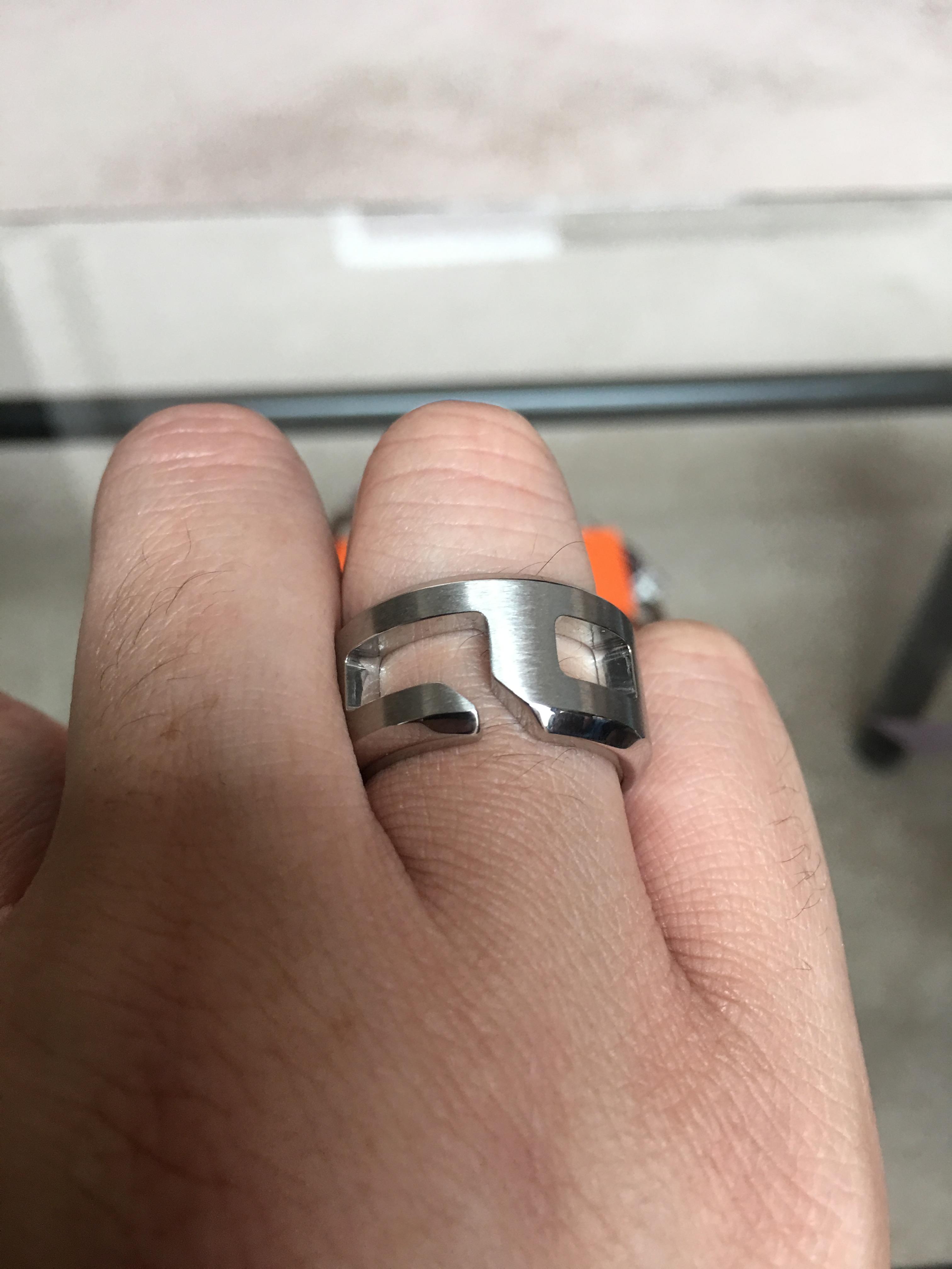
Really enjoying the size of the 40, although it's a tad on the heavier size but nothing I can't handle. Now I can't wait for my SO to arrive [emoji7]

TPF may earn a commission from merchant affiliate
links, including eBay, Amazon, and others
I LOVE it! The leather is beautifully relaxed, giving it a very casual vibe.Really enjoying the size of the 40, although it's a tad on the heavier size but nothing I can't handle. Now I can't wait for my SO to arrive [emoji7]View attachment 3800588View attachment 3800590


One of the new two-color Citybacks popped up on the EU website:View attachment 3805227
pretty amazing.
Beautiful! I'm looking forward to the other bicolor. So exciting!One of the new two-color Citybacks popped up on the EU website:View attachment 3805227
pretty amazing.
Beautiful! I'm looking forward to the other bicolor. So exciting!
One of the new two-color Citybacks popped up on the EU website:View attachment 3805227
pretty amazing.
I find the colour combination interesting but would be worried to get bored of it too quickly. I don't really regret having gone for the "traditional" monochrome design.


I think a monotone color is faaaar easier to match clothes. The Plomb for example looks especially amazing on dark green/olive and dark red clothes.
These bicolor ones have a lot of potential to look great. I'm not that impressed with the green one....but the red/indigo in swift could look rlly cool, and if they do like dark blue/light blue or black/red.....omg.