Ooo I love all of these !! I agree with Bull - that was my thinking too as I played around with the colors on mine. I just love the Saffron color though, and I bet Saffron and quartz is gorgeous together (I did blue and quartz, and the quartz really is a lovely contrast to the main color!). Although I really think you can’t go wrong with whatever you end up choosing - I know the feeling that it’s hard to commit to the one combo! Wait now I want a mon mono with saffron too 🤣
You are using an out of date browser. It may not display this or other websites correctly.
You should upgrade or use an alternative browser.
You should upgrade or use an alternative browser.
Milestone Bag - Mon Mono?
- Thread starter LVFloridagirl
- Start date
TPF may earn a commission from merchant affiliate
links, including eBay, Amazon, and others
More options
Who Replied?
I like the first one best - your original selection of saffron and caramel. The saffron just sings and the caramel is cozy and warm beside it. Go with your gut. If we're just confusing you, sleep on it another day or two.
I checked, the creme (or as they call it, quartz) is excellent with the saffron, but so is yellow. Saffron and yellow is fabulous. I recommend checking
Thank you all for the replies and feedback. Definitely need to sleep on this one, especially after popping into LV. They had a suitcase with saffron on it and it was much brighter & shinier than it appears on line. Looks like yellow nail polish, lol! Not sure how that plays into contrast..? Still love it on line but nervous as well. Also did a mock up of saffron & cream, pretty but not sure it’s my vibe. Wish I could’ve seen Carmel in person also. @wildwest81 - does your color selection give a natural feel?First, congrats on the milestone
Second, Mon Mono is always fun and you indeed have good taste, a tropical colour combo can be fun of course, but I'd much better go with the classics too. Unless it's my 100th Mon Mono
On the colours: saffron is one of my absolute favourites, but...
When it comes to Mon Mono, I prefer to follow the rules of make-up by choosing an accent colour, a dominant one, and another to provide contrast or elevate the first one, so it's less dark/vibrant/light, whatever the main aspect was that made the first one the primary colour.
So while I wouldn't say that the first combo is bad, I find the saffron and the camel to have very similar colour properties: both on the warm yellow spectrum, similar lightness level, etc... so if I were you, I'd choose one of them as the accent colour, and then pick another one to complement it. That is why I instinctively liked the version with the creme colour much more. That is an excellent combo with great contrast, good pairing. If you love saffron more (which I also do), I'd go with another secondary colour instead of the camel
Attachments
I actually prefer the Camel over the quartz. The second one I did was meant to be more fall colors so I went darker. I find the quartz really light(which looks amazing with vachetta btw) and looks really good with most the color options. I agree with bull that choosing a contrast looks really nice and gives it a pop. I love the camel color and knew I would love it with a darker contrast color like the Fauve. I’m a pretty basic color person so I don’t do loud colors but absolutely love seeing other people do them. I wish I was more adventurous!! I love Leah’s!!Thank you all for the replies and feedback. Definitely need to sleep on this one, especially after popping into LV. They had a suitcase with saffron on it and it was much brighter & shinier than it appears on line. Looks like yellow nail polish, lol! Not sure how that plays into contrast..? Still love it on line but nervous as well. Also did a mock up of saffron & cream, pretty but not sure it’s my vibe. Wish I could’ve seen Carmel in person also. @wildwest81 - does your color selection give a natural feel?
I really think you could go either way with your options you have made and it will look amazing. I love the saffron and think either way you would love it ❤️
I understand your dilemma and went through the exact same thing but in the end trusted my gut and went with what I knew would work with my wardrobe. As nerve wracking as it is the end result is so personal and it really makes it special 😊
They are vastly different than online. For the previous Mon Mono service, they had that flipping book in store, where we could check the pairings, printed right onto the PVC, not on a digital monitor. I don't know if they have that for the new collection already. But it it would be vers useful now.Thank you all for the replies and feedback. Definitely need to sleep on this one, especially after popping into LV. They had a suitcase with saffron on it and it was much brighter & shinier than it appears on line. Looks like yellow nail polish, lol! Not sure how that plays into contrast..? Still love it on line but nervous as well. Also did a mock up of saffron & cream, pretty but not sure it’s my vibe. Wish I could’ve seen Carmel in person also. @wildwest81 - does your color selection give a natural feel?
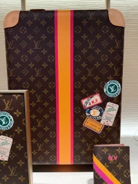
Funny how they went for those tropical combos for the display pieces
") but kinda understandable.
but kinda understandable.I went back to the Mon Mono thread and looked at the pics you posted. I put together a quick comparison, and it is astonishing how different the online and the actual colours are. But fortunately it looks excellent irl. I know that it is quite difficult to match digital and printed colours, but they could try a little harder.I actually prefer the Camel over the quartz. The second one I did was meant to be more fall colors so I went darker. I find the quartz really light(which looks amazing with vachetta btw) and looks really good with most the color options. I agree with bull that choosing a contrast looks really nice and gives it a pop. I love the camel color and knew I would love it with a darker contrast color like the Fauve. I’m a pretty basic color person so I don’t do loud colors but absolutely love seeing other people do them. I wish I was more adventurous!! I love Leah’s!!
I really think you could go either way with your options you have made and it will look amazing. I love the saffron and think either way you would love it ❤️
I understand your dilemma and went through the exact same thing but in the end trusted my gut and went with what I knew would work with my wardrobe. As nerve wracking as it is the end result is so personal and it really makes it special 😊
Attachments
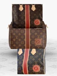
This is my issue. The colors online and the colors you will get in person on the monogram will not be exact. My CA warned me that if you put color on top of canvas, it is very hard to be true to that color. It's not like replacing the vachetta with a particular colored leathers.....I went back to the Mon Mono thread and looked at the pics you posted. I put together a quick comparison, and it is astonishing how different the online and the actual colours are. But fortunately it looks excellent irl. I know that it is quite difficult to match digital and printed colours, but they could try a little harder.
I was actually just posting about this on the other thread. I agree that the colors are a little different in real life and also I noticed that the same color, ie-camel does look different with the quartz over the Fauve. My only guess is that the colors can change depending on the secondary color. I deal with this a lot in my own work with digital printing on fabric as colors are often times different in person versus when we are digital printing off software template. I definitely think with the size of a company like LV that they would or could have better options to show colors more true. But again it also could be monitor settings? Camel with quartz is a different shade than the camel with Fauve. I did post a comparison pic of that in the other thread as well. I went safe with neutral colors so a shade off is ok but when you step into the brighter colors it could really throw things off. I love both of mine and the shade difference isn’t too bad but I was aware (due to my own work with digital presentation) that it could look different once on canvas.I went back to the Mon Mono thread and looked at the pics you posted. I put together a quick comparison, and it is astonishing how different the online and the actual colours are. But fortunately it looks excellent irl. I know that it is quite difficult to match digital and printed colours, but they could try a little harder.
I do think you have to go into it knowing it could look a little different than expected. The Fauve color threw me off but I still love it 😂
@LeahLVoes did your bag look considerably different than expected? I know you have bright colors on your bag.
I was actually just posting about this on the other thread. I agree that the colors are a little different in real life and also I noticed that the same color, ie-camel does look different with the quartz over the Fauve. My only guess is that the colors can change depending on the secondary color. I deal with this a lot in my own work with digital printing on fabric as colors are often times different in person versus when we are digital printing off software template. I definitely think with the size of a company like LV that they would or could have better options to show colors more true. But again it also could be monitor settings? Camel with quartz is a different shade than the camel with Fauve. I did post a comparison pic of that in the other thread as well. I went safe with neutral colors so a shade off is ok but when you step into the brighter colors it could really throw things off. I love both of mine and the shade difference isn’t too bad but I was aware (due to my own work with digital presentation) that it could look different once on canvas.
I do think you have to go into it knowing it could look a little different than expected. The Fauve color threw me off but I still love it 😂
@LeahLVoes did your bag look considerably different than expected? I know you have bright colors on your bag.
It came out definitely brighter than expected. 😅
I knew I was going for bright colors but when I got mine she is so very bright and like it is really popping. But I do love it, I think it's such a stark contrast to the classic monogram that it makes it very fun.

I have one of the "old" mon mono Neverfulls (my avatar photo) and it makes me sad that they no longer allow you to do the inside lining color. My NF has bright blue lining to match the blue stripe, and it's my favorite part of the bag. Clearly, I went bright, but I'm loving some of the more neutral, soft color combos in this thread.
WOW, I was staring at those photos for a while, but it's not an optical illusion, they are literally different colours. Very surprising.I was actually just posting about this on the other thread. I agree that the colors are a little different in real life and also I noticed that the same color, ie-camel does look different with the quartz over the Fauve. My only guess is that the colors can change depending on the secondary color. I deal with this a lot in my own work with digital printing on fabric as colors are often times different in person versus when we are digital printing off software template. I definitely think with the size of a company like LV that they would or could have better options to show colors more true. But again it also could be monitor settings? Camel with quartz is a different shade than the camel with Fauve. I did post a comparison pic of that in the other thread as well. I went safe with neutral colors so a shade off is ok but when you step into the brighter colors it could really throw things off. I love both of mine and the shade difference isn’t too bad but I was aware (due to my own work with digital presentation) that it could look different once on canvas.
I do think you have to go into it knowing it could look a little different than expected. The Fauve color threw me off but I still love it 😂
@LeahLVoes did your bag look considerably different than expected? I know you have bright colors on your bag.
I absolutely adore your bag and color choices!! 🩷💛. Seriously so fun and I wish I was brave enough to try it. I was wondering how your experience went and I’m glad to hear from you about it. So it seems that all colors end up a little brighter than the styler makes them appear online.It came out definitely brighter than expected. 😅
I knew I was going for bright colors but when I got mine she is so very bright and like it is really popping. But I do love it, I think it's such a stark contrast to the classic monogram that it makes it very fun.
View attachment 6205632
I’m glad you love yours!! It’s really beautiful ❤️
I was so sad they got rid of the lining colors, I didn’t make one on the last round and really regret not doing it. I bet it’s absolutely beautiful with the matching lining 💙💙I have one of the "old" mon mono Neverfulls (my avatar photo) and it makes me sad that they no longer allow you to do the inside lining color. My NF has bright blue lining to match the blue stripe, and it's my favorite part of the bag. Clearly, I went bright, but I'm loving some of the more neutral, soft color combos in this thread.
It was shocking to see in person but it still worked well so I wasn’t overly upset. I can imagine some people are arguing with LV about the Mon mono they received. If I was expecting muted pink and got a brighter pink I would’ve been a little disappointed.WOW, I was staring at those photos for a while, but it's not an optical illusion, they are literally different colours. Very surprising.
Thank you!I absolutely adore your bag and color choices!! 🩷💛. Seriously so fun and I wish I was brave enough to try it. I was wondering how your experience went and I’m glad to hear from you about it. So it seems that all colors end up a little brighter than the styler makes them appear online.
I’m glad you love yours!! It’s really beautiful ❤️

She's such a slice of sunshine 🩷💛
I really like yours too. You have great eye and sense. ☺️🙏🏻
Register on TPF! This sidebar then disappears and there are less ads!