You are using an out of date browser. It may not display this or other websites correctly.
You should upgrade or use an alternative browser.
You should upgrade or use an alternative browser.
Lala's Growing Garden
- Thread starter lala28
- Start date
TPF may earn a commission from merchant affiliate
links, including eBay, Amazon, and others
More options
Who Replied?
...Each leaf is decorated with geometric patterns symbolising a culture, belief, or social status...and whose complexity at times conjures up a sort of magic protecting from harm or summoning luck.
(excerpt from scarf stories A/W 2011, L'arbre de vie by Christine Henry)

(excerpt from scarf stories A/W 2011, L'arbre de vie by Christine Henry)


Thank you, ladies! 
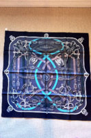
Astrologie suede pumps from Fall 2010, Art de Steppes scarf and vintage suede handbag
(P.S. If anyone is familiar with these types of bags please PM me. I don't quite understand the history, but apparently there is a significant story behind the handbag.)

Astrologie suede pumps from Fall 2010, Art de Steppes scarf and vintage suede handbag
(P.S. If anyone is familiar with these types of bags please PM me. I don't quite understand the history, but apparently there is a significant story behind the handbag.)

Hi Mree!! Long time no see!
Thanks hun! How are you? I'm doing ok.
And, what do you think of A/W 2011 RTW suede leather pants? Is there anything particularly "special" about these that makes them stand out from any other pair of suede pants? Opinions welcomed.

Um, you look HOT!! Your legs are amazing!!!
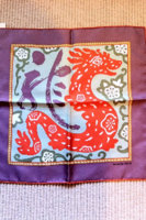
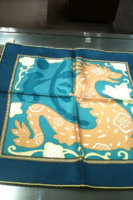
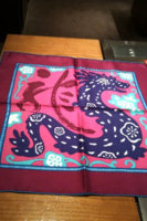
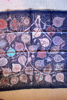
I ended up buying 3 colorways of the Dragon gavroche so I am definitely prepared for next year. I haven't bought the etoupe colorway (third attachment), but I am thinking about it...
Attachments

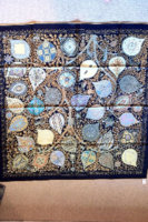
I think I'm all set for A/W 2011 with the exception, maybe, of adding another Ex Libris Kimono to the mix. I seem to have a habit of buying scarves in pairs.
Attachments
I wasn't sold on these initially, but when I saw them in person, I was drawn to them. In fact, I think a lot of the A/W 2011 collection looks better in person for some reason. I wasn't very optimistic when I saw the picture books.
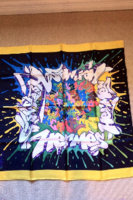
Hermes Graff - Looked really crazy in the book, but when I tried it on, the colors in the middle really come out and you have a lot of different styling options.
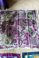
I've always liked Annie Faivre patterns, but when I saw this in the book, I thought it looked busy and too similar to the Fleurs Indiennes design. In this white/purple/green colorway, however, it looks less busy. Plus, I'm a sucker for contrast hems.
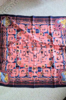
Esprit Ainou is not one of my favorite designs, but I thought this color combination of ink blue and coral was unique.
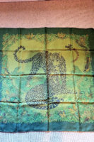
The Jungle Love dip dye looks really jewel toned in the picture book, but in real life, it has a lot more yellow in it. It matches my vert cru kelly") .
.
Hermes Graff - Looked really crazy in the book, but when I tried it on, the colors in the middle really come out and you have a lot of different styling options.
I've always liked Annie Faivre patterns, but when I saw this in the book, I thought it looked busy and too similar to the Fleurs Indiennes design. In this white/purple/green colorway, however, it looks less busy. Plus, I'm a sucker for contrast hems.
Esprit Ainou is not one of my favorite designs, but I thought this color combination of ink blue and coral was unique.
The Jungle Love dip dye looks really jewel toned in the picture book, but in real life, it has a lot more yellow in it. It matches my vert cru kelly
.Attachments


Lala, all of your pairings are so beautiful. Congrats.
I love the Brazil dress ! She is perfect with this belt and the CW really compliments your gorgeous hair !!
I love the Brazil dress ! She is perfect with this belt and the CW really compliments your gorgeous hair !!
Register on TPF! This sidebar then disappears and there are less ads!