Scarves …..Hermès Fall/Winter 2025 Scarves…..

TPF may earn a commission from merchant affiliate
links, including eBay, Amazon, and others

FALL-WINTER 2025 SCARF LIST

45 SILK GAVROCHE

1. Les Bassets (Xavier de Poret)
2. Cavalier en Formes (Gianpaolo Pagni)
3. Tulipomanie Detail (Aline Honore)

45 CS GAVROCHE
1. Ex Libris (Hugo Grygkar)
2. L'instruction du roy bayadere (Henri d'Origny)
3. Tulipomanie Detail

55 BANDANA
1. H Enlumine (Pierre Marie)
2. Grand Tralala (Virginie Jamin)

70 SILK
1. Paris Qui Roule (Hugo Grygkar)
2. Mors a Jouets (Henry d'Origny)
3. Tout en Tresse
4. Illusion Exquise
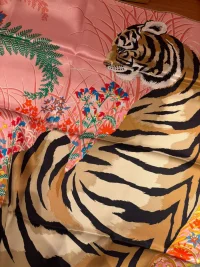
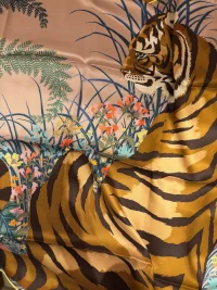
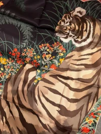
5. Tyger Tyger (Alice Shirley)

80 CASHMERE
1. Carreaux

90 SILK
1. Les Chevaux Dechaines (Octave Marsal)
2. L'heurs de Gants (Jonathan Burton)
3. Camails A Carreaux
4. A Toute Allure (Gianpaolo Pagni)
5. Academia Hippica (Jan Bajtlik)
6. Flora Y Plata
7. Bouquet Final (Katie Scott)
8. Dans Les Bras de Séléné (Sophia Andreotti and Édouard Baribeaud)

140 CSGM
1. Paddock (Jean-Louis Clerc)
2. Palefroi (Francoise de la Perriere)
3. Rendez-Vous Chez Hermes (Carine Brancowitz)
4. A Toute Berline!
5. Herizens
6. Cheval de Coeur Bandana (Daiske Nomura)

GIANT TRIANGLE
1. Clic Clac (Julie Abadie)
2. Plantes Officinales
3. Mille Et Un Lapins (Shinsuke Kawahara)

PLEATED TRIANGLE
1. Clic Clac (Julie Abadie)
2. Plantes Officinales
3. Mille Et Un Lapins (Shinsuke Kawahara)

TWILLY
1. C'est la Fete (Daiske Nomura)
2. Le Philateliste du Faubourg (Octave Marsal)
3. Pony Pit Stop (Ugo Bienvenu)
4. ??
5. ??
6. Paris qui Roule (Hugo Grygkar)
7. 18-3-7 (Geoff McFetridge)
8. ?? Fringe Twilly

CRAVATTE
1. Bouquet Final (Katie Scott)
2. ??
3. ??

EXCEPTIONALS
1. Ex Libris Marble scarf 90
2. Le Philateliste du Faubourg scarf 90
3. Ex Libris Embroidered scarf 90
4. Chorus Stellarum Shawl 140
5. Eperon d'Or et Tenues de Jour Shawl 140
6. Coaching Shawl 120
7. Petit Duc Poncho
8. Quadrige Poncho
9. Rectangle Grand Patchwork
10. C'est la Fete long twilly
11. Bouquet final Abeilles scarf 90 with leather tassel
12. Losange Bouquet Final Abeilles
13. Twilly Bouquet Final with leather
14. La Cite Cavalier La Nui embroidered scarf 90

MEN
45 POCKET SQUARE

1. ??
2. 24 Brides et Chaînes (Daiske Nomura)
3. ??

65 CS Fringe
1. On Air! (Carine Brancowitz)

65 CS Bandana
1. Awooooo! Bandana (Alice Shirley)

80 FRINGE
1. Grand Manège

100 CS
1. 24 Brides et Chaines (Daiske Nomura)
2. Hermès Optical Perspective (Ewan Mesa)
3. Cheval A La Couverture Spirale
4. Jeu d’adresse (Evan Hecox)

MUFFLER
 
Bouquet Final by Katie Scott is such a striking design that I had to see it for myself. I ordered CW07 in ébène / sable / vert because I loved the drama of this dark brown colorway, and I have nothing like it in my scarf collection. It was also my mother's favorite colors during my childhood when she had dark brown hair along with her brown eyes. I think that color memory resonates with me as well.

Here is the scarf flat on my living room floor with natural sunlight coming in through the window. The bottom of the scarf is getting more light, so the brown is a bit lighter there. When the light catches the black flowers from certain angles, they look much lighter in color.

20250812_161439.webp

The tag. You can see that the back of the scarf is just as brown as the front.
20250812_161626.webp

Here are some of the "black" blooms as seen from the back side. I have no worries about the back showing, as it has its own dramatic beauty.
20250812_161719.webp

It took me a while to find Katie Scott's signature, but it is there.
20250812_162123.webp

I tried mod shots with several different tops, beginning with one that had similar green and brown colors as this scarf. Beginning with a simple drape then the bias fold. Look at how the dark bloom varies in color as the light changes.

20250812_162608.webp20250812_162838.webp20250812_162815.webp

I tried a lighter top for contrast. This scarf can be folded to show mostly brown, or to pick up more of the colors of the flowers.

20250812_163141.webp20250812_163048.webp

Next, I chose a gold top that picked up one of the flower colors. I like this a lot. I think a soft white winter sweater would look great as well. I was trying to show the big white flower in this front triangle drape, but personally, I prefer the off-center bias fold. It pulls more of the flower colors forward.

20250812_163822.webp20250812_163600.webp

And finally, I think this scarf will look great under a jacket in the fall and winter. This is a cowboy triangle fold with the ends brought to the front and knotted.

20250812_164151.webp

I like this scarf a lot, and I am looking forward to seeing the brightly colored CW08, blanc cassé / vermillon / vert, when it appears.
 
Last edited:
Bouquet Final by Katie Scott is such a striking design that I had to see it for myself. I ordered CW07 in ébène / sable / vert because I loved the drama of this dark brown colorway, and I have nothing like it in my scarf collection. It was also my mother's favorite colors during my childhood when she had dark brown hair along with her brown eyes. I think that color memory resonates with me as well.

Here is the scarf flat on my living room floor with natural sunlight coming in through the window. The bottom of the scarf is getting more light, so the brown is a bit lighter there. When the light catches the black flowers from certain angles, they look much lighter in color.

View attachment 6214035

The tag. You can see that the back of the scarf is just as brown as the front.
View attachment 6214036

Here are some of the "black" blooms as seen from the back side. I have no worries about the back showing, as it has its own dramatic beauty.
View attachment 6214037

It took me a while to find Katie Scott's signature, but it is there.
View attachment 6214038

I tried mod shots with several different tops, beginning with one that had similar green and brown colors as this scarf. Beginning with a simple drape then the bias fold. Look at how the dark bloom varies in color as the light changes.

View attachment 6214046View attachment 6214042View attachment 6214043

I tried a lighter top for contrast. This scarf can be folded to show mostly brown, or to pick up more of the colors of the flowers.

View attachment 6214045View attachment 6214039

Next, I chose a gold top that picked up one of the flower colors. I like this a lot. I think a soft white winter sweater would look great as well. I was trying to show the big white flower in this front triangle drape, but personally, I prefer the off-center bias fold. It pulls more of the flower colors forward.

View attachment 6214041View attachment 6214044

And finally, I think this scarf will look great under a jacket in the fall and winter. This is a cowboy triangle fold with the ends brought to the front and knotted.

View attachment 6214040

I like this scarf a lot, and I am looking forward to seeing the brightly colored CW08, blanc cassé / vermillon / vert, when it appears.
RedBird, this a gorgeous addition to your scarf wardrobe. The ebene/sable/vert color way is lovely on you.
 
My small contribution. Bouquet Final in beige doré/canard/vert.
Thank you for posting this lovely colorway. Beautiful photos with it
5 minute gap in the diary. Let’s go!

Here is Mille et un Lapins in Bleu Pétrole / Naturel / Vert. I’ll try it against other clothes in the next few days as it pairs well with many colours in my wardrobe but scarf playing time is very limited over the school holidays.

Taken in indirect sunlight
View attachment 6213933
View attachment 6213934

And in direct light (in front of a window), which gives it a greener hue
View attachment 6213935
View attachment 6213936
I LOVE blue petrole! And that hem on this swirls of animal fun, wow. I am realizing like with this design and your chacun from sotd that I really love wide swaths of color on scarves. It’s so visually interesting. And the striped hem decision by H on this design is 10/10. I love it when they get it soooo right
 
Bouquet Final by Katie Scott is such a striking design that I had to see it for myself. I ordered CW07 in ébène / sable / vert because I loved the drama of this dark brown colorway, and I have nothing like it in my scarf collection. It was also my mother's favorite colors during my childhood when she had dark brown hair along with her brown eyes. I think that color memory resonates with me as well.

Here is the scarf flat on my living room floor with natural sunlight coming in through the window. The bottom of the scarf is getting more light, so the brown is a bit lighter there. When the light catches the black flowers from certain angles, they look much lighter in color.

View attachment 6214035

The tag. You can see that the back of the scarf is just as brown as the front.
View attachment 6214036

Here are some of the "black" blooms as seen from the back side. I have no worries about the back showing, as it has its own dramatic beauty.
View attachment 6214037

It took me a while to find Katie Scott's signature, but it is there.
View attachment 6214038

I tried mod shots with several different tops, beginning with one that had similar green and brown colors as this scarf. Beginning with a simple drape then the bias fold. Look at how the dark bloom varies in color as the light changes.

View attachment 6214046View attachment 6214042View attachment 6214043

I tried a lighter top for contrast. This scarf can be folded to show mostly brown, or to pick up more of the colors of the flowers.

View attachment 6214045View attachment 6214039

Next, I chose a gold top that picked up one of the flower colors. I like this a lot. I think a soft white winter sweater would look great as well. I was trying to show the big white flower in this front triangle drape, but personally, I prefer the off-center bias fold. It pulls more of the flower colors forward.

View attachment 6214041View attachment 6214044

And finally, I think this scarf will look great under a jacket in the fall and winter. This is a cowboy triangle fold with the ends brought to the front and knotted.

View attachment 6214040

I like this scarf a lot, and I am looking forward to seeing the brightly colored CW08, blanc cassé / vermillon / vert, when it appears.
This looks absolutely beautiful on you! It looks so elegant with your coat. Enjoy!
 
5 minute gap in the diary. Let’s go!

Here is Mille et un Lapins in Bleu Pétrole / Naturel / Vert. I’ll try it against other clothes in the next few days as it pairs well with many colours in my wardrobe but scarf playing time is very limited over the school holidays.

Taken in indirect sunlight
View attachment 6213933
View attachment 6213934

And in direct light (in front of a window), which gives it a greener hue
View attachment 6213935
View attachment 6213936
Looks wonderful and I like both the more blue and the greener hue.
 
Bouquet Final by Katie Scott is such a striking design that I had to see it for myself. I ordered CW07 in ébène / sable / vert because I loved the drama of this dark brown colorway, and I have nothing like it in my scarf collection. It was also my mother's favorite colors during my childhood when she had dark brown hair along with her brown eyes. I think that color memory resonates with me as well.

Here is the scarf flat on my living room floor with natural sunlight coming in through the window. The bottom of the scarf is getting more light, so the brown is a bit lighter there. When the light catches the black flowers from certain angles, they look much lighter in color.

View attachment 6214035

The tag. You can see that the back of the scarf is just as brown as the front.
View attachment 6214036

Here are some of the "black" blooms as seen from the back side. I have no worries about the back showing, as it has its own dramatic beauty.
View attachment 6214037

It took me a while to find Katie Scott's signature, but it is there.
View attachment 6214038

I tried mod shots with several different tops, beginning with one that had similar green and brown colors as this scarf. Beginning with a simple drape then the bias fold. Look at how the dark bloom varies in color as the light changes.

View attachment 6214046View attachment 6214042View attachment 6214043

I tried a lighter top for contrast. This scarf can be folded to show mostly brown, or to pick up more of the colors of the flowers.

View attachment 6214045View attachment 6214039

Next, I chose a gold top that picked up one of the flower colors. I like this a lot. I think a soft white winter sweater would look great as well. I was trying to show the big white flower in this front triangle drape, but personally, I prefer the off-center bias fold. It pulls more of the flower colors forward.

View attachment 6214041View attachment 6214044

And finally, I think this scarf will look great under a jacket in the fall and winter. This is a cowboy triangle fold with the ends brought to the front and knotted.

View attachment 6214040

I like this scarf a lot, and I am looking forward to seeing the brightly colored CW08, blanc cassé / vermillon / vert, when it appears.
It’s very refined and elegant as well as unique. Fantastic mod shots.
 
5 minute gap in the diary. Let’s go!

Here is Mille et un Lapins in Bleu Pétrole / Naturel / Vert. I’ll try it against other clothes in the next few days as it pairs well with many colours in my wardrobe but scarf playing time is very limited over the school holidays.

Taken in indirect sunlight
View attachment 6213933
View attachment 6213934

And in direct light (in front of a window), which gives it a greener hue
View attachment 6213935
View attachment 6213936

Oh wow @GloWW0rM , it is really very pretty 🤩 the design is cute and suits you so well and that cw is made for you. Such a happy riot of colours ( and bunnies 😊). And the hem! Wonderful choice!! I hope there will be another saturated cw popping up, because now I want one too ( and I don’t think I can pull of the bleu petrole, but will try) 🥰
 
Last edited:
Bouquet Final by Katie Scott is such a striking design that I had to see it for myself. I ordered CW07 in ébène / sable / vert because I loved the drama of this dark brown colorway, and I have nothing like it in my scarf collection. It was also my mother's favorite colors during my childhood when she had dark brown hair along with her brown eyes. I think that color memory resonates with me as well.

Here is the scarf flat on my living room floor with natural sunlight coming in through the window. The bottom of the scarf is getting more light, so the brown is a bit lighter there. When the light catches the black flowers from certain angles, they look much lighter in color.

View attachment 6214035

The tag. You can see that the back of the scarf is just as brown as the front.
View attachment 6214036

Here are some of the "black" blooms as seen from the back side. I have no worries about the back showing, as it has its own dramatic beauty.
View attachment 6214037

It took me a while to find Katie Scott's signature, but it is there.
View attachment 6214038

I tried mod shots with several different tops, beginning with one that had similar green and brown colors as this scarf. Beginning with a simple drape then the bias fold. Look at how the dark bloom varies in color as the light changes.

View attachment 6214046View attachment 6214042View attachment 6214043

I tried a lighter top for contrast. This scarf can be folded to show mostly brown, or to pick up more of the colors of the flowers.

View attachment 6214045View attachment 6214039

Next, I chose a gold top that picked up one of the flower colors. I like this a lot. I think a soft white winter sweater would look great as well. I was trying to show the big white flower in this front triangle drape, but personally, I prefer the off-center bias fold. It pulls more of the flower colors forward.

View attachment 6214041View attachment 6214044

And finally, I think this scarf will look great under a jacket in the fall and winter. This is a cowboy triangle fold with the ends brought to the front and knotted.

View attachment 6214040

I like this scarf a lot, and I am looking forward to seeing the brightly colored CW08, blanc cassé / vermillon / vert, when it appears.

Thank you for sharing Redbird. It is very elegant and I especially love it on the pale top and on the bright yellow. I also think it will be stunning with a soft white for winter!
 
Some more Tyger Tyger 70 pictures for reference…

View attachment 6212627
Beige Cendre 05 (left)
Bleu Lavande 07 (right)

View attachment 6212628
Bleu Lavande - automatic yes!

View attachment 6212629
Beige Cendre - maybe…when I go in next time to pick up the pink that wasn’t there! My SA mistakenly thought the pink had arrived.

View attachment 6212630
Noir Beige 01 - surprisingly a YES!

I’ll likely end up with 3 or 4 of this same design!
The 01 looks lovely on you! Today my SA sent me what she has in store now I don’t know if I can came in today but I’m so curious and I’m loving all of them I might get multiple as well. I’m a bit afraid of the beige border on the pink one, but love the flower details and the tyger stripes.
I only got multiple of the Vallée cristal but I think I will of this one as well.
 

Attachments

  • e736c669-8372-403c-8507-fc88dc410a21.webp
    e736c669-8372-403c-8507-fc88dc410a21.webp
    312.5 KB · Views: 51
  • 5884c589-b772-4a37-9a35-0035d382b178.webp
    5884c589-b772-4a37-9a35-0035d382b178.webp
    357.4 KB · Views: 49
  • cc405c06-a5d3-4da4-9d5d-118f8cf0a6a3.webp
    cc405c06-a5d3-4da4-9d5d-118f8cf0a6a3.webp
    322.8 KB · Views: 48
The 01 looks lovely on you! Today my SA sent me what she has in store now I don’t know if I can came in today but I’m so curious and I’m loving all of them I might get multiple as well. I’m a bit afraid of the beige border on the pink one, but love the flower details and the tyger stripes.
I only got multiple of the Vallée cristal but I think I will of this one as well.
Thank you! I hope you can visit the store soon. The design and various color ways, imo, are best to be tried in person. I didn’t think I’d like noir or beige cendre, and yet I bought noir and asked my SA to source beige cendre for me as it sold out immediately after I left. And yes, I need to try pink in person so the jury is still out on pink!
 
Thank you! I hope you can visit the store soon. The design and various color ways, imo, are best to be tried in person. I didn’t think I’d like noir or beige cendre, and yet I bought noir and asked my SA to source beige cendre for me as it sold out immediately after I left. And yes, I need to try pink in person so the jury is still out on pink!
Im going Saturday, she’s keeping the pink aside for as is the last one and will try all of them. Can’t wait! I’m actually quite excited for the pink one as I don’t have any pink ones. Hope you get yours soon and hope it works for you.
This one will be a popular one clearly.
 
Bouquet Final by Katie Scott is such a striking design that I had to see it for myself. I ordered CW07 in ébène / sable / vert because I loved the drama of this dark brown colorway, and I have nothing like it in my scarf collection. It was also my mother's favorite colors during my childhood when she had dark brown hair along with her brown eyes. I think that color memory resonates with me as well.

Here is the scarf flat on my living room floor with natural sunlight coming in through the window. The bottom of the scarf is getting more light, so the brown is a bit lighter there. When the light catches the black flowers from certain angles, they look much lighter in color.

View attachment 6214035

The tag. You can see that the back of the scarf is just as brown as the front.
View attachment 6214036

Here are some of the "black" blooms as seen from the back side. I have no worries about the back showing, as it has its own dramatic beauty.
View attachment 6214037

It took me a while to find Katie Scott's signature, but it is there.
View attachment 6214038

I tried mod shots with several different tops, beginning with one that had similar green and brown colors as this scarf. Beginning with a simple drape then the bias fold. Look at how the dark bloom varies in color as the light changes.

View attachment 6214046View attachment 6214042View attachment 6214043

I tried a lighter top for contrast. This scarf can be folded to show mostly brown, or to pick up more of the colors of the flowers.

View attachment 6214045View attachment 6214039

Next, I chose a gold top that picked up one of the flower colors. I like this a lot. I think a soft white winter sweater would look great as well. I was trying to show the big white flower in this front triangle drape, but personally, I prefer the off-center bias fold. It pulls more of the flower colors forward.

View attachment 6214041View attachment 6214044

And finally, I think this scarf will look great under a jacket in the fall and winter. This is a cowboy triangle fold with the ends brought to the front and knotted.

View attachment 6214040

I like this scarf a lot, and I am looking forward to seeing the brightly colored CW08, blanc cassé / vermillon / vert, when it appears.
Wow, just wow! A dramatic beauty on you, @Redbirdhermes. Thank you for your insights on how the colors present, as well as your observations on the backside of this lovely scarf. And your mod shots -- I am always so impressed by your knack for color pairings.

And here I thought that as beautiful as this design was, I would be able to pass it up.

I was so very wrong. 😅:loveeyes:
 
Top