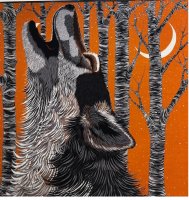
I had a chance to take a look at this earlier today in the orange cw, the navy blue and the prune. Shame on me, I didn't get a chance to take down the reference number. The orange is definitely a burnt, rusty orange, very autumnal and almost a little iridescent and quite bright.
To be honesty, I struggled a little with all three colour ways as it's quite a hard design to fold and get some detail - it worked best cowboy style with the snout in the centre, but for me the accent detail in the fur, which is in a contrast colour, is a little too busy for me. As a guy I'm still looking out for Brazilian Horses, Last Night (name confirmed to me by my SA) and the Imprimeur Fou design (can't remember exact name).
For the men's range, the scarves are being broken down into colour families - blue, grey, chartreuse, orange and prune. Unless I'm mistaken I think there may be two further designs to be revealed, one based on the Tableau d'Honneur 65 medal design and another with a geometric, repetitive pattern which to me looked almost like graphic equaliser squares across the scarf.


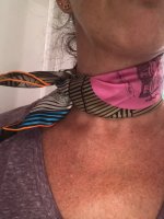
 it (and those earrings too)