I have seen some name logos similar to what you're asking about on the MK website.
Yes I notice there’s a difference between previous MK logo with the newest one.
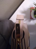
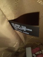
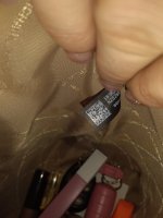
What I mean by the logo is off is that the space between letter is not clearly separated like these picts below. Or perhaps its just because of the production error? Sorry for questioning, I never meant to doubt you though
View attachment 4963328View attachment 4963329