2022 Holiday Pendant

TPF may earn a commission from merchant affiliate
links, including eBay, Amazon, and others

I think a lot of people still like the color of the HP this year, given it is a closest color substitute for a turquoise alhambra pendant.
I do think VCA is smart though, they chose this color which is close to turquoise yet not as bright or saturated or even-tone like turquoise. This way VCA will still maintain the premier status of turquoise in the VCA jewelry collection as turquoise is used in high jewelry collections or as a special alhambra stone for VCA’s VIP clients.
I own the yellow gold turquoise pendant. It was my first VCA piece. In fact I bought 2 at the same time --- One for my daughter she wears it almost everyday. Not long after I purchased my single YG turquoise motif my SA contacted me about a 20 motif she had just received. She sent photos to me and I instantly knew I had to have it. Looking back.....I am so happy I went out of my comfort zone and purchased the YG turquoise 20 motif.
I do not have my papers with me as they are in my safe in Rhode Island but I think the year was 1997. WOW! That seems like ages ago!
Anyone got one allocated and received it in Switzerland?
I wish I could go to Switzerland to pick up my holiday pendant :)
 
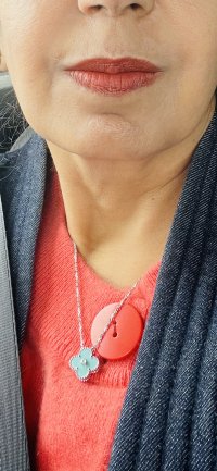
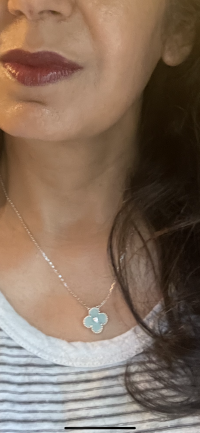
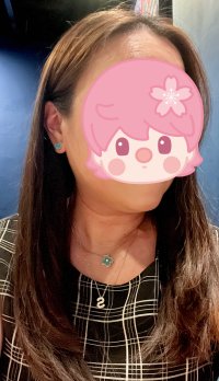
Received my necklace a few days ago but haven’t had a chance to take pics with daytime natural lighting. Shade varies with warmth of lighting. Mine is relatively smooth but the hi shine reflects small dots of light onto the surface creating a twinkling effect sometimes. Photographs bluer on the iPhone as others have said. Overall mine seems darker than others” pics but again haven’t had a chance to see it in sunlight yet given the weather and my work schedule.
My SA didn’t text me of my “approval” until this wk so I think there are more HPs trickling in. View attachment 5626327View attachment 5626328View attachment 5626329

Still this is my kind of carribean blue / sea foam green / celadon shade. Very happy.

View attachment 5626330
Last pic is with a Tiffany felt bag (also photographing bluer than true shade)
I like the cool tone of this one. Mine is smooth too.
 
  • Like
Reactions: sunshineshiney
Thank you for these distance and untouched up shots. These are the most “like turquoise” pics of this pendant I’ve seen. I think they chose to go with this config to satiate some of the turquoise craze. From a distance, you wouldn’t know this wasn’t turquoise. Maybe it is just the shade of your piece @Notorious Pink. I am so happy to note that from a distance the whitish edges are not visible. Looking forward to seeing what mine will look like.

U r right, marginal difference from a distance but it can be more/less obvious under different lighting.

C6E365B4-BD1B-4E2A-8F19-A256FF567F9F.jpeg1BFB9FAC-1D55-404B-AA8A-E9713BAE548E.jpeg
 
Despite not wearing small pendants (only got the HP last year because I was getting PG frivole at the same time so I layer them), and despite not having anything WG (but planning to), I fell in love with the pendant. I will layer it with last year’s pendant. I’m not seeing the texture so much on mine in person, you can see it just a bit in photos, but the rhodonite looks ”busier” to me. Definitely varies in the light.

Buncha photos. All of these are unedited, except the last was taken with a filter, HOWEVER, that is the color the pendant looked in that (my bathroom) lighting:

View attachment 5626404

View attachment 5626408

View attachment 5626405

View attachment 5626406

View attachment 5626409

View attachment 5626407
This color combo stacked looks lovely. So lively
 
Top