You are using an out of date browser. It may not display this or other websites correctly.
You should upgrade or use an alternative browser.
You should upgrade or use an alternative browser.
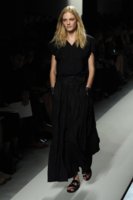
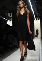
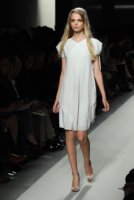
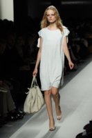
Seasonal Official BV Spring/Summer 2011 - Post Pics and Discuss Here!
- Thread starter jula
- Start date
More options
Who Replied?


Thank you, as ever, Jula!!! This is so somber for Spring/Summer. Maybe there will be something sunnier to follow...
You're very welcome
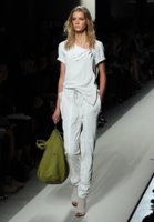
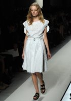
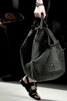
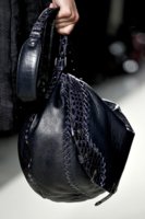
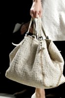
From what I'm seeing so far - I'm afraid we won't.... Lots and lots of white, pastel, black and grey...
The palette seems more subdued than this past spring/summer, which I thought was extraordinarily cheerful and sunny--yolk, orchid, delft
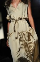
 I loved those colors, but I know they weren't to everyone's taste. I kind of like the look of these muted greys, but I'm not sure they're really for me. I think they're soothing (while this FW's catalog seemed downright depressing to me at times).
Thanks very much for sharing the photos, jula!
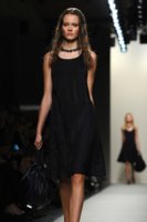


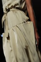
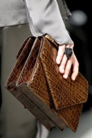
I usually love so much of every collection BV does, but this one to me is a let down. It almost looks grungy and dirty. What I love about BV is how feminine it is, but this is not showing it. I usually can't get enough of the gorgeous dresses, skirts, and gowns.
From what I have heard, Hermes will show a lot of white bags as well.
Thanks you for sharing!
From what I have heard, Hermes will show a lot of white bags as well.
Thanks you for sharing!
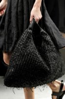
I usually love so much of every collection BV does, but this one to me is a let down. It almost looks grungy and dirty. What I love about BV is how feminine it is, but this is not showing it. I usually can't get enough of the gorgeous dresses, skirts, and gowns.
From what I have heard, Hermes will show a lot of white bags as well.
Thanks you for sharing!
You're welcome! I have to admit, I miss the gowns in this collection too... :ninja:
More
style.it
Attachments


style.it
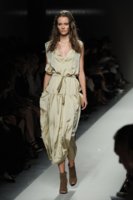
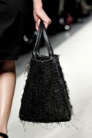
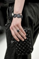
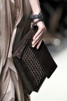
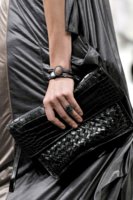
Ok... I spoke too soon. This is not soothing--it looks a little ratty.
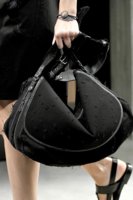
 But I might be a little hypersensitive to the hanging threads. It bugs me to have a thread popping out of a hem, so the idea of having them there deliberately is strange to me.
^^LOL...I'd have to take the scissors to those bags! Those hanging threads would drive me insane!

The palette seems more subdued than this past spring/summer, which I thought was extraordinarily cheerful and sunny--yolk, orchid, delft
Thanks very much for sharing the photos, jula!
You're very welcome

Ok... I spoke too soon. This is not soothing--it looks a little ratty.
lol
 thought the same thing
Last edited:
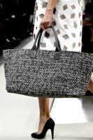
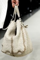

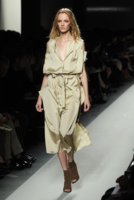
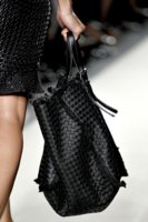
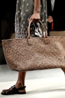
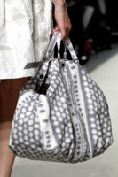
kind of loving these, looks like cloth?
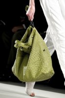
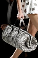
personally love the muted color palette, but i think taupe is a color. only thing that scares me a little is the hairy bags.
Jula thanks so much for the eye candy! for once, looking forward to SS colors!
Last edited:
Register on TPF! This sidebar then disappears and there are less ads!