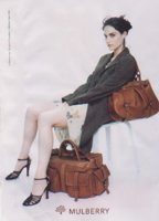
Hello ladies,
as I'm a big fan of all things design (not only bags) I though about starting a thread dedicated to the CI of Mulberry. I only have seen a few things until now but maybe we can collect together, I'd also be interested in how all those things looked before they were grey/gold or brown/gold. I'm going to take some pictures tomorrow of the things I have collected.
Of course we all love those grey bags with the golden logo conditioning and the thank you card on the bottom. But there's a lot more - envelopes for receipts, tissue paper, business cards, letter paper...
I also saw different tags attached to the bags for different occasions which I though were lovely! Oh and not to forget the wonderful invitations to the fashion week shows some bloggers shared - I'll have a look and see if I can find them again.
Also the look books are always an eye catcher. The logo and tree are embossed and finished with some foil (at least on aw 13 / ss 14).
So, feel free to share your thoughts/pictures on everything CI related! I hope here are some M fans that are interested in this, too


