Scarves Love it then leave it ,how do you curate your scarf collection?

I like your idea:tup:Large colours splotches:Pon scarves is a great idea to use complentary colours.
This idea about smaller multi colour patterns from afar blended makes me think that if I were to buy a smaller pattern design again I should go for a more monochromatic multi coloured? What would be an ideal colour combo for smaller designs?

The home you owned. I’m sorry the visual you have described is hilarious! I’m surprised the former owners never noticed...

:flowers:
Yes, the house was something ... actually a journey for me in understanding how others perceive color

The previous owner loved green - she used the stuff all over and it never dawned on her that the greens did not go together AT ALL

A tiurquoisy teal green marbly countertop
The door and shutters were painted inky inky dark green nearly black - ugly
Bath was pastel mint with a blue green marble floor tile

To her , it all went together ... OK... she perceived color differently than me, to me it all clashed, lesson learned
 
So Interesting about the screens. Could you give an example of a design that has more than 15 screens that has been popular, new or old? And/or which one this a/w 2020 has the most screens, “the one“ as you say?
I oddly avoid all monochromatic I think because subconsciously I just respect the work less. Silly I know. But I guess for me, my Hermès scarves must encompass all the aspects that make them the best, and mono color doesn’t meet my criteria.I also can’t do a bandanna For some bias I have about them. I’ll get one for a lot less if I want that style, can’t pay Hermès price.
A few years ago, ca 2010 - 2019, each season had an IT design, typically by Henry, Faivre, Honore, those seemed to have the highest screen count of each season. The designs that get the most traction here at TPF are the high color count ones, the IT designs

SAMOURAIS was the last one that I remember in this series ... before they kind of, sort of, got rid of those ladies, or at least - Faivre has retired, Henry does a design every 3 years ??? IMHO, Honore designs got dumbed down after SAMURAIS - SARASA and BOYAGI (sp?) were more graphic, less intricate designs, never got a lot of traction here, not IT designs, although Honore kind of returned to form with PLUMES EN FETE
 
Yes, the house was something ... actually a journey for me in understanding how others perceive color

The previous owner loved green - she used the stuff all over and it never dawned on her that the greens did not go together AT ALL

A tiurquoisy teal green marbly countertop
The door and shutters were painted inky inky dark green nearly black - ugly
Bath was pastel mint with a blue green marble floor tile

To her , it all went together ... OK... she perceived color differently than me, to me it all clashed, lesson learned
Wow! Some colours she had. I guess it really is dependent on each person.
Sometimes I would never think of a combination but when I see someone wear it, I find it amazing. Perhaps this is why I like H season colours over the years. The combinations, I would never think of. I hope they continue to push colour theory. I can’t wait to see what they come up with next!:flowers:
 
A few years ago, ca 2010 - 2019, each season had an IT design, typically by Henry, Faivre, Honore, those seemed to have the highest screen count of each season. The designs that get the most traction here at TPF are the high color count ones, the IT designs

SAMOURAIS was the last one that I remember in this series ... before they kind of, sort of, got rid of those ladies, or at least - Faivre has retired, Henry does a design every 3 years ??? IMHO, Honore designs got dumbed down after SAMURAIS - SARASA and BOYAGI (sp?) were more graphic, less intricate designs, never got a lot of traction here, not IT designs, although Honore kind of returned to form with PLUMES EN FETE
Ah yes Thanks so much. The pattern that caught me in the Hermès scarf net was Samourais. Love at first sight.
I thought perhaps this might be one when I asked you the question. It was the only one I could think of that might.
 
You are a serious stylist with a good eye and a calm head (for letting go when it’s time). Always inspired by you! And I have learned not to attempt to replicate anything you do, because it’s impossible!

I’m zooming the same way. Lipstick, 90, t shirt, yoga pants, slippers, LOL.
Thanks for the compliment moma; I’m happy to know we are twinning our sweat uniforms for our Zoom sessions!

One thing I have learned on what works or doesn’t work on me? I adore the Detailed toile ( Leila garden, Houtin, Les Cabanes, etc) look on shawls but every time I try those engravings on they completely wash me out or go flat on me. I think the scale of pattern against background is so important. I waited a while for Cite before buying for this reason. And the architectural drawings looked best on the most contrasting neutral of black on cream.

I find the discussion about dimming popularity of the more traditional scarf artists somewhat sad as they represented the backbone of H’s artistry for so long. Many of whom I still have inluding my favorite Honore.

Trends come and go, but I am glad I have printed mousselines to enjoy since H stopped printing patterns on mousselines. I guess I’ll see if that lasts or not.
 
Ah yes Thanks so much. The pattern that caught me in the Hermès scarf net was Samourais. Love at first sight.
I thought perhaps this might be one when I asked you the question. It was the only one I could think of that might.
A few years ago, ca 2010 - 2019, each season had an IT design, typically by Henry, Faivre, Honore, those seemed to have the highest screen count of each season. The designs that get the most traction here at TPF are the high color count ones, the IT designs

SAMOURAIS was the last one that I remember in this series ... before they kind of, sort of, got rid of those ladies, or at least - Faivre has retired, Henry does a design every 3 years ??? IMHO, Honore designs got dumbed down after SAMURAIS - SARASA and BOYAGI (sp?) were more graphic, less intricate designs, never got a lot of traction here, not IT designs, although Honore kind of returned to form with PLUMES EN FETE

I have a silk Samurai, you can see that there very little saturation on the reverse. It's not so recent that this seems to occur, Apperat des Plaines also shows this (2015). Glad to see my pics of SS20 & AW20 are not so marked in terms of difference.
 
  • Like
Reactions: ElainePG and Nomad
Yes! So I remember reading somewhere that Hermès was not doing the traditional ink screening on all scarves and had started computer inkjet printing (or something) en masse. So is the zoom wing one of those? and what are some other ones?? I find this all fascinating. And will Hermès never admit it label online when they use a different process for printing?
We’ve had discussions and rants on this topic, and I am totally ignorant of printing and silkscreening. I just find that some of the recent designs look flat on the surface, like there is no depth to the coloring. I have so many vintage designs, which are sometimes breathtaking in their texture.
 
I go through very strong shorter or longterm phases so I daren't cull. One minute I thinking "why did I ever buy this?" and the next it's my favourite scarf.

I haven't worn my ol' default black/gold classics for. a long time (remember those anyone?). They are so much off the radar, I'm thinking there could be a Papertiger does blk/gld revival soo.

I am also aware that I look better with the mottled (not the ultra feminine ditzy 'Liberty' print though) but sometimes it's matching what's on the inside that counts.
Haha yes black and gold. I have one truly black and gold old lady scarf that I tried to sell but it came back to me. There must be a reason. Perhaps a momasaurus black and gold revival also?
 
I like your idea:tup:Large colours splotches:Pon scarves is a great idea to use complentary colours.
This idea about smaller multi colour patterns from afar blended makes me think that if I were to buy a smaller pattern design again I should go for a more monochromatic multi coloured? What would be an ideal colour combo for smaller designs?

The home you owned. I’m sorry the visual you have described is hilarious! I’m surprised the former owners never noticed...

:flowers:
As to the previous owners never noticing ... well, maybe they were color blind or maybe I am hypersensitive ... I have been known to exaggerate ....

The previous owners bought it under construction, they picked everything out of catalogs or based on small sample swatches, that is my explanation ... they never saw saw it in situ until done

Like the difference between picking paint based on the tee tiny chips at the store, or based on a 6 x 6 ft sample on the wall, under the exact lighting conditions
 
We’ve had discussions and rants on this topic, and I am totally ignorant of printing and silkscreening. I just find that some of the recent designs look flat on the surface, like there is no depth to the coloring. I have so many vintage designs, which are sometimes breathtaking in their texture.
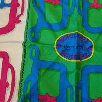
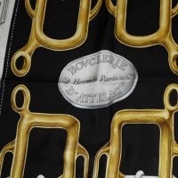
The best example of the flat type rendering is BOUCLERIE. The 1970s version shows 3D shapes to the buckles while BOUCLERIE MODERNE has outlines of buckles , almost no relief or 3D , very comic-book like. Think Roy Lichtenstein.
Hermès is deliberately driving this, it has happened systematically on reissues eg anything by Origny, Passementerie etc
You either like the new or the old rendering, few people like both, I am with you , I like the old ones where the buckles are totally 3D due to shadings, that was one way to ID an HS, the hardware had to look real, not graphical
 
Found some pix , black & white is the detailed oldie - yes it is black and gold ... to me, it looks like real hardware. The old 3D rendering style is not about color saturation - putting a lot of one color ink on so that it soaks thru to the back - it is about using 4 or 5 shades of gold, where BM has one shade of blue

The multi color is B MODERNE done A LA Roy Lichtenstein. BM has substituted a single shadow behind the buckle for the 5 shades of gold

The simple flat style rendering - BM - has been replicated everywhere - anything recent by Jamin, FOUETS, CANNES, CARRE EN BOUCLES, so, I think it is fair to say the simple rendering style is favored/dictated by H, not the individual artist or colorist
Of course, the new renderings are in super nova colors, not black and the dreaded gold


GOld 2 copy.jpg

H003106S-06 Rose Indien Blanc Multi (4) copy.jpg
 
Last edited:
Found some pix , black & white is the detailed oldie - yes it is black and gold ... to me, it looks like real hardware. The old 3D rendering style is not about color saturation - putting a lot of one color ink on so that it soaks thru to the back - it is about using 4 or 5 shades of gold, where BM has one shade of blue

The multi color is B MODERNE done A LA Roy Lichtenstein. BM has substituted a single shadow behind the buckle for the 5 shades of gold

The simple flat style rendering - BM - has been replicated everywhere - anything recent by Jamin, FOUETS, CANNES, CARRE EN BOUCLES, so, I think it is fair to say the simple rendering style is favored/dictated by H, not the individual artist or colorist
Of course, the new renderings are in super nova colors, not black and the dreaded gold


View attachment 4911921

View attachment 4911922
Thanks for posting this visual comparison, there’s much more depth to the earlier version. Each to their own, but I know which I prefer...
 
Found some pix , black & white is the detailed oldie - yes it is black and gold ... to me, it looks like real hardware. The old 3D rendering style is not about color saturation - putting a lot of one color ink on so that it soaks thru to the back - it is about using 4 or 5 shades of gold, where BM has one shade of blue

The multi color is B MODERNE done A LA Roy Lichtenstein. BM has substituted a single shadow behind the buckle for the 5 shades of gold

The simple flat style rendering - BM - has been replicated everywhere - anything recent by Jamin, FOUETS, CANNES, CARRE EN BOUCLES, so, I think it is fair to say the simple rendering style is favored/dictated by H, not the individual artist or colorist
Of course, the new renderings are in super nova colors, not black and the dreaded gold


View attachment 4911921

View attachment 4911922
So amazing! Thank you for sharing these photos. As @paula24jen said, I am sad these are no longer done. Amazing when seen you close!:flowers:
 
You are a serious stylist with a good eye and a calm head (for letting go when it’s time). Always inspired by you! And I have learned not to attempt to replicate anything you do, because it’s impossible!

I’m zooming the same way. Lipstick, 90, t shirt, yoga pants, slippers, LOL.
Haha me too. Colleagues comment on how "put together" I am. It's so easy really, just put a scarf on it!
 
Haha me too. Colleagues comment on how "put together" I am. It's so easy really, just put a scarf on it!
Haha me three. One of my male colleagues commented that he appreciated that I "made an effort" for our Zoom meetings, always wearing a H-scarf or shawl, lipstick and interesting earrings, and allowing the video feed to stay on (he also looks professional). Actually the video feed is bit of a bugaboo for me - I come from a culture where people use their hands, facial expressions, etc. to convey their thoughts & emotions (I've been criticized for the use of my hands as I now live in an area where folks are "less expressive") so I am peeved when participants turn off their video. I do realize, however, that it saves bandwidth and can help if household internet connections are less stable, but sometimes you wonder if they've just crawled out of bed for the meeting.....