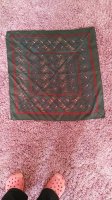
Thank you! Well, it isn’t by color. I just went over to H.com and looked at three similarly colored scarves—Blanc/Brique/Brun, Blanc/Fauve/Brique, and Blanc/Rose/Brun and they are entirely different CWs. It’s probably something ridiculously simple like the order that they screen the series. The CW they do first is probably 01, the one they do second is 02 etc.
Got to thinking some more ...
Nowadays there are signature colors every season - menthol was big a bit back, bleu noir is big this season and so forth
Well, there are 4-5 signature colors each season , eg rose pale, ciel, bordeaux, curry, marine, marron - brown is back!! I picked up those off the cws for PATISSERIE
And there are signature color combos - again from PATISSERIE - Rouge/Rose/Blanc, Orange / Rose , Marron/Beige
Then you can go to another design - I randomly picked BOLDUC AU CARRE - also 2019AW - and lo and behold we have the same colors and combos eg Rose Pale / Ciel, Marron / Rose, Jaune/Rose
Well, anyway, the instructions for the colorists when starting a new design eg COSMOGRAPHIA could be along the lines / are certainly along the lines of
1. You MUST have the following cws : Rouge/Rose, Ciel/Rose, Orange / Rose
2. For a pen and ink design - CITE CAVALIERE - which is nearly monochrome - you MUST have a cw in each of the 4 signature colors
So, a colorist may "copy" the colors from BOLDUC onto a new design eg COSMO , that could account for numbering sometimes being carried over, but I dont think there is as requirement to reuse the numbering , just to reuse the palette colors
Anyway, it did not used to be like that - Bali when she designed used her own distinctive palette of primary colors, Faivre did not use the BB palette, the Faivre cws were not seen in BB scarves , there was more variation from designer to designer, but that seems to be a thing of the past
To coin a pun, there used to be a lot more coloring outside the box

 .
.


