Flamenco Logo Tote

TPF may earn a commission from merchant affiliate
links, including eBay, Amazon, and others

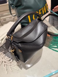
it’s very pricey too for what it is, and has very little difference from the large flamenco tote. It already feels heavy without anything in it and yes I think the Loewe branding is too loud and borders on tacky. In fact the RTW in the same collection suffers from the same problem. I almost immediately vetoed the bag when our SA took it out to show us together with the Featherlight puzzles so this half image is all I have of the bag.

IMG_2998.jpeg
 
  • Like
Reactions: fettfleck
Just doesn't vibe with the brand. I don't own any loewe bags but my sister is a long term fan (from early noughties - before puzzle) it's always been subtle from what i remember. This isn't.
 
I don’t like it, and I didn’t like the raffia bags that had big black LOEWEs on them either. The brand is so lucky to have a logo that actually looks beautiful as a design element, I wish they wouldn’t go in for the billboard trend.

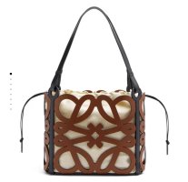
This is how I like seeing the branding used:

IMG_8920.jpeg
 
Top