Dior Pre-Fall 2017 by Maria Grazia Chiuri

averagejoe

AJ
Moderator
Authenticator
O.G.
Nov 22, 2006
27,309
18,254
Dior Pre-Fall 2017:

The clothes are starting to have more "Dior" silhouettes.

From WWD:
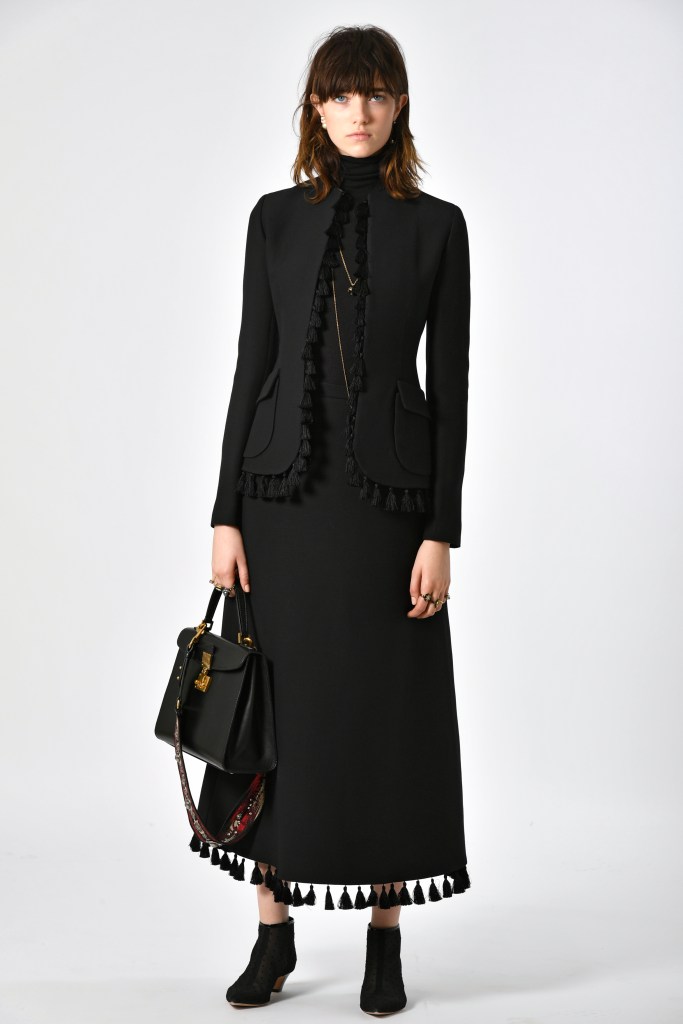
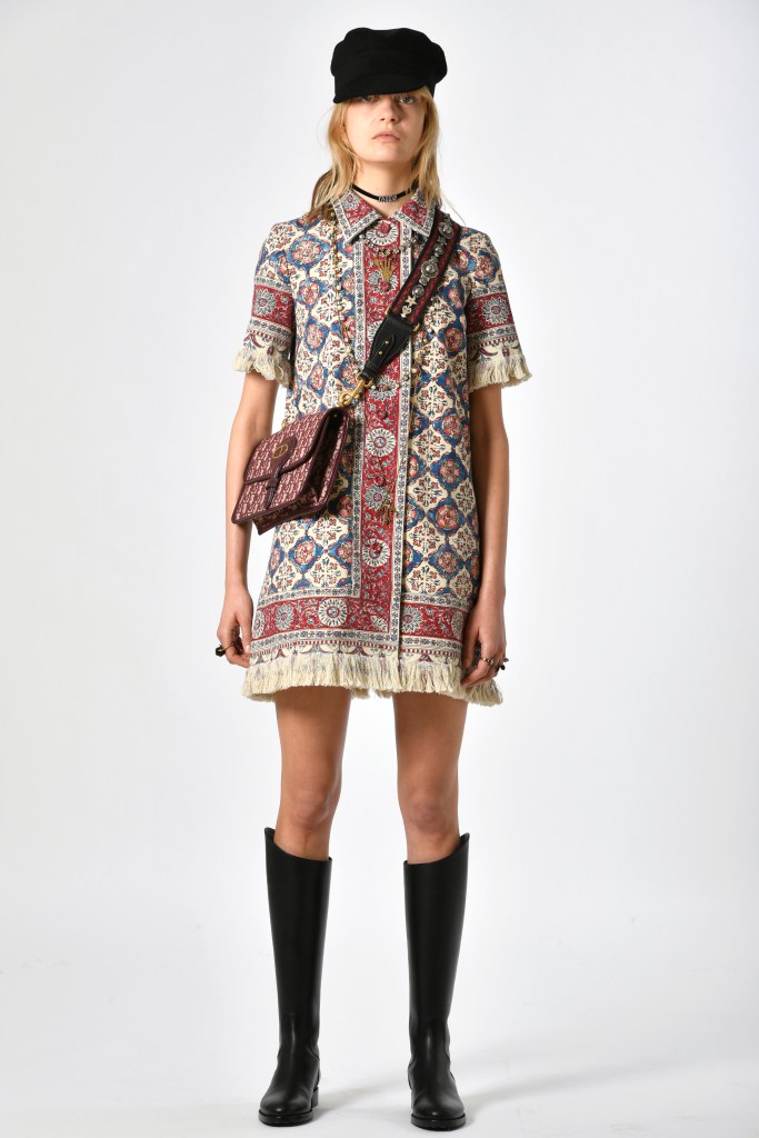
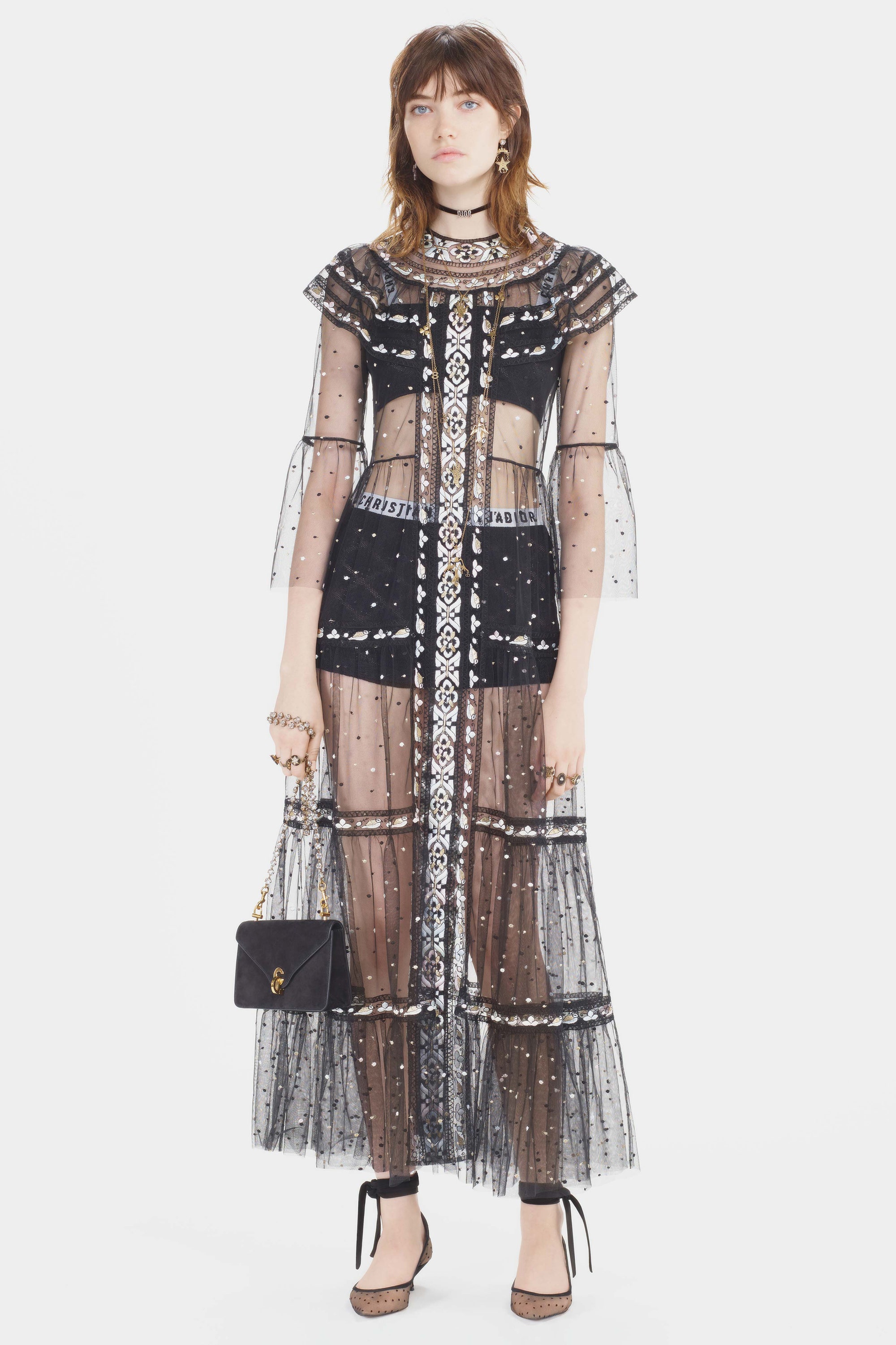
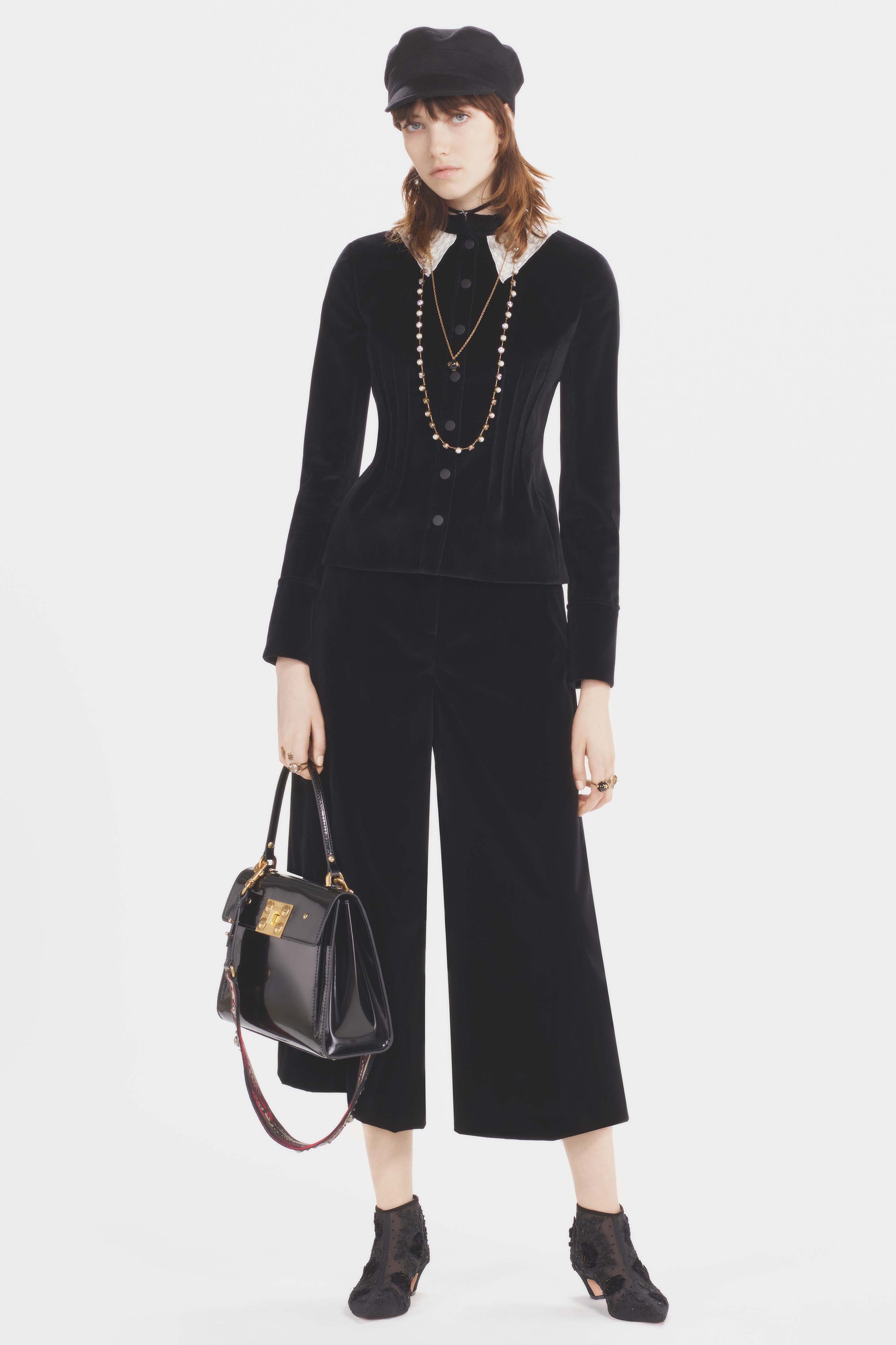
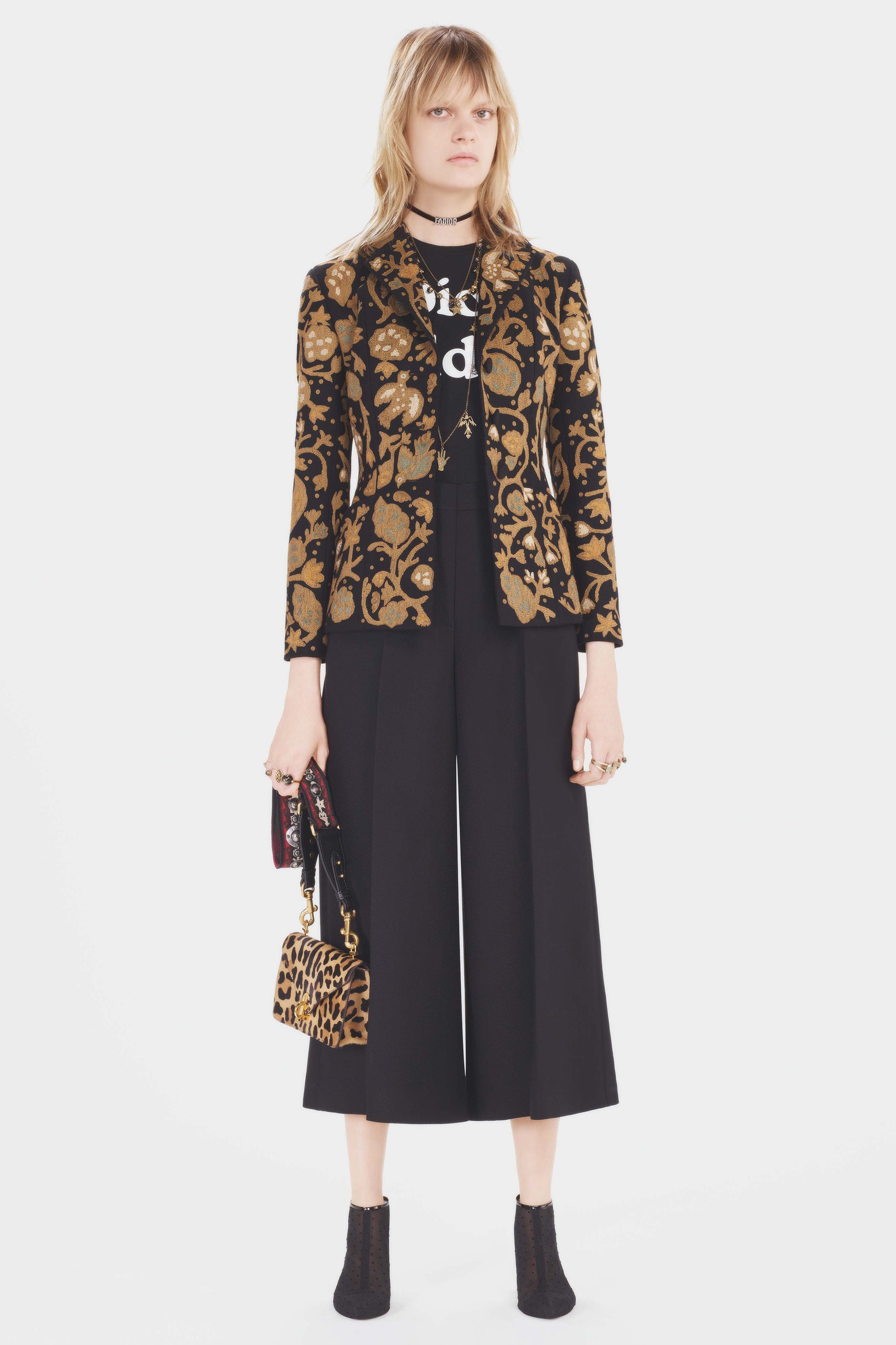
As Dior prepares to celebrate its 70th anniversary with a series of commemorative events, Maria Grazia Chiuri is looking to the house’s future. In her debut pre-fall collection for the label, the Italian designer expounded on her vision for the brand — and it’s aimed squarely at a younger generation.

Having moved to Paris from Rome last year, Chiuri is still soaking up the atmosphere of the French capital, and it pervaded the lineup, though in unexpected ways. The designer said she was drawn by the city’s role as a magnet for bohemians, as described in Ernest Hemingway’s Twenties classic “A Moveable Feast.”

She cast that oft-referenced period in a new light by making a connection with American counterculture artists like Shepard Fairey and Harmony Korine, as portrayed in the 2008 documentary “Beautiful Losers.” And she updated the concept of Paris as cultural melting pot with a trove of ethnic influences.

dior-pf17-1.jpg

dior-pf17-2.jpg

dior-pf17-3.jpg

dior-pf17-4.jpg

dior-pf17-5.jpg

dior-pf17-6.jpg

dior-pf17-7.jpg

dior-pf17-8.jpg

dior-pf17-9.jpg

dior-pf17-10.jpg

dior-pf17-11.jpg
 
Last edited:
  • Like
Reactions: OneMoreDay
I did some screen shots of the zoom-in pictures. Please ignore the rectangle in each picture.

The "Bohemian" guitar strap was done while Maria Gracia Chiuri's team was at Valentino, so this feels lazy even if it is "of the moment".

The box-shaped bag and the Kelly-shape bag look kind of neat.

The crocodile shoulder bag features an interesting and subtle CD lock, which looks very vintage but I think that was the look they were intending.

Maria's move in bringing back vintage Dior logo bags is a good idea, but I think the CD logo needs a serious update. No doubt this will cause resale values of similar vintage pieces to escalate.

1.jpg 2.jpg 3.jpg 4.jpg 5.jpg 6.jpg 7.jpg
 
I did some screen shots of the zoom-in pictures. Please ignore the rectangle in each picture.

The "Bohemian" guitar strap was done while Maria Gracia Chiuri's team was at Valentino, so this feels lazy even if it is "of the moment".

The box-shaped bag and the Kelly-shape bag look kind of neat.

The crocodile shoulder bag features an interesting and subtle CD lock, which looks very vintage but I think that was the look they were intending.

Maria's move in bringing back vintage Dior logo bags is a good idea, but I think the CD logo needs a serious update. No doubt this will cause resale values of similar vintage pieces to escalate.

View attachment 3572206 View attachment 3572207 View attachment 3572208 View attachment 3572209 View attachment 3572210 View attachment 3572211 View attachment 3572212

Thanks Averagejoe! I definitely like this collection more. And that lady Dior looks really nice.
 
  • Like
Reactions: averagejoe
Dior Pre-Fall 2017:

The clothes are starting to have more "Dior" silhouettes.

From WWD:


dior-pf17-1.jpg

dior-pf17-2.jpg

dior-pf17-3.jpg

dior-pf17-4.jpg

dior-pf17-5.jpg

dior-pf17-6.jpg

dior-pf17-7.jpg

dior-pf17-8.jpg

dior-pf17-9.jpg

dior-pf17-10.jpg

dior-pf17-11.jpg
What I love about this is Maria is doing exactly what she said she'd do: I can see shade of Christian, John, Raf, even Marc and Gianfranco in this, I also see her in this collection as well. And it doesn't scream "I used to work at Valentino before", she's adapting and evolving. The thing I most love though, Is when she says "I want to wear Dior to work everyday", and she's designing with that mindset, clothes that will adapt to a modern woman's wardrobe, while still having this savoir faire to them. It's nice, it's modern.
 
... it's for you too if you get your mother pay for you :smile:
You know, I used to buy lots of Dior RTW. I'm one of their favourite customers here. If they prefer to "isolate me" in order to win potential younger clientele - so be it. I will be upset, but I will survive and take my money elsewhere. We will see what is more important to the brand, the younger image or the money :smile:

To me, the straps, the CK underwear-style huge logos on handbags look cheap. But, as someone said before, it is probably too early for the final verdict. I will keep on waiting and hoping
I don't see how also offering items that may appeal to a different demographic is isolating to current customers. As long as they keep producing classic RTW, why would it be isolating if they also offered a few edgier pieces. I never saw any indication that they are doing away with classic RTW or bags in favor or edgier pieces.
 
Maria's move in bringing back vintage Dior logo bags is a good idea, but I think the CD logo needs a serious update. No doubt this will cause resale values of similar vintage pieces to escalate.

I personally quite like the Dior logo. It is unique compared to other logos. It has a more vintage feel to it which I like. Everyone else's logos look very similar largely because they copied the iconic LV logo. I hope CD logo stays unique.
 
I do like this collection more. Don't like what they did with the accessories. Hate the new logo style.

Me too. Don't really like the new logo. Not sure why they see the need to update the perfectly fine logo to smthg "trendy" that may only need to be updated again in a few years when it goes out of style. I guess they are trying to do a Gucci inspired revival from the looks of the fabrics and styles.
 
I really like how they "brought back" the Dior Addict shirt. It actually reminds me of the Dior Addict shirts that the sales associates for Dior Beauty used to wear when the Dior Addict lipstick was first launched over a decade ago when Galliano was the designer at Dior.
 
  • Like
Reactions: missdiorling