Damier Ebene Canvas - how is it holding out?

TPF may earn a commission from merchant affiliate
links, including eBay, Amazon, and others

exenity

Member
May 1, 2021
33
16
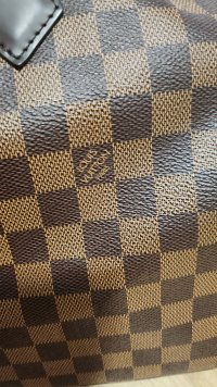
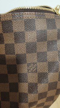
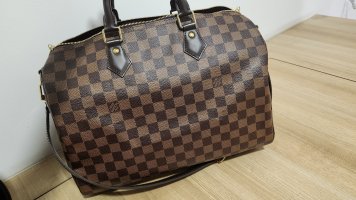
Hi! I tried searching for a similar thread and was unable to find one. Hope i am able to find some answers here. I am aware canvas differs batch by batch but would like to seek your views on the following two. The first two pic is for a keepall 45 produced in 2016 and the last two is foe a speedy 35 produced in 2018.

The 2016 version is darker and the louis vuitton wordings is less clear as compared to the 2018 version.

Does the difference extend to the wordings as well? I heard of canvas thickness and colour differing across batches. Looking forward to hear from you.

Thank you.

20230317_194349.jpg

20230317_194403.jpg

20230317_194542.jpg

20230317_194409.jpg
 
They use quite a few versions of the PVC coating with different thickness and pliability for each. But the prints can also differ vastly, no matter which design. When I first saw this, I though that they are just lazy and should put more effort into being consistent. Because the uniformity of the print is also an aspect of the quality of the product.
But after having worked with printing houses and color management specialists, I realised that delivering the exact same color is very difficult, especially that there is a high chance that they print the canvases in more places, and synchronising them is not easy. Also controlling the ink coverage is more of a fine art. So many things to keep in balance. But this is just part of it, I guess.
I have a THEORY! :) I believe that Louis Vuitton intentionally keeps these — sometimes quite big — variations. And they have a sample from every batch from all ateliers. So when a product returns for repair for example, they check the date code (or now the chip), and they know exactly what characteristics should that canvas have. This is why I cannot take online authenticators seriously, since they'll never have all the resources to decide for sure. They can have a good guess — just like most of us here, who are enthusiasts —, but that won't ever be official, nor always right.
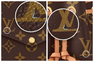
This theory of intentional variations is also backed by the fact that even the Monogram pattern is not just a singular design. They have more versions. See below a Félicie and a Noé. The corner of the L is rounded on one and sharp on the other. The ink coverage also differs a lot, each ink dot is distinctive on the Félicie, while they blend together on the Noé. I really believe that this is all part of the plan. And this recipe goes for the Damier prints as well.
Canvas-prints-differences.jpg
 
There are authenticity-related details in the canvas that we won't get into discussing, but are enough to cause questions for some buyers of preowned merch. Hopefully this isn't about this.

To answer the question, my mid-2000s Damier Ebene is perfection still today and has had a lot of usage.
 
They use quite a few versions of the PVC coating with different thickness and pliability for each. But the prints can also differ vastly, no matter which design. When I first saw this, I though that they are just lazy and should put more effort into being consistent. Because the uniformity of the print is also an aspect of the quality of the product.
But after having worked with printing houses and color management specialists, I realised that delivering the exact same color is very difficult, especially that there is a high chance that they print the canvases in more places, and synchronising them is not easy. Also controlling the ink coverage is more of a fine art. So many things to keep in balance. But this is just part of it, I guess.
I have a THEORY! :smile: I believe that Louis Vuitton intentionally keeps these — sometimes quite big — variations. And they have a sample from every batch from all ateliers. So when a product returns for repair for example, they check the date code (or now the chip), and they know exactly what characteristics should that canvas have. This is why I cannot take online authenticators seriously, since they'll never have all the resources to decide for sure. They can have a good guess — just like most of us here, who are enthusiasts —, but that won't ever be official, nor always right.
This theory of intentional variations is also backed by the fact that even the Monogram pattern is not just a singular design. They have more versions. See below a Félicie and a Noé. The corner of the L is rounded on one and sharp on the other. The ink coverage also differs a lot, each ink dot is distinctive on the Félicie, while they blend together on the Noé. I really believe that this is all part of the plan. And this recipe goes for the Damier prints as well.
View attachment 5742659
I love those info, so interesting! Have to check my pieces. :smile:
 
  • Like
Reactions: exenity and BULL
They use quite a few versions of the PVC coating with different thickness and pliability for each. But the prints can also differ vastly, no matter which design. When I first saw this, I though that they are just lazy and should put more effort into being consistent. Because the uniformity of the print is also an aspect of the quality of the product.
But after having worked with printing houses and color management specialists, I realised that delivering the exact same color is very difficult, especially that there is a high chance that they print the canvases in more places, and synchronising them is not easy. Also controlling the ink coverage is more of a fine art. So many things to keep in balance. But this is just part of it, I guess.
I have a THEORY! :smile: I believe that Louis Vuitton intentionally keeps these — sometimes quite big — variations. And they have a sample from every batch from all ateliers. So when a product returns for repair for example, they check the date code (or now the chip), and they know exactly what characteristics should that canvas have. This is why I cannot take online authenticators seriously, since they'll never have all the resources to decide for sure. They can have a good guess — just like most of us here, who are enthusiasts —, but that won't ever be official, nor always right.
This theory of intentional variations is also backed by the fact that even the Monogram pattern is not just a singular design. They have more versions. See below a Félicie and a Noé. The corner of the L is rounded on one and sharp on the other. The ink coverage also differs a lot, each ink dot is distinctive on the Félicie, while they blend together on the Noé. I really believe that this is all part of the plan. And this recipe goes for the Damier prints as well.
View attachment 5742659
Thanks so much for sharing. I wouldn't have noticed though i own two pieces in monogram too.
 
They use quite a few versions of the PVC coating with different thickness and pliability for each. But the prints can also differ vastly, no matter which design. When I first saw this, I though that they are just lazy and should put more effort into being consistent. Because the uniformity of the print is also an aspect of the quality of the product.
But after having worked with printing houses and color management specialists, I realised that delivering the exact same color is very difficult, especially that there is a high chance that they print the canvases in more places, and synchronising them is not easy. Also controlling the ink coverage is more of a fine art. So many things to keep in balance. But this is just part of it, I guess.
I have a THEORY! :smile: I believe that Louis Vuitton intentionally keeps these — sometimes quite big — variations. And they have a sample from every batch from all ateliers. So when a product returns for repair for example, they check the date code (or now the chip), and they know exactly what characteristics should that canvas have. This is why I cannot take online authenticators seriously, since they'll never have all the resources to decide for sure. They can have a good guess — just like most of us here, who are enthusiasts —, but that won't ever be official, nor always right.
This theory of intentional variations is also backed by the fact that even the Monogram pattern is not just a singular design. They have more versions. See below a Félicie and a Noé. The corner of the L is rounded on one and sharp on the other. The ink coverage also differs a lot, each ink dot is distinctive on the Félicie, while they blend together on the Noé. I really believe that this is all part of the plan. And this recipe goes for the Damier prints as well.
View attachment 5742659
That's so interesting! I can't wait to look at my pieces
 
Well, I really meant it only as interesting info that few people might know about their own collection. I thought that you just found the colour differences surprising, that’s why I dived into my geekery :smile:
x
 
Last edited by a moderator:
  • Like
Reactions: exenity
Top