Hello all! Please pardon my long story and bare with me!! TYIA 
I just ordered a black on black St. Louis PM from BG, being shipped to me. I live in SoCal, and so I was going to bring it up to Goyard @ NM BH to get it monogrammed/striped this Friday. I decided on my colors and how they're organized, however, I'm in SUCH a dilemma with part of the striping and initials. Which is why I obviously had to turn to you lovelies for opinions and expertise!!
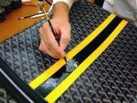
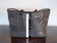
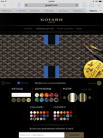
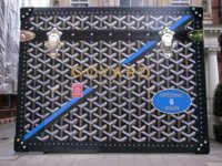
So what I originally was thinking was *see pics* to have the stripes vertical (with similar relative thicknesses), but one solid line down, meaning no initials in middle, and then with the initials (how they look) in bottom right corner (in small size I think). *Note: the only reason the diagonal stripe pics are on there is to see how the full line looks, and with the letters on the side of it.*
However, I showed my friend (who's not that familiar with Goyard, but loves luxe stuff) my idea for the personalization. That's where I went crazy again... She said that it'll be ugly if it's just a straight line down the middle
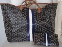
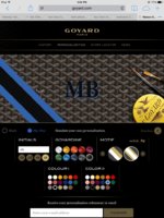
  and that she feels the lines open and with initials somewhere along it (like the standard norm and what most people do) makes it more edgy, it's more signature look/what it's known for, and it's what she thinks about right away with the personalization.
So now idk whether to do the classic initials in between the stripes, or do it the way I originally wanted.
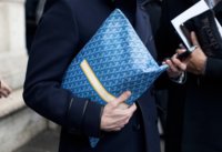
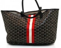
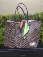
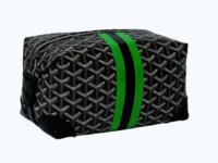
I've attached some photos I found online and through the forum, **I don't take responsibility or ownership for any of the photos posted, besides my own monogram screenshots** They show how the blue and black stripes look on the black canvas
But please help!! All opinions are welcomed and I would greatly appreciate them!!
I just ordered a black on black St. Louis PM from BG, being shipped to me. I live in SoCal, and so I was going to bring it up to Goyard @ NM BH to get it monogrammed/striped this Friday. I decided on my colors and how they're organized, however, I'm in SUCH a dilemma with part of the striping and initials.
Which is why I obviously had to turn to you lovelies for opinions and expertise!! So what I originally was thinking was *see pics* to have the stripes vertical (with similar relative thicknesses), but one solid line down, meaning no initials in middle, and then with the initials (how they look) in bottom right corner (in small size I think). *Note: the only reason the diagonal stripe pics are on there is to see how the full line looks, and with the letters on the side of it.*
However, I showed my friend (who's not that familiar with Goyard, but loves luxe stuff) my idea for the personalization. That's where I went crazy again...
She said that it'll be ugly if it's just a straight line down the middle and that she feels the lines open and with initials somewhere along it (like the standard norm and what most people do) makes it more edgy, it's more signature look/what it's known for, and it's what she thinks about right away with the personalization. So now idk whether to do the classic initials in between the stripes, or do it the way I originally wanted.
I've attached some photos I found online and through the forum, **I don't take responsibility or ownership for any of the photos posted, besides my own monogram screenshots** They show how the blue and black stripes look on the black canvas
But please help!! All opinions are welcomed and I would greatly appreciate them!!
Attachments
-
 thumb_IMG_1713_1024.jpg281.5 KB · Views: 306
 -
 thumb_IMG_1714_1024.jpg281.4 KB · Views: 299
 -
 thumb_IMG_1715_1024.jpg279.1 KB · Views: 295
 -
 thumb_IMG_1716_1024.jpg280.6 KB · Views: 293
 -
 thumb_IMG_0024_1024.jpg147.5 KB · Views: 295
 -
 thumb_IMG_0026_1024.jpg135.8 KB · Views: 298
 -
 thumb_IMG_0023_1024.jpg31.8 KB · Views: 302
 So that was sort of the vibe I was going for...simple, chic, minimalistic, blending and flowing.